

🔥
2d •
Writing, re-writing... who even knows at this point
Oh my gosh, friends. I know I can come in and talk about this because we are in this space for writing Skool copy... But do you feel like you are constantly writing and rewriting your About Page?! There is something really about trying to fit it all into 1000 and convey what it's about, but I feel like with every rewrite, i'm uncovering other layers of what my community is REALLY about. It's not about telling them everything, just giving them enough to get a taste and want to be inside. What do you think? What have you learnt about your business/offer from writing (and rewriting) your About Page?
🔥
5d •
About page fun
Hi everyone, I'm still evolving my Skool community being it's only be open just over a month. And one of the things I'm really focussed on is making my community fun for my members, and a joyful place for me. Spirituality, is often heavy going emotionally and my sense is that the topic needs a fresh approach. Cue the fun. So I have a question. I'd appreciate your ideas that could help bring this fun vibe into my about page. What can I do with my about page to so people feel that, beyond coming straight out and saying it. p.s I'm still yet to do a video for my about page as I've been waiting for my community structure to settle in before I did that. I'm getting there.

🔥
Jan 30 •
Your community isn't for everyone (your copy shouldn't be either)
Your copy actually needs to REPEL people. If your copy is repelling people, it’s doing its job ;) Because anyone can look at your page! - Heck, we can all look at your page (and a lot of the lovely members here HAVE been looking at your pages in our beautiful feedback thread) And they’ll decide whether it resonates with them or not. But the most important question to ask is this: 👉 Does it resonate with my ideal member? - The person who would be the very best, highest quality member I could possibly have? - Does it resonate and connect with them? Because THAT is what actually matters. Btw the BEST feedback doesn't filter through your own personal taste. It tires to look through the ideal member’s eyes, and asking QUESTIONS to inquire about THEIR members' personal taste (a whole different train of thought). I digress... We don’t want to be attracting everyone. So we don’t want our messaging to speak to everyone. If it speaks to everyone, it speaks to NO ONE. That's usually 'cause it's vague! And vague doesn’t bring in the right people. Your message needs to speak to YOUR perfect member!! Not everyone will get what you do... that's OK. (More than OK, because that's how it SHOULD be!) If you’re in a really specific niche around a particular skill or a particular passion, there might be words within that community that only the people you want in the community would even know. And the rest of us wouldn’t get it. Use THOSE words that your members "just get". That’s how the right people feel seen. The only caveat is this (especially relevant to more expert-led communities): If you're using "expert language" that your members actually wouldn't understand. Ask yourself this: - Are these words coming from MY expert brain…or from my MEMBER'S brain?? Look, ULTIMATELY you want to make sure the words on your ABOUT page (and anywhere else you write words to attract members!) are words your ideal members actually understand... and connect with.. and feel SEEN by.
Feb 27 •
About Page Question
I used the about page template to revamp my page after switching from paid to freemium. I thought it was pretty clear, but it scored terribly on Evelyn's about page checker in the traffic challenge. 🥴 Before rewriting it, I thought I would share the before and after here to see if anyone had feedback about what I might be missing in the transition. (The before version passed Evelyn's checker, but it doesn't work for freemium). Previous About Page: ✨ Intuitive Art for Nervous-System Regulation & Soulful Living ✨ Access the clarity, peace, and flow you've been seeking. When your nervous system is calm, you rise into a higher vibrational state where divine guidance and manifestation flow with ease. We use intuitive art as a sacred portal—a way to quiet the overthinking mind and slip into flow where clarity, insight, and guidance come alive. This is not about “making art.” It’s a creative dialogue with your Soul. 🎨 No art skills needed—just an open heart and the willingness to explore. Inside this community, you’ll discover simple yet powerful practices that help you: 🌿 regulate your nervous system and release stress 🌿 gently move through stuck emotions 🌿 access the wisdom of your Soul 🌿 reconnect to your deeper purpose and clarity ✨ Enjoy weekly live art circles, step-by-step art classes, and a vibrant, heart-led community that reminds you of who you truly are: a limitless divine being, here to live with clarity, connection, and trust. New About Page: Are you a spiritual woman who struggles to actually live what you believe? Hi, I'm Dara. I've been on a spiritual path for over thirty years, but most of that time I felt frustrated and unfulfilled. I understood all of the spiritual concepts (manifestation, spirit guides, divine guidance, high vibration, etc.) but didn't REALLY know how to LIVE from a place of spiritual connection. When I started using intuitive painting as a form of meditation, I FINALLY got it! This isn't about making art. It's a creative dialogue with your Soul. No art skills needed, promise! Intuitive painting calms your nervous system and drops you into a meditative state, effortlessly.
Feb 25 •
If You Had to Rewrite Your Skool About Page Today…
If you had to rewrite your About page from scratch today, what would you change? More clarity? Stronger promise? Better niche positioning? Clearer CTA? Curious what lessons you’ve learned after growing your community.
1-11 of 11
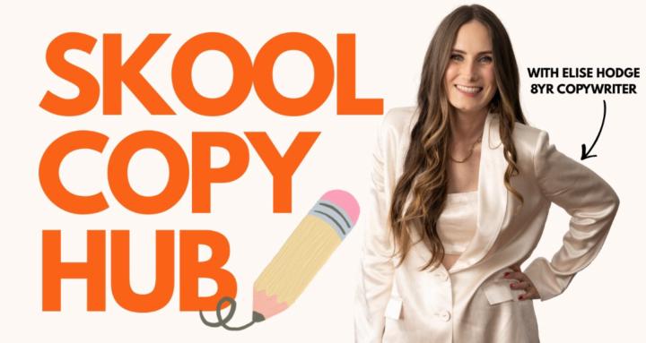
skool.com/skoolcopy
NEW 🔥 Skool About Page Template 🔥 Copy templates, tools, and support for Skool Community owners
Leaderboard (30-day)
1

🔥
+130
2
🔥
+75
3
🔥
+46
4

+46
5
+45
Powered by