
🔥
Jan 25 • About Pages ❓
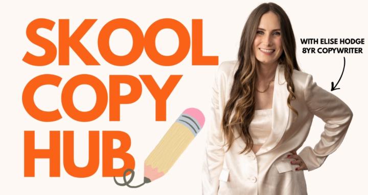
I reviewed 15 Skool About pages — almost all were missing THIS
TOTALLY different niches, topics, & creators.
The communities seemed SO awesome.
I could tell that once members were INSIDE, they'd get a ton of value.
BUT the problem is:
- The About Page needs to CONVERT as many visitors to members as possible!
And after reviewing 15 pages in a row, the same patterns kept popping up again and again…
Here’s what I noticed 👇
--
1. Lots of lovely words BUT not enough clarity
So many pages sounded beautiful.
Inspiring.
Heart-led.
But I still couldn’t instantly answer:
👉 Who is this actually for?
👉 What changes if I join?
And if I can’t tell in 5 seconds…neither can someone finding you through Skool discovery.
As a copywriter, I always tell my clients + students: CLEAR > CLEVER. (EVERY time!!!).
Unfortunately, sometimes when we lean on AI to write our copy, it includes a bunch of words that don't realllllly make sense, or that don't convey what we want to say in the most simple, easy-to-understand format.
So be aware of that!
Write in simple language.
Write like you're explaining something to an 8 year old :)
--
2. The point of difference was almost always buried
People had a genuinely unique method or approach…
…but it was hidden halfway down the page.
(Like one community that teaches guitar by creating music instead of boring exercises 👀).
- How cool is that?!
Your about page shouldn't JUST highlight the outcome.
It should highlight HOW you do it differently.
That’s usually the whole reason someone chooses you over another Skool.
P.S. I gave an example of what highlighting your POV can look like in THIS post here >>
--
3. Authority was there — just in the wrong spot
Decades of experience.
Great results.
Super interesting backgrounds.
And then it was tucked right at the bottom like a little footnote 😂
Trust should be built in the FIRST FEW LINES, not discovered after scrolling.
- Establishing trust EARLY on give someone a reason to read on! If they don't trust you, they'll bounce.
--
4. Feature lists without context
I kept seeing stuff like:
- weekly calls
- templates
- frameworks
- resources
- community support
Which is great and factually correct…
BUT what does that actually DO for the member?
I always ask THIS question: "Why should I even care???"
Then ANSWER it with the supporting copy.
Instead of “weekly calls” → maybe it’s "get detailed feedback on your copy so you feel confident it's going to convert"
Instead of “templates” →“templates so you’re not staring at a blank screen wondering what to write”
People don’t join for features.
They join for the RESULT!
--
5. No clear CTA (so people don’t know what to do next)
So many pages ended with something like a sign off with the person's name...
But never actually told the reader to JOIN.
From writing hundreds of web pages, sales pages, and emails over the last 8+ years, I've always found that people need CLEAR instructions.
Your About page should literally guide them:
👉 Click Join Free
👉 Start your free trial
👉 Join now and get started
If you don’t tell people what to do next… they usually do nothing.
MAKE IT CLEAR! :)
--
P.S. If you want a framework to fix this, check out my About Page template + training in the Classroom.
And if you want me to review your About page (or your sales emails, tier copy, or ANY piece of copy) on an ongoing basis — upgrade to VIP. It’s a silly cheap founding price right now. 🤪
24
20 comments
I reviewed 15 Skool About pages — almost all were missing THIS
Leaderboard (30-day)
1

🔥
+99
2

🔥
+64
3
🔥
+58
4

🔥
+51
5

+47
Powered by