Activity
Mon
Wed
Fri
Sun
Oct
Nov
Dec
Jan
Feb
Mar
Apr
May
Jun
Jul
Aug
Sep
What is this?
Less
More
Memberships
Real Men Real Style Community
13k members • Free
42 contributions to Real Men Real Style Community

1d •
Alan Flusser on Pattern Pairing in "Dressing the Man"
Team, I used AI to help me write this because I wanted to drive home, via application of one of Flusser's many principles on Pattern Pairing. Did I get it right? In "Dressing the Man: Mastering the Art of Permanent Fashion", Alan Flusser dedicates significant attention to pattern coordination in the "Neckwear" chapter (pp. 144–169), emphasizing that successful mixing hinges on scale, contrast, and harmony rather than rigid rules—timeless principles drawn from classic menswear's history. He advises starting with a solid suit as a "blank canvas" to let shirt and tie patterns shine, then layering patterns by varying their sizes (scales): pair a small-patterned shirt (e.g., fine check or subtle stripe) with a larger, bolder tie pattern (or vice versa) to create visual interest without chaos. For contrast, ensure the tie is darker than the shirt to draw the eye upward, while harmonizing colors via the color wheel—complementary shades (e.g., blue shirt with orange accents in the tie) or analogous tones (blues and greens) prevent clashing. Flusser warns against "competing" patterns of similar scale and motif (e.g., two large plaids), which can overwhelm; instead, he champions "pattern-on-pattern" as an art form for the discerning dresser. Application to My Recent Outfit (Tan Suit, Blue Checkered Shirt, Patterned Tie & Pocket Square) Your ensemble—a tan suit (likely solid or subtle texture), blue checkered shirt, patterned tie, and coordinating pocket square—aligns well with Flusser's guidelines, making it a correct and effective application for a polished, versatile look suitable for San Antonio's mild September weather. The solid tan suit provides the ideal neutral base, allowing the shirt's check pattern (assuming a fine-to-medium scale) to interplay with the tie's bolder pattern (e.g., stripes or geometric), creating balanced contrast as long as the tie's tones echo the shirt's blues without matching exactly. The pocket square adds a harmonious "echo" (Flusser's term for subtle repetition of colors/motifs across accessories), elevating the outfit without overcomplicating it—perfect for daytime professionalism or evening transitions.


4 likes • 16h
Love the tan suit. Very versatile, you could wear a plain white shirt and tie underneath and that would also look very classy if a little more relaxed.
3 likes • 16h
Sorry, and no tie I meant to say

1d •
Afternoon fit feedback?
I’m heading out for some errands. Since it’s still in the mid-80s, the fall fabrics and layering need to wait another month or so here. Simple and cool with a cotton oxford, stretch denim, and some double monks. Any recommendations to improve? Thank you in advance!
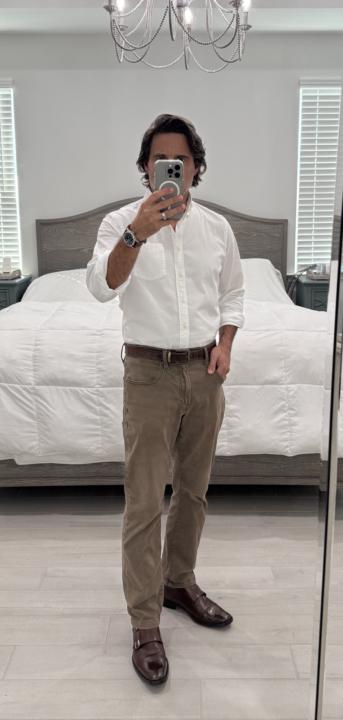
4 likes • 16h
Great look ! I often dress similarly, alough not a fan of monk straps having seen yours maybe I need to explore more....

1d •
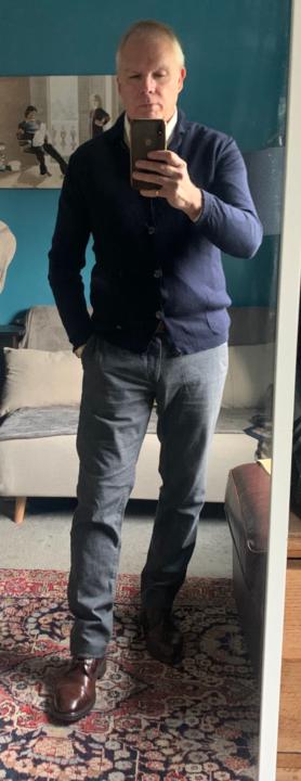
Harmonizing colors and patterns in Classic TIMELESS Menswear
Watch 76 years old✅ Shoes 43 years old✅ Tie 35 years old✅ Suit 30 years old✅ Shirt 10 years old✅ Any one who has taken the time to read any of my posts has heard me blather on about Classic TIMELESS menswear and how it is timeless because this style endures and thus provides some great value because one can wear it for many years on many occasions. Today I thought I might blather on about the use of adding interest to the basic grey timeless suit with the use of harmonizing colors and patterns. Firstly colors. While I am not a color wheel guy- I do use the “color wheel” of nature. The greatest artist of all time provides some pretty compelling combinations: a backdrop of Blue sky filled with clouds, and in the foreground grey barked trees with deep green leaves = grey suit, with blue and white shirt, with teal green tie. While some store clerks might recommend trying to match a color of thread or even the grey suit with some matching color in a tie to “blend” it together- Harold used to teach us to “harmonize color” the same way that harmonizing with a melody adds depth to a piece of music. This quote of his was drilled into us. Another thing Harold explained was that our inventory was what he called narrow and deep (fewer colors but a bigger variety of suitings and sport coats in each of those fewer number of colors.) This forced us to add accesory colors together more creatively. Most department stores and many wearhouse stores are wide and deep (with many colors and patterns of suits and sport coats) naturally with this huge inventory to unload on customers, the task is to pick some thread or base color and blend the tie and shirt together. I find this much less creative. In the old days I could delineate guys who shopped at one of our quality competitors versus a department store based upon their accessories. Secondly patterns. Again to add interest to the basic grey suit pattern, harmonizing patterns can add interest as well. Antonio has some brilliant videos about how to match the size and directions of patterns together. A beginner on upping their wardrobe should probably stick with Antonio’s great solid module or “capsule” plan at first. Mixing patterns can take several years for a guy to do on his own without help from a professional clothier. What is sad is when guys get stuck and still think that patterns can’t be mixed. I assure you they can. Today’s OOTD began with my windowpane shirt. I knew a grey suit would be a no brainer and even though the suit has a ghosted lighter grey window pane I knew it’s larger style, thinner line, and pale color wouldn’t conflict with the shirt pattern. Then as I mentioned earlier knowing that grey with green and blue were great combos-I went looking for a suitable green tie (my ties are arranged by color). The woven silk tie I chose had a larger ameba pattern so I knew it couldn’t conflict with the windowpane shirt. The tie “reads” green but is actually a black background with small teal houndstooth repeating pattern. How a pattern (and color) “reads” is important when harmonizing. At 5 feet away the tie appears (reads) as a solid green. At about 2 feet the pattern becomes visible. Working at mastering this concept of how colors and patterns read adds depth to a very basic suit.

6 likes • 16h
You do have a great classic look. It's true that style never goes out of fashion.

9d •
Denim Recommendations
Tell me Gentlemen, is there a brand of denim you guys prefer over others. After watching several of the videos put out on YouTube, it's clear I need to update my wardrobe and Levi's aren't cutting it...🤣
2 likes • 16h
Levis can hit the spot, for me 511 give a great silhouette. Hilfiger slim scanton are great and I've recently seen a pair of olive jeans by &sons which look amazing. I think it's more about the specific pair of jeans than the brand, I find jeans hard to buy as the colour and fit have to be spot on. Even what we call high street jeans in the UK can be great and really good value. It's true what @Antonio Centeno says, fit (and colour with jeans) is everything.
1d •
OOTD 24th Sept - date night
Date night tonight guys....even though we've been together a long time it's still nice to make an effort.
2 likes • 1d
@Fernando Mendoza thank you
1-10 of 42

@les-warburton-marsh-5994
Mid 50's with an interest in style, design and positive lifestyle choices. Based in Cheshire, UK. Barbour enthusiast.
Active 6h ago
Joined Aug 8, 2025
INFJ
Cheshire
Powered by