Activity
Mon
Wed
Fri
Sun
Jul
Aug
Sep
Oct
Nov
Dec
Jan
Feb
Mar
Apr
May
Jun
What is this?
Less
More
Memberships
The Art of Guitar Composition
434 members • Free
Brotherhood Of Scent
8.9k members • Free
10K Club
78 members • $997/m
🇺🇸 Chicago IRL
420 members • Free
Real Men Real Style Community
13.6k members • Free
Watch Lover | Community
2.7k members • Free
6522 contributions to Real Men Real Style Community
19h •
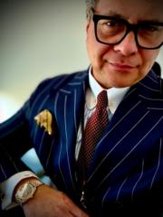
OOTD late entry for Friday 19 June
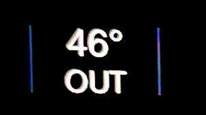
Doing the Friday half-day school pickup, and my car told me it was 46 Celsius / 115 Fahrenheit at midday. Summer has definitely arrived in Dubai! For a Friday, casual vibe I’m breaking in a new bespoke half-lined, unstructured safari style jacket, in an E.Thomas wool-silk-linen. The slubby texture of the fabric gives the jacket a beautiful depth to a casual garment. Paired with- Bespoke, striped cotton shirt Hackett navy cotton chinos Viola Milano navy striped unlined silk grenadine tie Ede & Ravenscroft cufflinks Nobile Italy navy cotton socks Fairfax & Favor brown suede horse bit loafers WOTD MB&F M.A.D.1s “Grow Your Dreams” SOTD layering Houbigant’s Fougere Royal and Roja Dove’s Pierre de Velay Essence Rare. Layering Houbigant’s Fougere Royal with Roja Dove’s Pierre de Velay Essence Rare is a highly sophisticated "Neo-Classical Hybrid"experiment, crashing the clean, structural, aromatic spine of the world's most historic barbershop genre directly into an opulent, sweet, velvet-wrapped French Fruity Chypre.

0 likes • 16h
Very cool. That wouldn’t probably work here in rural Oklahoma but that looks perfect for your tasty environ. Very nice
3d •
Back to basic Blue and Grey
After a couple of bold combos with blacks and various greens I went back to basic menswear blue and grey. Started with a Pendleton cotton patterned shirt and grabbed my new gaberdine light grey trousers ((my busy Stephen Giles from whom I purchased them calls them Cary Grant grey😏). Grabbed my MTM Royal blue blazer I had made for my son’s wedding in 24 and running Bison Pendleton socks with Clark’s cloth black Oxford shoes and. Weneger field watch and a reversible p square:grey seersucker/ blue tattersall.

2 likes • 2d
@Kevin Letts thanks
1 like • 1d
@Geoff Saunders

2d •
What Style Choice Shouldn't Matter But Still Bothers You?
I'm watching the World Cup match featuring Mexico and South Korea, and keep finding myself cringing every time the South Korean head coach is shown. The problem (which shouldn't be a problem)? He's wearing a polo shirt with all the buttons buttoned... I don't know why, but I can't stand seeing a polo shirt with all the buttons buttoned. It's worse, to my eye, than a tailored jacket with all the buttons buttoned. I honestly have no idea why it bothers me so much, but it does. So, what say ye? What style choice - or choices - bother you that really shouldn't?
4 likes • 2d
@Christopher Hansford ? Funny perhaps in England it’s a different thing. Here it’s the opposite. A 3/2 should have the top button undone.
4 likes • 2d
@Alex Kilpatrick I re read. You are correct. He is talking about simply not buttoning a button while standing. Thanks for correcting me.

🔥
2d •
Favourite Sports Teams
G'Day Gents, So, a while back I asked the American gentlemen within this group what sports and teams they follow, now I want to extend the question to every gentleman in this group the same question, I'll go first. Sports I follow: 1. Rugby Union 2. Rugby League 3. Cricket 4. Baseball 5. American Football Teams I support: Rugby Union 1. Epping Rams (Australia) 2. Eastwood (Australia, will be renouncing them at the end of the season) 3. King Country Rams (New Zealand) 4. Waikato Mooloos (New Zealand) 5. NSW Waratahs (Australia) 6. Bath (England) 7. RC Toulon (France) 8. Saitama Wild Knights (Japan) 9. Wallabies (Australian national team) 10. Steelers (Australian national Wheelchair Rugby team) Rugby League 1. St George-Illawarra Dragons (Australia) 2. Warrington Wolves (England) 3. NSW Blues (Australia) 4. Kangaroos (Australian national team) Cricket 1. Sydney Sixers (Australia) 2. NSW Blues (Australia) 3. Australian Test, ODI & T20I Teams (Australia) Baseball 1. New York Yankees (America) 2. Sydney Blue Sox (Australia) 3. Southern Thunder (Australian national team) American Football 1. New Orleans Saints (America)
6 likes • 2d
lol well sports (no teams) vs games with teans Favorite sport: Fly fishing favorites Lefty Kreh Lee Wulff Joan Wulff Tom Rosenbauer Randall Kaufman Games (teams) Oklahoma Sooners football Oklahoma City Thunder basketball Celtics Basketball Oklahoma State cowboys wrestling Oklahoma Sooners girls softball The rest??? Admire many programs with long storied histories and great coaches of the past From tom Osborn to Bear Bryant And from Tom Landry to Mike Ditka Other than that not much of a spectator.

2d •
Something different… outfits of the week
I wanted to mix it up rather than posting an outfit per day, here is a look back on my week. Monday - meeting with a District Attorney on a case, so I wore a gray suit, white shirt, blue/white/red stripe tie, brown AE boots. Tuesday - busy day. Meeting again with a District Attorney so I chose a heather blue suit, white shirt, solid navy tie. I did not get a full suit photo but I took a quick picture in the break room after packaging evidence from an investigation. Wednesday - I had to testify in front of a grand jury so I chose a navy suit, light blue shirt, blue/green/ white tie. After testify I had to go work a crime scene and it was about 85 degrees Fahrenheit which reflect in the photo. Today I wanted to end the week in a chill manner ahead of tomorrow’s holiday. I work a navy short sleeve button up, gray slacks and brown Thursday boots.

2 likes • 2d
@Jamie King there are no standard sizing in shirts anymore. It’s even hard to find shirts with proper sizing (neck circumference and sleeve length in inches). They come in the irrelevant erroneous S-M-L and XL where even the same brands have inconsistencies. The other issue might me the fit of the shirt. Officers of the law traditionally have worn their shirts extremely tight ( with good cause -as a martial artists I recognize the use of clothing in throws etc). I come from an era when shirts were much fuller. Admittedly too full in many circumstances. But if your neck is too tight it sounds like you are buying too small shirts. There should be a happy medium in the middle. You need to go up a size and if the body is too full for your liking, even with a tuck in (you can use garters if the tails come out) or have darts sewn into the back of the shirt
1-10 of 6,522

@brian-mcguire-7072
Start: 1975 men’s clothier; ’84 institutions/indiv. Financial Advisor; ‘90 fly fisherman; ‘04 Celtic Band singer; ‘05 mart arts; ‘10 Scouting & sailor
Active 6h ago
Joined Feb 25, 2024
ENFP
Powered by