
Write something

Sep '25 •
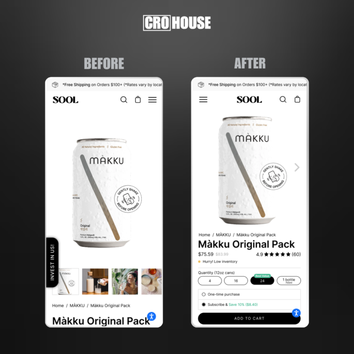
Gaining back $400k in lost revenue
I just reverse-engineered a Korean beverage brand doing Millions of $$$ and discovered they're making the same fatal mistake as 85% of premium alcohol brands… They are letting thousands of people leave because their most valuable stuff is below the fold. SOOL has incredible products but their funnel is bleeding money. Here are the $400K+ revenue leaks I found on their product page and how to get back those lost sales. ✓ Moved the hamburger menu to the left (where its meant to be) for a small conversion uplift. ✓ Reduced vertical space of the image to fit crucial conversion-boosting elements below. ✓ Added arrows within the product image to encourage scrolling through images. ✓ Added breadcrumbs below the image so the user can easily identify where they are and navigate the pages. ✓ Displayed a “before” price which is a huge motivator. ✓ Removed the "Invest in us" badge as this is not the place for that, it's a bigger distraction than you think. ✓ Added scarcity with a “low inventory” element to enourage faster purchase and FOMO. ✓ Auto-selecting the best value variant and ‘Subscribe' option for a huge LTV gain. ✓ ‘Add to Cart’ button above the fold for quick and “no-scroll” purchase. Here's what most brands miss: you can have the world's best product, but if your page doesn't convert, you're just an expensive traffic waster. I've seen this exact transformation add $2M+ to similar beverage brands within 90 days. These aren't minor tweaks, they're revenue rescuers based on 1,200+ A/B tests. SOOL has the demand. Now they just need the funnel to match it. Want a CRO design of your brand? Tell me in the comments below.
Aug '25 •
Something BIG is coming!
I'm working on creating some amazing assets for you guys. The first members of the group will get EXCLUSIVE assets and bonuses. They will help you become true CRO masters. It's knowledge I have gained in the last 10+ years as a CRO expert. Not much longer to wait now!

Aug '25 •
Question for start up website
We don’t have enough visitor in website, so are we still able to the A/B testing?
Aug '25 •
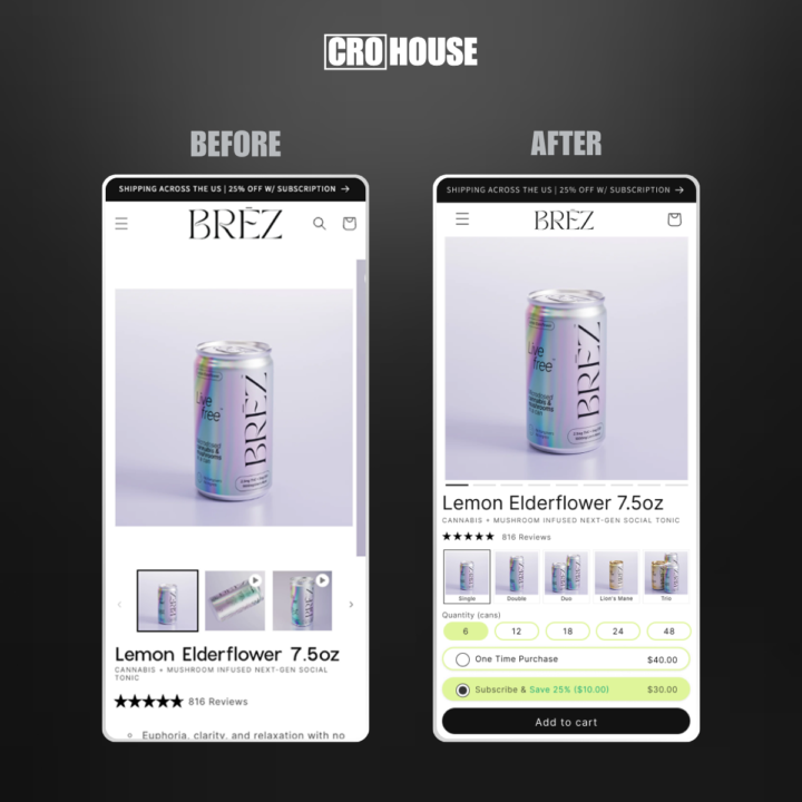
Spent 5h analyzing a $28M+ ecom brand for +20% more conversions
I analyzed BRĒZ (a $28M+ cannabis beverage brand) and found several critical CRO opportunities that could boost their conversion rate by +20%. This isn't guesswork, these insights come from running 500+ A/B tests across high-growth ecommerce brands. BRĒZ has already made some changes since I analyzed their store so this is CRO based on their previous store design, but either way, they can take it to a much higher level. *PRODUCT PAGE* ✓ Focused visitor attention where it counts By reducing header spacing, we immediately draw eyes to the most important revenue-generating content. ✓ Frictionless purchase path: No scrolling needed Key buying elements (product, pricing, CTA) were moved above the fold so users can take action instantly, minimizing effort and maximizing sales. ✓ Simplified visual flow to spotlight the CTA Removed clutter, white space, and thumbnail distractions to guide attention directly to the ‘Add to Cart’ button, boosting clarity and click-throughs. ✓ Made decision-making effortless All 5 product options are now displayed visually and clearly, reducing cognitive load and creating a smoother path to purchase. ✓ Maximizing LTV by pre-selecting ‘Subscribe’ Leveraged the power of commitment by gently guiding users toward the higher-value subscription option without extra clicks or confusion. ✓ Strategic button placement for higher engagement The ‘Add to Cart’ button was repositioned above the fold and made sticky so it's always visible. *MENU* ✓ Turned a static menu into a dynamic, visual sales tool Replaced text-only navigation with rich product imagery to create an engaging and appealing browsing experience. ✓ Clarity over confusion Each product variant now shows size, ingredients, and key benefits, making it obvious and easy to choose. ✓ Reduced mental effort, increased confidence Instead of guessing what “Lion’s Mane” or “Trio” means, customers now get instant clarity, increasing trust and decreasing bounce rates. ✓ Injected instant social proof into the buyer journey
Jul '25 •
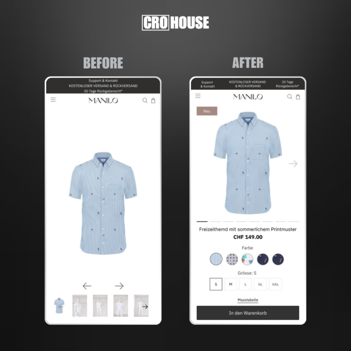
How to increase conversions by +10%, +20%, even +30%
I just took a deep dive into a successful ecom brand named MANILO, and I will show you how I would optimize their store for MAXIMUM sales. This isn’t theory – these are battle-tested strategies and experience running 300+ A/B tests in the past year alone. PRODUCT PAGE - Move up main image to make space for other crucial elements - Add arrow in the image indicating you can swipe to see more images - Bring 'Color' and 'Size' variants closer together to avoid scrolling back and forth to see all details - Add size guide above the Add To Cart button to make choosing a size easier CART - Remove menu header to avoid disctraction from purchasing - Make product details compact to allow for other important elements - Include upsell element to increase AOV - Include USPs increasing confidence and motivation to continue the purchase - Sticky 'Checkout' button at the bottm of the page makes it easy to purchase at any moment within the cart These are just some first UX changes I would implement, but CRO goes much deeper into analysis and research to find what's most impactful for YOUR brand, then A/B testing and implementing the winners.
1-6 of 6
powered by

skool.com/ecom-cro-2111
🏅Learn top CRO strategies to EXPLODE your sales
📈See my live AB tests & strategies from 10+ ecom shops
🚀Every week I redesign a group member’s shop
Suggested communities
Powered by