Activity
Mon
Wed
Fri
Sun
Mar
Apr
May
Jun
Jul
Aug
Sep
Oct
Nov
Dec
Jan
Feb
What is this?
Less
More
Memberships
The Meditation Community
103 members • Free
4D Copywriting Community
63.3k members • Free
AI Automation (A-Z)
130.8k members • Free
Agency Growth
4.3k members • Free
AI Automation Society
255.2k members • Free
Agency Owners
18.9k members • Free
AI Automation Agency Hub
292.7k members • Free
14 contributions to 4D Copywriting Community

15d •
Agency owners let’s connect! Building a huge network, to help each other out.
Recently we had a chance to work with a marketing agency and bring them some amazing results. I have documented their journey here: https://youtu.be/lp8qd5-OHK8?si=t2stQwDyXpg1YffJ I believe that the most important thing in running a business is having a good network. Having a warm network helped me connect to this guy, we got on a call and discussed the bottlenecks in his business and helped them provide a solution. P.S., His business saves over 50+ hours weekly now! If you’re a business owner and are facing some bottlenecks at your business, shoot me a DM. Speak soon 🤝
0
0
Jan 12 •
We just delivered a system into production for a newsletter agency! & it changed how their writers think about competitors.
The problem wasn’t writing. It was research fatigue. Their copy team was manually: - Subscribing to dozens of newsletters - Reading every issue - Tracking hooks, openings, CTAs, tone shifts - Trying to reverse-engineer why certain issues worked Good writers. Too much cognitive load. So we built Mark One — an internal agent that handles the pattern recognition side of competitor research, so writers can focus on judgment and craft. Mk1 is now live in production and actively used by the agency’s team. The demo shows: - How different competitors open their issues - How structure changes week to week - Where CTAs show up (and how often) - Tone and intent patterns across a niche - Side-by-side issue summaries that save hours of reading It doesn’t write anything. It just answers the questions writers usually spend hours figuring out manually: What’s working? What’s repeating? What’s noise? Here’s a short walkthrough of the system in action: 👉 https://youtu.be/XRq-a6fasuk?si=ZrH1kLvwqGTKDFV_ Not sharing this to sell anything — just showing how we’re reducing research time for copy teams so their actual writing energy goes where it matters.
Dec '25 •
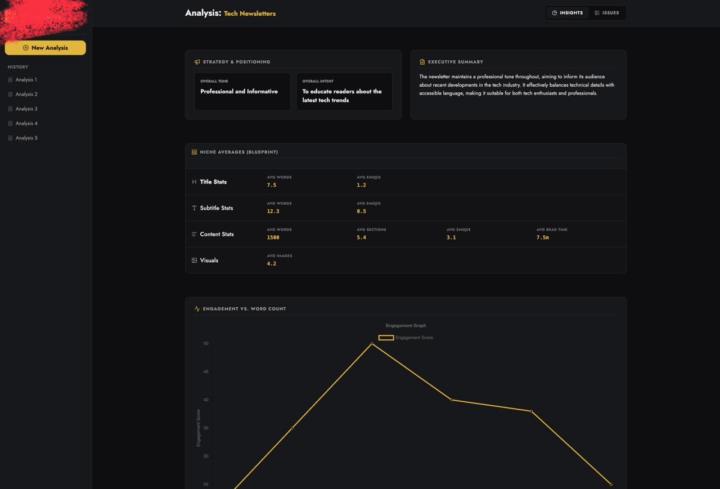
We’re in the final testing phase of our platform (MK1) — it analyzes entire newsletter ecosystems and produces competitor insights automatically.
My CTO has a strong philosophy: “Doesn’t matter how smart your backend is — if the UI doesn’t make people feel like they’re using something powerful, they won’t.” And honestly… he’s right. So before we push this out publicly, I wanted to get some honest feedback on the UI from founders, designers, newsletter operators, and copywriters who care about clean product experiences. Here are a few screens from the current build: (You can find 3 screenshots attached) 🔍 Quick context (non-technical explanation): MK1 basically takes multiple newsletter issues → breaks them down into structured insights → and shows patterns across the entire niche. The UI’s job is to make all of that complexity feel simple. Some things the UI needs to communicate clearly: - Tone + intent of each issue - Niche-wide benchmarks - Issue-level metrics - Structure breakdowns (titles, sections, visuals, CTAs, etc.) - Engagement patterns (vs word count, vs structure) - Individual issue summaries - Consistency markers across creators The backend is… not small.It’s a full distributed pipeline (scraping → TOON compression → issue-level LLM runs → aggregation), but none of that matters if the UI doesn’t let people understand the story instantly. 🧠 What I’m specifically looking for feedback on: 1. Does it feel intuitive at first glance? 2. Are the insights easy to digest, or does it feel “dashboard complicated”? 3. Which parts feel unnecessary or too heavy? 4. Do the cards/graphs help or distract? 5. Does this UI make you want to explore deeper? 6. If you ran a newsletter or content team, would this type of layout actually help you? We’re still tweaking visual hierarchy, spacing, and how much data to surface at once — so I’m open to brutal honesty. 💬 The bigger question (UI philosophy): Do you think products like this succeed because of UI,or despite it? Some founders believe “if the model is good, UI is secondary.”My CTO believes the UI is the major part of a product, and everything else is invisible unless the UI communicates it well.
2 likes • Dec '25
@Watibå Danïsh 💯
1 like • Dec '25
@Abdul akeem Olalekan will keep posted ;)
Dec '25 •
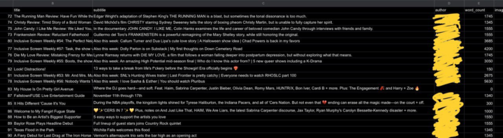
We analyzed a huge dataset of newsletters recently (100+ issues across different niches)… and a lot of people asked if we could share what those “patterns” actually look like. So here’s a small behind-the-scenes peek.
One thing we noticed pretty fast: the data is never as clean as you think. Different newsletters structure things in wildly different ways… sometimes even the same creator changes formatting issue to issue. Here’s a tiny snippet from one of our comparisons (blurred names for privacy): (check the screenshots) This is the kind of stuff we’re tracking per issue: - Word count - Image count - Section count (Issues with ~5 sections performed better on average than issues with 9–10, regardless of how long they were) - CTA count - Ad frequency - Tone - Intent - Emoji usage (One issue we saw literally had 36 emojis 😭) - Reading time - Summary - Structural patterns - What the issue is trying to do (inform, entertain, persuade, etc.) - Recurring creative formats - How consistent a creator actually is from week to week If you run a newsletter, I’m curious: Which patterns do YOU notice in your niche that other people might miss? Always love hearing how different creators think about structure and storytelling.
0 likes • Dec '25
@Shaurya Srivastava not sure what you're talking about
Dec '25 •
We analyzed 100+ newsletters across niches & Here are the 7 patterns that kept repeating.
I’ve spent the last few weeks analyzing over 100 newsletters from different niches — tech, AI, business, finance, parenting, marketing, creator economy, you name it. And honestly… I did NOT expect newsletters to be this predictable. Different voices, different niches — but the underlying patterns were shockingly similar. Here are the 7 patterns that showed up again and again: 1. Subject lines follow the same 4 formulas Almost every high-performing issue fell into one of these buckets: - The “Curiosity Gap” subject line - The “Unexpected Number” hook - The “Hot Take / Contrarian” opener - The “Outcome Tease” (promising a result) It’s wild how repetitive this is — but it works. 2. Top newsletters use fewer sections than you’d think Most creators assume more structure = better content. But the best-performing newsletters? They averaged only 3–4 sections per issue. (Anything beyond that dropped engagement.) This aligns perfectly with the idea that readers want brevity with clarity, not complexity. 3. The CTA patterns are almost identical Even across niches, the placement was the same: - CTA early → light teaser - CTA middle → contextual insertion - CTA end → the main ask And the most surprising part? The end-of-issue CTA still wins by a massive margin. People finish reading → then decide. 4. Tone is weirdly consistent Across categories, the tone that wins is: Clear > Clever. Conversational > Corporate. Personality > Perfection. Even business newsletters are shifting toward “smart casual” instead of “MBA textbook.” 5. Visual + link usage is either low or VERY intentional There’s almost no middle ground. The top newsletters either: - Keep visuals minimal and frictionlessOR - Use images/videos only as anchors to highlight core ideas. Same with links — too many links kills focus; too few kills depth. Top performers found a balance. 6. Ads follow the same structure across niches Even newsletters with entirely different audiences used similar ad placements:
0
0
1-10 of 14

@kshoneesh-chaudhary-2571
Building custom AI systems for businesses
Active 13h ago
Joined Nov 26, 2025
Powered by