
Write something

10d •
What's your swatch situation? (no..not the watch brand)
I hope everyone in the Midwest or Eastern seaboard in the US is staying cool. My son is at overnight camp this week with no AC, which means I've had unusual stretches of uninterrupted thinking time. One thing I've been turning over: how much people actually rely on physical swatch tools as part of color implementation, and whether that changes over time. Did you use a swatch book or fan heavily after your analysis in check for harmony or attribute matching? A few hypotheses I'm sitting with: -S types may hold onto physical references longer because a concrete comparison point is more reliable than an abstract rule. N types often internalize the framework earlier and drop the swatch sooner, which isn't always a sign of mastery. Sometimes it's just pattern-matching confidence running ahead of actual accuracy. -Si-dominant and Si-auxiliary types (ISxJ and ESxJ) may be the most likely to actually collect multiple swatches and fans, not just use them occasionally. Si builds detailed internal sensory libraries, and a physical reference collection is a very natural extension of that. -And then there's a completely different behavior I'm curious about: the person who decided the existing fans weren't quite right and built their own out of paint swatches. (You know who you are.) My guess is that's lprobably more of an NT one: the system has gaps, the available tools don't fully solve the problem, so obviously the answer is to make a better one from scratch. What's your type, and what's your swatch situation?

10d •
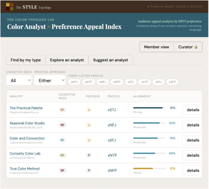
New Tool Under Construction: Color Analyst × Preference Appeal Index
Color analyst marketing copy is not neutral. It signals who the analyst is writing for, whether that's intentional on their part or not. An analyst writing about structured four-step processes and documented deliverables is speaking to a completely different personality preference audience than one writing about trusting your instincts and a journey of self-discovery. The service might be identical. The messaging is not. I've been building a tool that makes that pattern readable, and it's close enough to share before the full build. I want your input first. The tool is called the Color Analyst × Preference Appeal Index. The concept: it analyzes a color analyst's website marketing language and scores it against the eight three-letter preference profiles. The I versus E preference would be more difficult to assess from marketing copy so I have left that out. The output is an alignment percentage for each three-letter profile, showing whose communication style the analyst is actually reaching based on language signals, not what the analyst intends to communicate. file:///Users/virginiaschobel/Downloads/color_analyst_preference_appeal_index_final.html Three views in the tool: -Find by my type. You filter by cognitive need (NT, NF, ST, or SF), process approach (J or P), or your full three-letter profile. The result is a ranked list of analysts whose marketing language aligns with your preference pattern. Each entry includes specific language pulled from their site, tagged by signal type, source location (homepage hero vs. service description vs. FAQ), and whether it's analyst-authored copy or client testimonial language the analyst has chosen to feature. (Those two categories are tracked separately. What a client reflects back and what an analyst deliberately positioned are not the same thing.) -Explore an analyst. When you select or search for a specific analyst in the index, you get a ranked bar chart of all eight preference profiles from highest alignment to lowest. Each bar is an absolute percentage, so 82% fills 82% of the bar regardless of how any other analyst scores. It shows at a glance who a given analyst's marketing is most likely reaching, and equally, who it probably isn't. An analyst scoring 91% for xSTJ and 11% for xNFP is telling you something concrete about how their copy reads across different preference audiences.
26d •
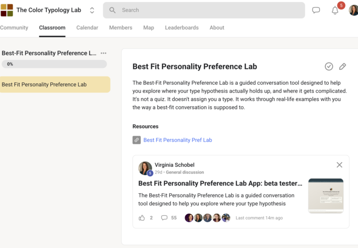
Best-Fit Personality Preference Lab: a month of beta fixes
A month into beta testing the Best-Fit Personality Preference Lab, the feedback coming back wasn't really about polish. It was about what the tool needed to do that it wasn't doing yet, and that turned out to be more useful than I expected going in. Here's what changed because of it: - Hosting outage. The tool went down within hours of the original post. That one was Netlify, not the tool itself, and it got fixed the same day. - Personality and color intersection. This section was thin at first (@Amanda Owens conversation nailed her type clearly but left the color side underbuilt). It has more depth in it now. - Saving sessions. The save function wasn't obvious. Saving as a .txt file lets you pick up a session exactly where you left off. Downloading as a PDF gives you a copy to keep. - Typing vs. speaking. If typing out long answers isn't your thing, there's a microphone option. Several of you found speaking the answers more natural than typing them. - Enter vs. Shift+Enter. Enter sends your message immediately. Shift+Enter gets you a new line instead. This one cost a couple of you complete data on a multi-part question, so it's worth knowing before you go back in. None of this was about making the tool prettier. It was about closing the gap between "this technically works" and "this is actually usable," which is the same gap I care about on the color side. The whole point of building it this way was avoiding the "flourishy nothingburger" problem (thank you @Kiersten Emmi for that very apt description) most AI chat tools have (technically responsive, not actually useful), and that only happens by building around what real use revealed, not what looked finished in testing. If you haven't tried it: bestfitlab.netlify.app. If you have and hit something worth telling me about, working or not, drop it below or DM me.
26d •
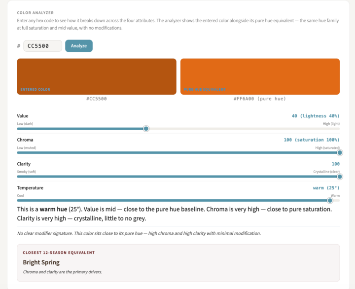
Color Attribute Explorer: what changed since launch
The launch landed about where I'd hoped: useful enough to be worth people's time, with plenty of room left to keep building. @Kiersten Emmi put it well when she called the vocabulary section a goldmine and admitted she'd never heard of "toasted" as a color modifier before trying this. That's basically the whole reason the tool exists: most of the words people in color analysis use constantly (bright, muted, soft, burnished) get handed to you without ever being precisely defined. At the end of the day, that's probably a fair description of why this Skool group exists too. My ESTJ side has never been able to just accept a term at face value. I want to understand and implement the concept, not just have the word. Here's what changed in the few weeks since this landed in the Classroom: - Temperature slider. Nudge any selected hue warmer or cooler within its own hue family. A warm blue pulls toward violet, a cool blue pulls toward teal, same hue family, different temperature. - Hex code input. @Mary Molle asked directly for this: "I wish I could enter a hex code in the tool." Now you can, instead of being limited to the pure hues in the original picker. - Color analyzer. Enter any hex code, a garment color, a paint swatch, whatever you're trying to place, and get a breakdown of value, chroma, clarity, and temperature, plus a tentative season estimate. One caveat: this reads a garment color, it doesn't diagnose you. A few things are still in motion based on what's already come up in the comments, worth naming now so you can weigh in before any of it is locked in: - A glossary mapping the typical attribute ranges for each of the 16 subseasons is coming, so you can see roughly where a subseason tends to fall on value, chroma, clarity, and temperature instead of just seeing a name attached to it. - The vocabulary reference page is getting a few more entries, starting with luminescence. If there's a term you've run into that doesn't have a clean definition yet, this is the place to flag it. - The pure hue reference still shifts when you move the temperature slider. That's a bug, not a feature, and it's on the list to fix.
May 16 •
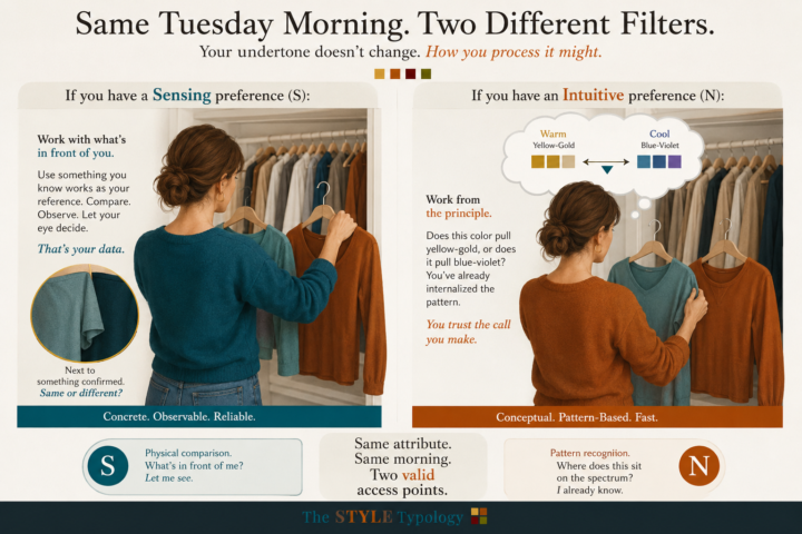
How you check for undertone on a random Tuesday — S vs. N
You know your undertone. Cool, or warm, or somewhere in between. The question is what you actually do with that on an ordinary morning when you're standing in front of your closet holding two tops that both seem fine. The answer depends less on the colors than on how you process information. And S vs. N is one of the clearest differences I've seen. If you have a Sensing preference (S): You work with what's in front of you. Abstract principles don't stick as reliably as concrete reference points, so the most useful undertone check is a physical one. You probably already have at least one piece in your wardrobe that you know works. Use it. Hold the new item next to something confirmed, and let your eye tell you whether it reads the same or pulls differently. You're not analyzing the theory. You're observing a direct comparison. That's your data. If you have an Intuitive preference (N): You're more likely to work from the principle. Once you understand that your undertone describes where your coloring sits on the warm-cool spectrum, you can apply that framework to evaluate a new color before you even hold it up. The question you're asking is: does this color pull yellow-gold, or does it pull blue-violet? You'll often make that call quickly and trust it, because you're pattern-matching against a concept you've already internalized. Same attribute. Same Tuesday morning. Two completely different access points — and both of them valid. Which one sounds more like how you actually navigate a color decision? Or do you find yourself switching depending on the day?
1-7 of 7
powered by
skool.com/the-color-typology-lab-7535
Exploring personality type and the implementation of personal color analysis results. MBTI, Enneagram, OCEAN, and color frameworks.
Suggested communities
Powered by