
2d •
Assignment #16: The Psychology of Red & Blue (Until August 2nd)
Hey everyone, A quick apology for the delay. I am still working on some exciting upgrades for our academy alongside a few major client projects. This assignment is starting a bit later, but it will run until the very end of July. From August onwards, we will shift to a clean, full one-month rhythm. This time, we work with Color Psychology. (For deep guidance, look at the complete color guide in our resource library here). Welcome to Assignment #16 THE TASK: Create or select an intentional image (or a mini-series) where the color Red, the color Blue, or the direct interaction of both dictates the entire emotional narrative. Crucial Note: Use Black, White, and Grey as neutrals to anchor your composition. Do not just shift your white balance to force a color onto the frame. We want real, intentional color choices. SOME IDEAS: - The Monochromatic Dominance: Flood the entire frame with just one single color. (Example: A deep blue sky with a small white plane). - The Chromatic Friction: Place a striking red element directly against a deeply blue environment. Use the psychological contrast to create instant separation between subject and background. - The Ambient Mood: Focus on lighting rather than objects. Use the natural blue hour of twilight, or the artificial red reflection of neon lights. - The Neutral Contrast: Use whites, blacks, and greys as a canvas to shape your color subject. Like a single red graffiti on a massive white wall, or a lonely cloud in a deep blue sky. THE GOAL: To train your selective perception. We want to see you move past just "capturing colored objects." The color itself should be the main character of the image. THE RULES: - Title Format: Please use "Assignment #16: [Your Title]" - Number of pictures: You can submit up to 3 images this time (either separately or as a coherent mini-series in one single post). Quality over quantity is paramount—curate only your absolute strongest frames. - Details: Add 2–3 brief sentences explaining the emotional intent behind your choice. What specific emotion do you associate with your image? - The Mission: Go out and shoot a new frame (highly preferred) or select an intentional, unreleased piece from your archives. - Where to post: Create a New Post inside the "Assignments" category.

20d •
Assignment #15: Golden hour
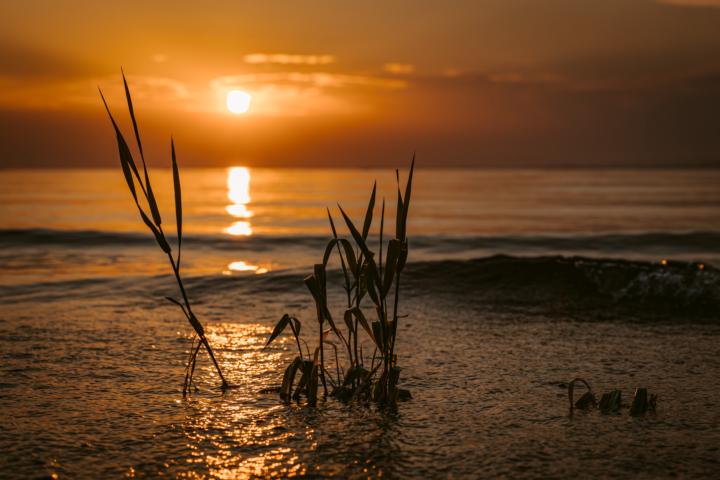
My preferred lens is the Canon RF 70-200mm, 2.8. Also this time I thought, this would give me a little bit of flexibility as I was shooting at the Lake of Constance. Enough to capture the wideness of the lake or perhaps to capture an object/animal in the distance as my sister gave me the order to shoot a nice picture for her house to hang on the wall (not a gallery ;-) ) So I took many photos of the sunset - even with boats, SUP, ducks, etc. But I chose this picture because it conveys calm, solitude and quiet reflection to me. The end of a day in comforting way. I would definitely present it on a glossy material - I think even acrylic glass seems suitable. 97 x 68 cm is preferred by my sister. But I would also present it like that in a gallery. f8, 1/250, ISO 100, 70mm, Canon R6 Mark II
17d •
Assignment #15: The Delightful Moment
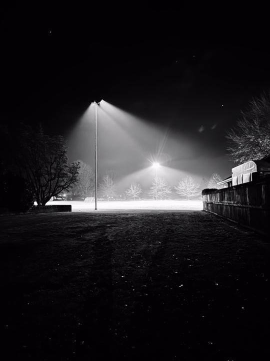
Playing football in a foggy winter night is heavenly. It was a surreal moment when the lights turned on, illuminating the silky-smooth texture of the heavy fog. It was a moment where it felt like time stood still. I think this delightful feeling could be preserved by printing this photo frameless on matte black paper to simulate the white glow against the deep, dark sky. The fine texture of the matte black paper would also prevent glare from unintended light sources. (Photo 2 depicts the placement on a wall) This photo is best displayed on a dark wall that is still slightly lighter than the darkest part of the image, keeping the piece distinct from its background. A single spotlight from above will help accentuate the glow even further. I would use a temperature-controlled light and program it to match the ambient room temperature.
17d •
REPLAY: Assignment Call #15
Here is the Replay of this week's Assignment! 📸 This week was a bit difficult, so I will try to keep it a little simpler next time. If you want me to send you the mockups I have created for you, just let me know! :) 💎 Premium Members: Keep Posting to Win! To all our Premium Tier members: Remember that the next 1-on-1 coaching call will be drawn from those who actively participate. Post your images in the Feedback tab, show your progress, and let's keep pushing the boundaries together. (I already had a great portfolio review call with @Endri Dano last week!) 🤫 Working on something big... I’ve been spending a lot of time in the background working on some massive upgrades, high-level content, and new structures for the community. I’m cooking up something really special to help you guys fast-track your visual identity. Stay tuned—more details are coming very soon! Let's keep lifting each other up. See you in the next call! :)

19d •
Assignment #15: Across Pont des Arts
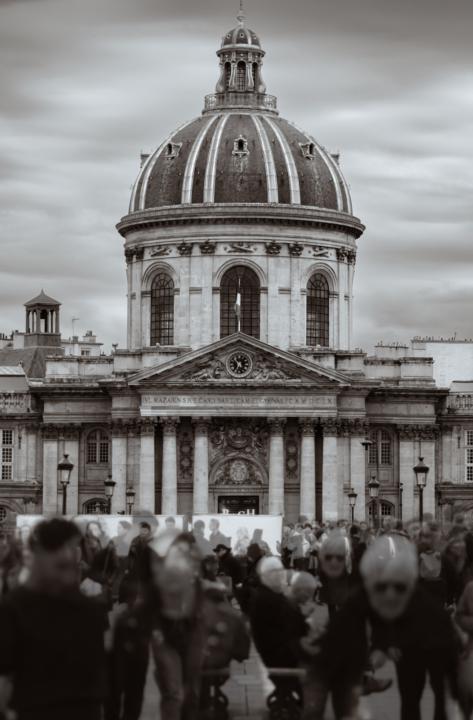
First time posting an assignment, will be glad to receive everybody's comments and suggestions. Pont des Arts is the famous pedestrian bridge over the Seine in Paris. At the left bank, the bridge ends perfectly aligned with the beautiful Institute de France Palace and its dome. The subject is the Institute and the goal was to blur out-of-focus the multitude of people crossing the bridge all day long (it was a saturday in may, with lots of tourists) For that, I used a medium telephoto lens Samyang 75mm f/1.8 with my regular camera Fujifilm X-T50. As it is an APS-C camera, the full frame equivalent focal length is 112mm. Settings were ISO 125, ss. 1/1500, f/1.8 The intention was to fill the frame as much as possible with the Institute, with the people also helping framing the Palace. Focus was placed on the Institute and the long focal length together with the widest aperture purposedly blurred the people crossing the bridge. in addition, 3 sequential images were shot, handheld, a few seconds between each shot, with the same settings and composition. The individual images were edited in Lightroom, converted to B&W and then auto-aligned and blended using Affinity Canva, the goal here being to emphasize the number of people coming and going through the bridge and to provide a sense of loss of individuality, mixing the different faces altogether.
1-30 of 98
powered by
skool.com/photography-by-emanuel-schi-7529
Helping photographers develop their style, master photography & create more emotional images 📸 Weekly feedback + live edits. Free to join
Suggested communities
Powered by