Activity
Mon
Wed
Fri
Sun
May
Jun
Jul
Aug
Sep
Oct
Nov
Dec
Jan
Feb
Mar
What is this?
Less
More
Memberships
Copywriting Launchpad
4.9k members • Free
Online Business Friends
89.6k members • Free
27 contributions to Copywriting Launchpad
The BEST Font To Use On ANY funnel
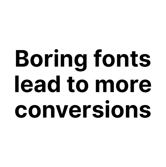
There's no way something as small as a FONT can make such a difference to a funnel. I used to think this before, until I realised it does make a difference? Because after building countless funnels, landing pages, and sales pages for clients & my own, I've learnt that the font surprisingly does make an impact The most successful funnels I've built are what most would consider, ''boring'' What you don't want is a font that is not readable, so hard to read that you need to squint your eyes, or font's that are just too over the top like cursive) where you can barely make out what it says. Instead what you want is a font that everyone can read easily. The font I mainly love to use on EVERY funnel is ''Inter'' (the font in the images below) I always end up changing and KEEPING the font to INTER because it's just easy to read. Yes, It's boring, but it's readable & understandable. But what about if you want to be a bit fancy but not too much? Here's some more: - Poppins - Monserrat - DEPENDS...Oswald & Anton I always end up changing these fonts to inter though haha This also makes a huge difference on the above the fold content. Like the headline, subheadline, button. That WHOLE section needs to be clear. You can have the best headline ever, but if nobody can read it well game over. It's the first thing people are reading. It needs to be easy, readable, and understandable that you won't even need to really read to understand it. Anyways, I thought that would be useful to anyone making funnels, landing pages, & sales pages! Catch you guys later :)

1 like • Mar '25
there are actual studies about that! Interesting fact is that newspapers are better readable with serif fonts while digital texts rather stay with the reader with serifless fonts. There is a reason why Word used to have Times New Roman as their standard font and with the digitalisation it changed to Arial and Calibri. Arial was preferred over Calibri in the test runs, but maybe people are just used to see Arial. Be careful: Just because you find something easy to read it doesn’t mean the broad public does. You can just be too used to it personally!
2 AD COPY
https://docs.google.com/document/d/17UcjCYOuh3zxTr2mCBLEBWM5Ypu47fJubuICB9C5BGQ/edit?usp=drivesdk
What’s the single biggest mistake beginners make in copywriting ??
I’m a beginner in copywriting and that’s why I’m asking. What’s the one mistake you see most often, and how can I avoid it ??
JUST A QUESTION 🙏
Hello! I am a beginner who watched Alicia's video 👉 “How To Learn Copywriting Without Courses / Programs! (NO BS)” (that alone actually made me join this community). She tells us to gather at least 3 SUCCESSFUL ENTREPRENEURS to subscribe to and read their emails to learn. But I’m still stuck on my niche, is it essential to pick your niche first? Or do later? P.S. Also, who did you follow that actually helped you? Thank you so so much! 🙆
Plz Give me Courage.
After completing shooting of my first YT video I am still stuck in editing. And the thing which is disturbing me is that basically English is not my first language it's my 3rd language. And my accent is not much good that's why after watching myself in the video, I just......
1-10 of 27
@ray-socher-6837
What you say matters.
How you say it changes everything.
Active 215d ago
Joined Feb 4, 2025
INFJ
UK
Powered by


