Activity
Mon
Wed
Fri
Sun
Aug
Sep
Oct
Nov
Dec
Jan
Feb
Mar
Apr
May
Jun
What is this?
Less
More
Memberships
Ecom CRO Mastery
14 members • Free
The Vault by Growthub
4.2k members • Free
Conversion Experts (CRO)
727 members • Free
2 contributions to Ecom CRO Mastery

Jul '25 •
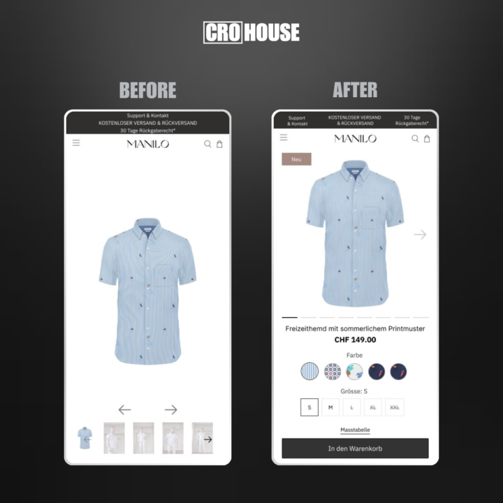
How to increase conversions by +10%, +20%, even +30%
I just took a deep dive into a successful ecom brand named MANILO, and I will show you how I would optimize their store for MAXIMUM sales. This isn’t theory – these are battle-tested strategies and experience running 300+ A/B tests in the past year alone. PRODUCT PAGE - Move up main image to make space for other crucial elements - Add arrow in the image indicating you can swipe to see more images - Bring 'Color' and 'Size' variants closer together to avoid scrolling back and forth to see all details - Add size guide above the Add To Cart button to make choosing a size easier CART - Remove menu header to avoid disctraction from purchasing - Make product details compact to allow for other important elements - Include upsell element to increase AOV - Include USPs increasing confidence and motivation to continue the purchase - Sticky 'Checkout' button at the bottm of the page makes it easy to purchase at any moment within the cart These are just some first UX changes I would implement, but CRO goes much deeper into analysis and research to find what's most impactful for YOUR brand, then A/B testing and implementing the winners.

1 like • Jul '25
Daaaamn pure value, loving these direct before and afters idk how the brand can let his product page be so tall above fold
Jul '24 •
Welcome! -> Start here
This group is for ecommerce store owners who want to skyrocket conversions and average order value without additional ad spend. 🏅Learn top CRO strategies to EXPLODE your sales 📈See my live AB tests & strategies from 10+ ecom shops 🚀Every week I redesign & optimize a group member’s landing page Introduce yourself by adding a comment BELOW: - What do you do? - Where are you from? - What are you looking to gain from this group?
1 like • Jul '24
My name is Josef..I am in Marketing. I am from Switzerland. I want to learn strategies to grow my online shop.
1-2 of 2

Active 320d ago
Joined Jul 21, 2024