

🔥
7d •
Product Photography Lighting and Set Up
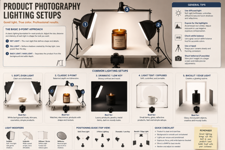
It’s Less About Your Camera, More About Your Light. A common misconception I see is people think is that they need an expensive camera to take good product photos. Its 2026 and most of our cameras can do more now than our older cameras (not everything~! But for product photos, it is enough.). You really don’t~ A phone with good lighting will almost always beat an expensive camera with bad lighting. You are not just trying to make your product brighter~ think about how to show its shape, texture, color, and craftsmanship. Here are a few basics to get you started: 💡 Key Light This is your main light. It creates the overall look of your product and defines its form. I usually place it at about a 45° angle and slightly above the product. 💡 Fill Light This softens harsh shadows created by your key light. It doesn’t have to be another light~ you can often use a white foam board or reflector to bounce light back onto your product. 💡 Back (or Rim) Light This helps separate your product from the background and gives it a little extra depth. It’s especially helpful for darker products. 📦 Use Diffused Light Harsh, direct light creates hard shadows and blown-out highlights. A softbox, light tent, diffuser, or even a sheer white curtain over a window can create much softer, more flattering light. 🎨 Keep Your Background Simple Your product should be the star. A clean white, black, gray, or neutral background works for most products without competing for attention. 📸 Use a Tripod Keeping your camera steady lets you use lower ISO settings for cleaner images and makes it easier to keep every photo consistent. ✨ Take More Than One Photo Try moving your lights a few inches. Raise them. Lower them. Rotate your product. Tiny adjustments can completely change the mood of a photograph. Whether you’re selling paintings, ceramics, candles, jewelry, woodworking, stickers, or handmade goods, good lighting helps people appreciate the work you’ve already put into creating it. You don’t need a professional studio to get started.
🔥
7d •
Photographing Your Artwork: Make It Look Like the Original
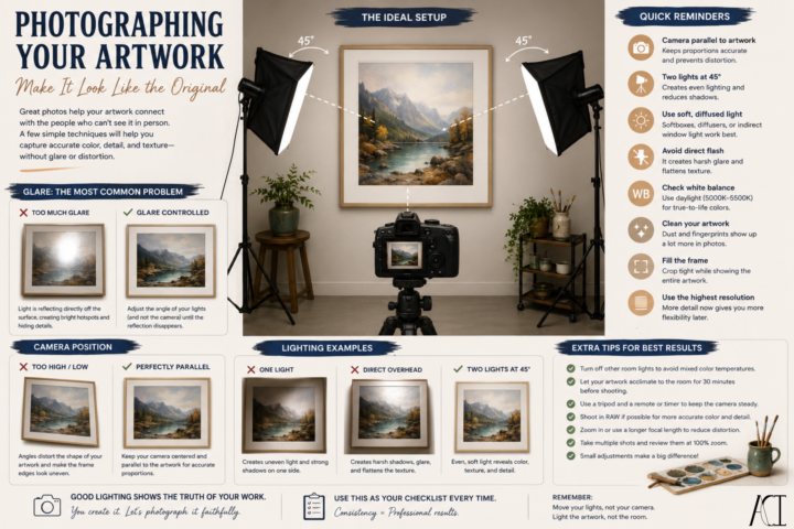
Have you ever finished a painting, taken a photo, and immediately thought… “Why doesn’t it look like my artwork?” You’re not alone. Most of the time, it isn’t your camera~ it’s the lighting. Here are a few things that make a huge difference: 🎨 Use Even Lighting Place two lights at roughly 45° angles to your artwork, one on each side. This creates even illumination across the surface and helps minimize harsh shadows. ☀️ Natural Light Works Too A bright, overcast day or indirect window light can produce beautiful, even lighting. Just avoid direct sunlight, which creates hot spots and washes out colors. 📸 Keep Your Camera Parallel If your camera is tilted, your artwork will look distorted. Keep your camera centered and as parallel to the artwork as possible. 📐 Fill the Frame Crop tightly while still showing the entire piece. The artwork should be the focus—not the wall around it. ✨ Watch for Glare Gloss varnishes, metallic paints, resin, and glass all love to reflect light. If you notice glare, don’t move the camera first. Move your lights. Even shifting a light a few inches can dramatically reduce reflections. 🎨 Check Your Colors Our eyes naturally compensate for different lighting conditions. Cameras don’t. Use consistent daylight-balanced lighting and check your white balance so your colors stay true to the original. 🧹 Clean Before You Shoot Dust, fingerprints, and stray fibers are much easier to spot in a photograph than they are in person. A quick wipe-down can save you editing time later. Try photographing the same artwork with just one change at a time~ move a light, adjust the camera height, or change the angle slightly. You’ll be surprised how much a small adjustment can improve the final image.
🔥
8d •
📸 Product Photography 101: Helping Your Work Sell Before Someone Holds It
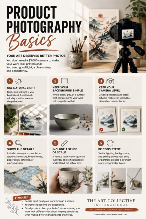
One of the biggest mistakes I see artists make isn’t their artwork. It’s their photos~! Whether you’re applying to an art festival, listing work online, submitting to a gallery, or posting on social media, your photos are often the first impression someone gets of your work. Good product photography isn’t about making your art look better. It’s about making it look accurate~ Here’s where I’d start: ☀️ 1. Prioritize your lighting. Lighting is everything~!!! Natural, indirect daylight is still one of the best options available. A north-facing window or a bright room out of direct sunlight produces soft, even lighting that shows color accurately. Avoid: • Direct midday sunlight • Mixed lighting (window light + warm indoor bulbs) • Flash whenever possible The more consistent your lighting is, the more consistent your portfolio becomes. 💡 2. A light box is one of the best investments you can make~ If you regularly photograph jewelry, ceramics, glass, miniatures, stationery, candles, or other smaller products, a foldable LED light box can dramatically improve your photos. A good light box gives you: • Even lighting • Fewer harsh shadows • Cleaner backgrounds • More accurate colors • Repeatable results every single time They’re relatively inexpensive now, fold flat for storage, and can save hours of editing later. Or you can make one~! For larger artwork, you can recreate the same idea using foam boards, reflectors, or diffused studio lights. 🎨 3. Keep the background supporting the work~ not competing with it. Your background shouldn’t be the most interesting thing in the photo. Simple white, gray, black, linen, wood, or another neutral surface usually works best. Ask yourself: “Does this background help people see my work?” If not~ then simplify it. 📐 4. Keep your camera level. A crooked horizon. A tilted painting. Distorted perspective. These small things subconsciously make work feel less professional. Use the grid lines on your phone and take an extra few seconds to straighten everything before pressing the shutter.
🔥
15d •
The Art of a Good Logo
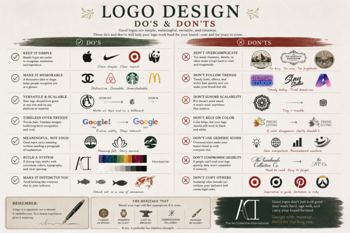
A logo doesn't have to tell your entire story. It isn't your mission statement, your values, or your elevator pitch. A logo is like a signature~ Its job is to identify you clearly, consistently, and confidently. The meaning comes from everything you build around it~ your work, your reputation, your community, and the experiences people have with your brand. That's why some of the most recognizable logos in the world are also some of the simplest. When you're designing a logo, ask yourself: • Can someone recognize it at a glance? • Will it still work at the size of a favicon and on a storefront? • Does it still make sense in black and white? • Is it memorable because of its shape, not just its color? • Will it still feel relevant in ten or twenty years? A great logo doesn't have to be the loudest in the room~ I can be the one that quietly becomes familiar through years of good work. Design with intention~! Build for the long run~!
🔥
14d •
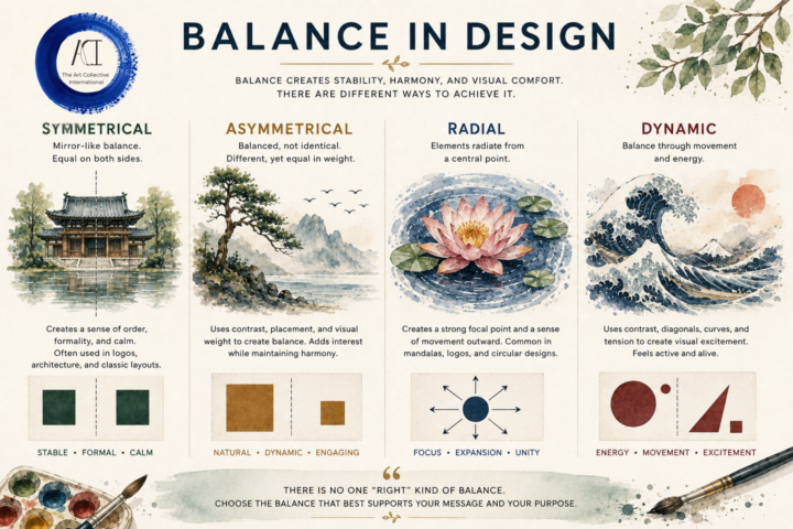
⚖️ Balance in Design
One of the biggest misconceptions about balance is that it means everything has to be perfectly symmetrical. It does NOT~! Balance is about visual weight~ how your eye moves through a composition and where it naturally comes to rest. There are many ways to create that feeling: ⚖️ Symmetrical: Calm, stable, and formal. 🌿 Asymmetrical: Different elements that still feel balanced through size, color, placement, or contrast. 🌸 Radial: Everything flows from a central point, drawing the eye inward before leading it back out. 🌊 Dynamic: Movement, diagonals, curves, and tension create energy while still feeling intentional. The best choice depends on what you're trying to communicate. A peaceful landscape may benefit from symmetry. A windswept tree might feel more alive with asymmetry. A mandala naturally lends itself to radial balance. A crashing wave comes alive through dynamic balance. There isn't a "correct" type of balance~ only the one that best supports your subject, your message, and the feeling you want your viewer to experience. You don't need to make everything equal to have great design~! Just make everything feel intentional~
1-30 of 30
powered by
skool.com/theartcollectiveinternational-5768
A welcoming home and hub for artists, creatives, and curious minds to learn, create, share, and grow together.
Suggested communities
Powered by