
Write something

Apr 11 •
🧶 Ever Thought About a Custom Crochet Design? 👀
A while ago, someone messaged me and said: “I don’t know if this is even possible… but could you turn this into a crochet design?” It was something really personal to them — not something you’d ever find in a standard pattern. And honestly? Those are my favourite kinds of projects 💛 We chatted through the idea, what they wanted it to feel like, how it would actually work as a mosaic overlay… Because not everything that looks good as an image works as a crochet design — it has to be translated properly so the stitches make sense 👀 Then came the process: ✏️ Mapping out the design 🧮 Building the chart 🧵 Testing how the stitches sit 🔁 Tweaking (always tweaking 😅) Until it wasn’t just an idea anymore… It was a real, workable pattern they could actually crochet. And that’s the bit I love most —taking something that feels like “just an idea” and turning it into something tangible 🧶 Something you can make, gift, keep… or even pass down. If you’ve ever looked at something and thought: “I wish I could crochet that…” You probably can 👀 I do take on custom design projects — and I’m always happy to chat through ideas (even if you’re not sure yet). Just drop me a message or comment below 👇
0
0
Mar 14 •
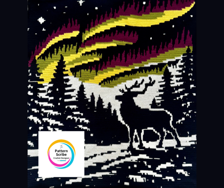
What Makes This Work?
One of the things that separates a good mosaic overlay design from a great one is how the image reads from a distance. Looking at the Moonlit Winter Stag design, I deliberately kept the stag silhouette bold and simplified so it remains clear when worked in stitches. 👀 Your turn: When you look at a mosaic design, what do you think makes the image work well? Is it: • Strong contrast between colours • Clean outlines • Simplicity of shapes • The spacing around the motif • Something else? Designing mosaic patterns is often about what you leave out as much as what you include. I’d love to hear your thoughts — especially if you've ever had a chart that looked great on screen but didn't translate well in crochet. Angela The Pattern Scribe
Feb 25 •
Roll Call 👇
Are you here to: A) See new Crochet patterns B) Learn to design your own mosaic overlay patterns C) Both I’m planning upcoming content based on what you want most.
Feb 13 •
Quick thought…
Something I’ve noticed over the years… Mosaic overlay only feels complicated when it’s approached row by row. When you begin to see it as a series of structural blocks, repeating logic rather than isolated stitches, everything shifts. Charts stop feeling abstract. Diagonals stop feeling advanced. Colour changes stop feeling unpredictable. Design isn’t about memorising symbols. It’s about recognising structure. Have you ever had a moment where mosaic overlay suddenly “clicked” differently for you?
Feb 11 •
Which Would You Choose?
Same design. Two completely different moods. A = Dramatic contrast of colour B = Soft & subtle Which would you crochet? And why?
1-5 of 5
powered by
skool.com/the-pattern-scribe-8072
A hub for crocheters who want clarity, control and deeper learning in mosaic overlay crochet design.
Suggested communities
Powered by