
Mar 14 • 🎨 Design & Progress
What Makes This Work?
One of the things that separates a good mosaic overlay design from a great one is how the image reads from a distance.
Looking at the Moonlit Winter Stag design, I deliberately kept the stag silhouette bold and simplified so it remains clear when worked in stitches.
👀 Your turn:
When you look at a mosaic design, what do you think makes the image work well?
Is it:
• Strong contrast between colours
• Clean outlines
• Simplicity of shapes
• The spacing around the motif
• Something else?
Designing mosaic patterns is often about what you leave out as much as what you include.
I’d love to hear your thoughts — especially if you've ever had a chart that looked great on screen but didn't translate well in crochet.
Angela
The Pattern Scribe
2
6 comments
What Makes This Work?
powered by
skool.com/the-pattern-scribe-8072
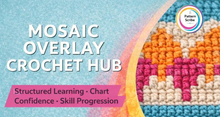
A hub for crocheters who want clarity, control and deeper learning in mosaic overlay crochet design.
Suggested communities
Powered by