
Write something

23d •
Favorite Color to Wear?
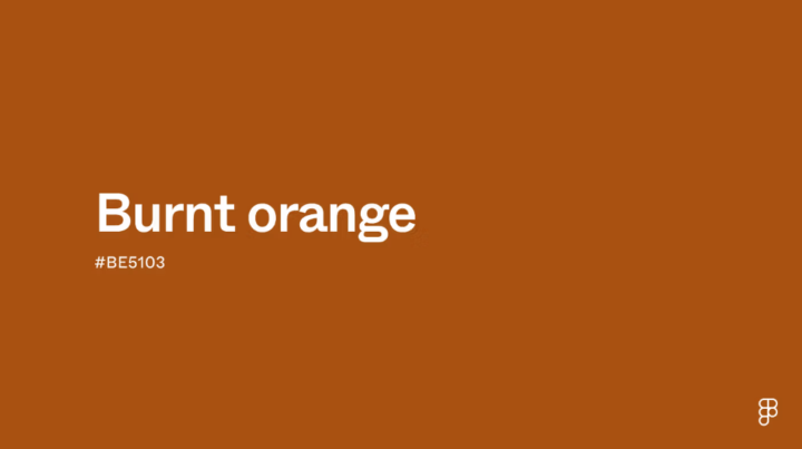
Hi all! Slowing down today and, for those that know their best color attributes, thought it would be fun to share out favorite color to wear. Share your season or tonal combination and a swatch of your favorite color. I will go first. As a Dark Autumn who can borrow from Deep Winter, my favorite color to wear is a burnt orange. And yes, this is a proof point towards the idea you often subconsciously already know your "season." Burnt orange is a deep, warm shade that combines the vibrancy of orange with a subtle infusion of brown, giving it a rich, earthy quality. It's positioned in the red-orange side of the color wheel, exuding a sense of energy and enthusiasm while maintaining a cozy and inviting feel. https://www.figma.com/colors/burnt-orange/
7d •
One of the Most Interesting Ways I've Seen Color Taught (The Colour Room)
One of the things I've really enjoyed about spending time in different color communities is seeing the completely different ways people teach the same concepts. Lately I've been exploring The Colour Room, created by Tracy Holmes, and I thought some of you might enjoy it too. What I find particularly interesting is her approach to teaching color itself. Rather than starting with seasonal systems or "what colors should I wear," she builds your ability to see color through observation and hands-on practice. One of her core tools is a monthly Color Tracker that has you working with color gradients and relationships. It sounds simple, but it's a surprisingly effective way to train your eye. I've especially enjoyed how it builds an intuitive understanding of how hue, value, and chroma interact. Watching pure colors evolve through carefully constructed gradients makes abstract color theory feel much more tangible. It's a very different perspective from the work we're doing here in Color Typology Lab, which is why I enjoy it. I think the more ways we have to understand color, the stronger our overall foundation becomes. If you're someone who enjoys digging into the mechanics of color and building your visual vocabulary, I think it's worth checking out. https://www.skool.com/the-colour-room/about?ref=e59d1900d8994c8ba25a1b44e0ff1fa9 Have any of you found other color educators whose teaching style has really expanded how you see color? I'm always interested in learning from people who approach the subject differently.
May 24 •
Introducing the Color Attribute Explorer
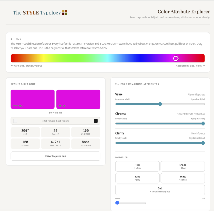
A new tool just landed in the Classroom! The Color Attribute Explorer lets you select any pure hue and adjust value, chroma, and clarity independently. See exactly what each attribute does in isolation rather than just reading about it. It also includes five modifiers: tint, shade, tone, toast, and dull. When you apply any of them, ghost indicators appear on the sliders showing which attributes are shifting and why. There is an explanation panel for each one that gets into the actual mechanism (including why tinting and shading are not simply opposites, and why toasting a cool hue also dulls it). At the bottom of the tool there is a full color vocabulary reference. Every term you have probably encountered in color analysis (bright, muted, soft, burnished, jewel-toned, earthy) is translated into its precise attribute definition. The Soft vs Muted entry is worth reading on its own. Find it in the Classroom under Color Attribute Explorer. Go play with it! This is a first version and I would love your feedback. What would make it more useful to you? What's missing, what's confusing, what do you want to be able to do that you can't do yet? Drop it in the comments.
May 8 •
Draping my first two-system case study
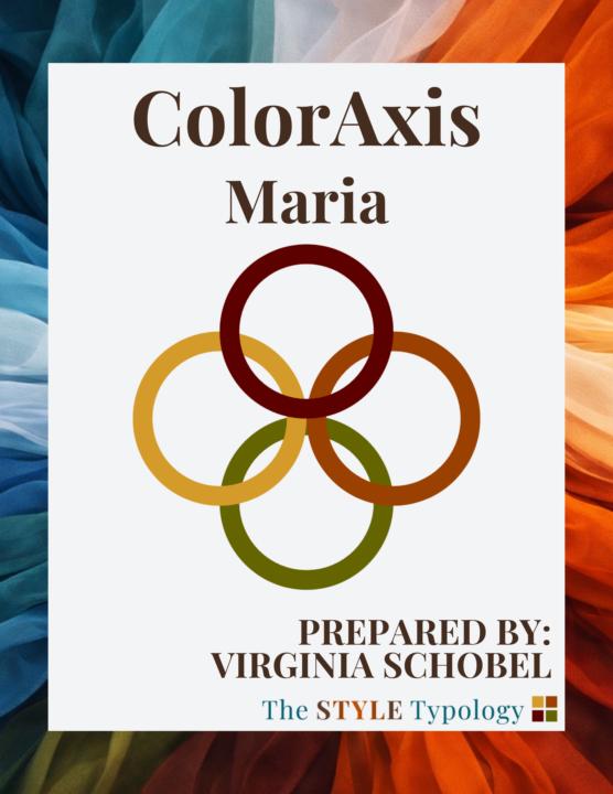
I draped my friend Maria today. She's also my first MBTI certification volunteer, which means she's going through both systems with me — color first, personality assessment next week. She's foundational to what I'm building here, and the fact that she said yes to that means a lot. My friend Emily is next. Two of my closest friends, both willing to let me run them through a process I'm still actively developing. I don't take that lightly. Her color attributes came back cool, deep, and moderately high clear. You should see her glow in those deep and rich jewel tones! Next week we find out what her personality preference is. From that, I will structure her ColorAxis report in a way that honors the way she likes to receive and implement information. The real test is whether delivering her result in a way that's built for her — not just accurate, but structured for how she actually thinks — makes it land faster, feel more supported, and stick in real life. That's the question I'm chasing. I'll share what I find.
May 9 •
The Five Dimensions of Personal Color Analysis — free resource in the Classroom
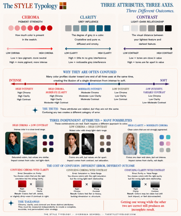
This community is built around one idea: a color determination is only as good as how it's structured for the way you think. Most color analysis stops at the label. This space explores what that label is actually made of — and why understanding the underlying attributes is what makes a result usable long-term. Start here: Get the free guide — The Five Dimensions of Personal Color Analysis — covering hue, value, chroma, clarity, and contrast as independent, measurable attributes. 👉 The guide is available in the Classroom tab. Where are you in your color journey? If you've had an analysis done, which part of the process felt clear and which part didn't stick?
1-5 of 5
powered by
skool.com/the-color-typology-lab-7535
Exploring personality type and the implementation of personal color analysis results. MBTI, Enneagram, OCEAN, and color frameworks.
Suggested communities
Powered by