
2d • 🤖 AI Related
✨ My Favorite NotebookLM Visual AI Sidekicks
One of my favorite things about NotebookLM is that it does not just help you understand your research → it can help you see it.
Inside NotebookLM, you can turn your source material into visual assets like:
🧠 Mind maps to see how your ideas connect
🎤 Slides to quickly shape your research into a presentation
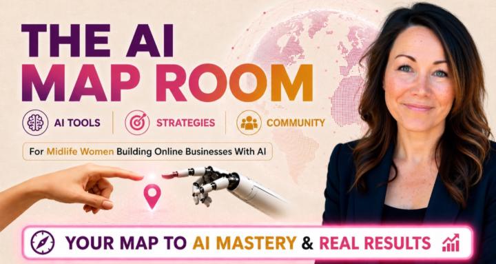
📊 Infographics to simplify big ideas into something easier to share (like the one attached to this post!)
These are not always the final polished version, and you do still need to prompt the tool to get the visual aid you're looking for, but they are (in my opinion) the best AI-powered starting points.
They help you spot patterns, organize your thinking, and move from “I have a pile of research” to “I can actually use this.”
Actually, it was originally launched as a Student's tool, to help students digest information, study it, and learn concepts in an easy way. But it has since morphed into so much more than that!
I have a full lesson on this inside the NotebookLM classroom module if you want the step-by-step on these, and all the other fun ways NotebookLM's Studio can help you.
Your Turn: ⤵
Have you used any of these tools? If not, which one sounds the most interesting to you right now? A mind map, slides, or an infographic? 👇
3
4 comments
✨ My Favorite NotebookLM Visual AI Sidekicks
skool.com/the-aimap-room
A community of midlife women learning to build online income with ChatGPT, Claude, and other AI tools. No overwhelm and no tech background needed.
Leaderboard (30-day)
1

🔥
+85
2

+84
3

🔥
+77
4

+54
5

+29
Powered by