
Pinned

⭐
Aug '25 •
🤝Welcome to Media Valley School! Introduce yourself 📢
Salam everyone, Welcome to Media Valley School! I am so happy that you’re here * Please read this post or watch this video till the end to know How to get most out of this community * This community is all about helping you with All stages of life specially with Money making, Healthy Mindset and Healthy Body, Not only these topics we are planning to add more topics like How to find Love of your life and get married, have kids and raise Beautiful human beings and make this world a better place together. 𝗛𝗘𝗥𝗘'𝗦 𝗪𝗛𝗔𝗧 𝗬𝗢𝗨 𝗡𝗘𝗘𝗗 𝗧𝗢 𝗞𝗡𝗢𝗪: 1. The Goal Our goal is simple – to help you with Money Making, Growing your mind and character and taking care of your body. 2. The Community - This is a space for like-minded people to connect, share ideas, and support each other. Stay active and engage! 3. The Classroom - Find valuable resources and lessons inside the classroom to help you take action and start seeing results. If you need video resources on a specific topic then you can post in the community and we will provide those resources to you. 4. The Calendar - We host Weekly / Monthly workshops and Q&A calls in the community. Check the calendar so you never miss out Important Events! ______________________________________________________________________________________________________ 𝗖𝗢𝗠𝗠𝗨𝗡𝗜𝗧𝗬 𝗥𝗨𝗟𝗘𝗦: 1. Be positive – Disagreements are fine, but keep it constructive and respectful. We need your help to make this community THE BEST COMMUNITY so help us by giving us feedback in a positive way. 2. Make an effort – Post in the right category, stay on-topic, and add value. 3. No promotions – No self-promoting, ads, or links to your content. Violating this will get you banned. 4. No DM-ing other members to sell anything or to invite them to another community/group. Please note that scammers will use chats and other groups to communicate with you as we cannot track their activity there. 5. No low-quality posts/spam. Let's work together to make this community a valuable space for everyone.
Pinned

Aug '25 •
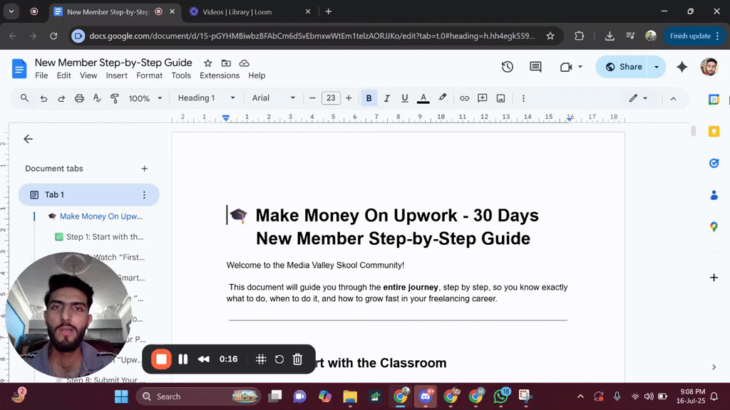
📌 Step-by-Step Guide for New Members..... Must Watch
Welcome to the community! 👋 I’ve created a step-by-step guide specially for all the new members who are just joining our Skool community. In this guide, I’ve explained: 🔹 What steps to follow when you first join 🔹 Which video/lecture to watch first and what to watch next 🔹 How to get the most value out of the community and content 🔹 How to properly engage and grow inside the platform 📹 I’ve also recorded a video walkthrough to make it even easier to follow and attached it with this post. Everything mentioned in the video is also written clearly in the linked document. https://docs.google.com/document/d/15-pGYHMBiwbzBFAbCm6dSvEbmxwWtEm1telzAORJJKo/edit?usp=sharing 🎯 Whether you're just starting or want to reset your learning path this guide is a must watch. 📝 Note: No one is allowed to make a post asking for likes or comments just to level up. If you want to level up, you need to engage meaningfully share your learning, provide value in comments, and interact with others’ posts. That’s how the system works. We reward real contribution, not shortcut requests 🚫 Let’s keep the quality of the community high and support each other through genuine engagement 💬💡
Pinned

Nov '25 •
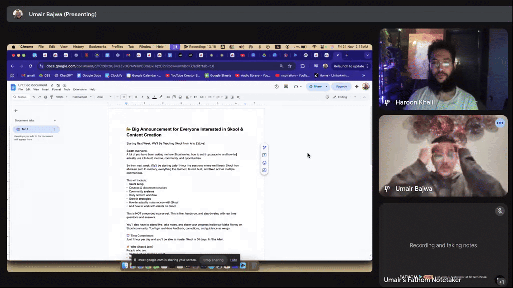
📣 Important Skool & Content Creation Announcement
Starting Next Week Monday, We’ll Be Teaching Skool & Content Creation From A to Z (Live) Salam everyone, A lot of you have been asking me how Skool works, how to set it up properly, and how to actually use it to build income, community, and opportunities. So from next week, We’ll be starting daily 1-hour live sessions where we’ll teach Skool from absolute zero to mastery, everything I’ve learned, tested, built, and fixed across multiple communities. This will include: • Skool setup • Courses & classroom structure • Community systems • Daily content workflow • Growth strategies • How to actually make money with Skool • And how to work with clients on Skool This is NOT a recorded course yet. This is live, hands-on, and step-by-step with real time questions and answers. You’ll also have to attend live, take notes, and share your progress inside our Make Money on Skool community. You’ll get real-time feedback, corrections, and guidance as we go. ⏰ Time Commitment Just 1 hour per day and you’ll be able to master Skool in 30 days, In Sha Allah. 🔥 Who Should Join? People who are: • Serious about learning Skool • Ready to attend live sessions • Willing to take action • Open to sharing progress • Determined to build a real skill 💲 How to Join It’s only $3, this price is not for money. It’s only to filter in the people who are actually committed and want to learn properly. 👉 Join Here: https://www.skool.com/skool-coaching-classes-7316/about?ref=0bd4776d784249258ff5d57ed06e23a0 If you’ve ever wanted to understand Skool deeply or build your own community in the future, this is the best time to start. See you inside. Bismillah.
⭐
12d •
Video Editing Class 01 03-02-2026
After watching the session, you are required to complete the assignment. Assignment Instructions: - The assignment details are provided in the Google Doc link below. https://docs.google.com/document/d/1GFSJA7nU1xqsnTm-CLNbjOOI1a65ddiZopMnBWPgSFg/edit?tab=t.j66ja3fl8j48 - After completing the assignment, share your Google Drive link in the comments section with access. ⚠️ Important: - Watching the Video Editing Introduction Class is mandatory before starting the assignment. - Submit only your own work in a properly formatted Google Drive file. If you have any questions, feel free to ask in the comments. Best of luck! 🚀


6h •
14th Feb, Do Hazaar 26 - 📝61st Journal
Febraury Goals: 1. Fully optimize my Upwork profile and start receiving inbound leads. 2. Submit 20 genuine proposals on Upwork and improve bidding through expert feedback. 3. Complete content till Project Management Mastery; focus on dummy bidding, SMM, and lead generation for quick execution. 4. Complete Furqan Qureshi’s Seerah playlist. 5. Revise the entire Holy Quran in preparation for leading Taraweeh (InshaAllah). 6. Maintain strong performance at both jobs, with priority on Taraweeh in Ramadan. 7. Improve English communication to a fluent, confident conversational level. To-Do List for Today: - Quran Revision krni he - Quran Recitation improve krni he. - English Communication improve krni he. - All 5 prayers should be on time. - Weekend he, thora relax kronga. - Ghr ki maintenance ke kuch kaam hein wo krne hein. - Journal or Notes likh kr post kronga. - Seerah Course lazmi continue kronga. - SMM 10th Assignment complete kronga 😴 Sleep & Routine - Slept at: 08:00 AM - Woke up at: 04:00 PM - Total Sleep: 8 hours 🌅 Day Routine - ( 04.00 PM - 04.30 PM ) - Woke Up, Thori deer Mobile use kia. Fresh hoa. Wuddu Kia. Asar ki namaz keliye - ( 04.30 AM - 04.50 PM ) -Asar ki namaz prhi. - ( 04.50 PM - 05.30 PM ) - Khanna Khaya ( Chicken Biryani ) - Sth Youtube Videos dekhein. - ( 05.45 PM - 06.10 PM ) - Maghrib ki namaz keliye masjid gya. - ( 06.10 PM - 06.40 PM ) - 1 2 Videos dekhein youtube pr, Time hi waste kiya. - ( 06.40 PM - 07.40 PM ) - Ghr ke maintenance ke kaam start kiye. - ( 07.40 PM - 09.30 PM ) - Kuch kaam the bahir ke, wo poore kiye. Sth namaz bhi prhi. - ( 09.30 PM - 10.30 PM ) - Ghr aya, Phr kaam poore kiye. - ( 10.30 PM - 11.30 PM ) - Dinner, Family Time. - ( 11.30 PM - 05.30 PM ) - Saara time waste krdiya, Youtube dekhne me, Koi knowledge gain ni ki. - ( 05.30 PM - 07.00 PM ) - Fajar ki namaz prhi Alhamdulillah, Then community me helpful comments post kiye. ⚠️ Mistakes - Quran Recitation ni kr paaya. - Ajke din boht time waste kiya. Around 6 hours mene social media pr waste krdiye. - Exercise apni laziness ki waja se miss hogai. - Zuhr ki namaz miss krdi. - Kuch learn ni kr ska. - Seerah Course bhi miss hogya.

1-30 of 23,355
powered by

skool.com/make-1k-5k-in-30-days-8449
Media Valley School is the fastest way to hit $1K/month with freelancing or agency work. Guaranteed.
Land your first $1K month in 30 days
Suggested communities
Powered by