
Write something
9h •
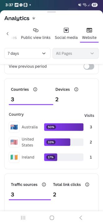
Analytics
Well not bad, not great either now its time to spend a good day at landing pages to see what works. But happy I actually got some looks.
15h •
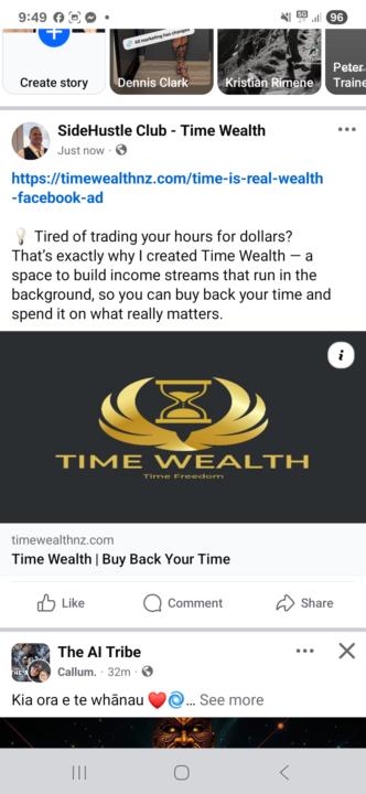
First landing page
Took me a while to get it to work properly but I did it thanks to lots of communication to chatGPT 5 but with persistence I did it. Lets go!!!
1
0

4d •
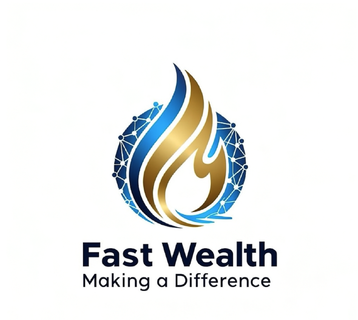
Great work Ida!
✨ Great work Ida! This is really clean, simple, and easy to understand — which is exactly what you want a logo to be. The flame shape is strong, the gold/blue combination feels professional and trustworthy, and the tagline “Making a Difference” ties the brand to a bigger mission. Big thanks to the designer for pulling this together 👏 — it definitely communicates clearly. If you wanted to explore refinements down the track (totally optional): - Balance the flame weight: a little smoothing of the inner curves could make it feel even more polished. - Font harmony: a typeface with a touch more uniqueness could add personality without losing clarity. - Versatility: testing a flat single-colour version (all gold or all navy) ensures it looks great on merch, prints, or in tiny social media icons. But overall, this works well as a brand mark — clear, memorable, and professional.
5d •
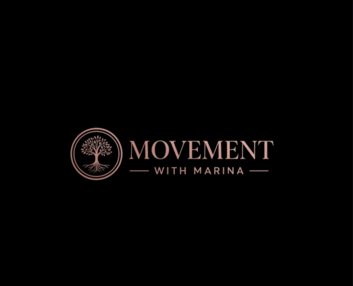
That logo looks really polished 👌
That logo looks really polished 👌 — clean, modern, and it perfectly communicates the brand message. Your feedback is spot-on: - Vertical vs Horizontal Layouts: They’re essentially the same design, just formatted differently. This gives Marina flexibility depending on where it’s being used (website header, social media profile, business cards, merchandise, etc.). - Consistency: Because the elements are the same, the brand stays consistent no matter which format is used. - Strength: The tree symbol conveys growth, grounding, and connection — perfectly in line with the word Movement.
1-4 of 4
skool.com/creators-hub
Build a clean brand and launch a digital product with Canva + AI. Get step-by-step checklists, templates, and support to start fast within 7–14 days.
Leaderboard (30-day)
1
+36
2

+34
3
+21
4
+8
5
+5
Powered by