
4d • 🚀 Wins & Showcases
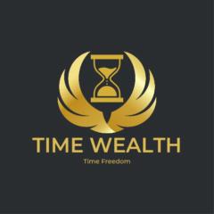
Great work Ida!
✨ Great work Ida!
This is really clean, simple, and easy to understand — which is exactly what you want a logo to be. The flame shape is strong, the gold/blue combination feels professional and trustworthy, and the tagline “Making a Difference” ties the brand to a bigger mission.
Big thanks to the designer for pulling this together 👏 — it definitely communicates clearly.
If you wanted to explore refinements down the track (totally optional):
- Balance the flame weight: a little smoothing of the inner curves could make it feel even more polished.
- Font harmony: a typeface with a touch more uniqueness could add personality without losing clarity.
- Versatility: testing a flat single-colour version (all gold or all navy) ensures it looks great on merch, prints, or in tiny social media icons.
But overall, this works well as a brand mark — clear, memorable, and professional.
4
2 comments
Great work Ida!
skool.com/creators-hub
Build a clean brand and launch a digital product with Canva + AI. Get step-by-step checklists, templates, and support to start fast within 7–14 days.
Leaderboard (30-day)
1
+36
2

+34
3

+21
4

+8
5
+5
Powered by