Activity
Mon
Wed
Fri
Sun
Dec
Jan
Feb
Mar
Apr
May
Jun
Jul
Aug
Sep
Oct
Nov
What is this?
Less
More
Happily Ever Authors (Free)
2.4k
Free
Kidlit Author Growth Academy
1.5k
5.0
$1/m
10 contributions to Kidlit Author Growth Academy

Nov '25 •
Launch Day!
Hey everyone! I am now a published author!!!! WOOT! https://www.amazon.com/Timmy-Tractor-Truck-Train-read-aloud/dp/B0FX26DMWB/ref=tmm_pap_swatch_0 Now what?

0 likes • Nov '25
@Karen Shea Thanks Karen!!!
0 likes • Nov '25
@Lucina Mangoba Thanks Lucina!
Nov '25 •
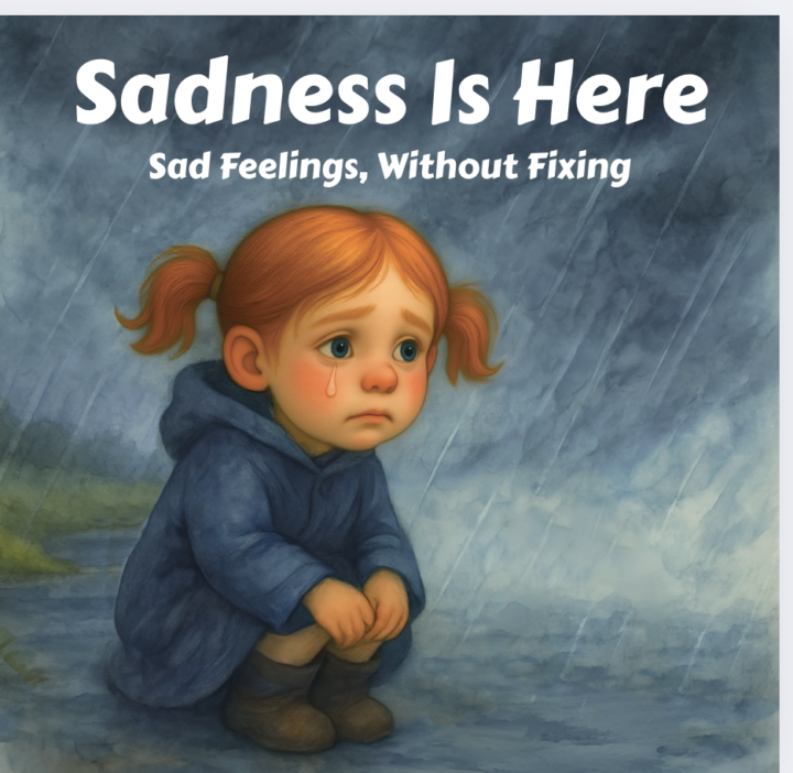
Advice on Font Style and Color for Children's Book on Sadness
Hi everyone! I’d love some advice on font choices for my book. I’m attaching the title page and a few of the inside pages — the illustrations were done by an illustrator, but I’m not sure what font style, layout, or color would work best with them. Any suggestions and ideas would be appreciated. Thanks!
2 likes • Nov '25
Cute illustrations! The interior is very readable and I like the font you already have. However I wish the font on the cover looked more stylized to the story. I don't know if I have a specific font for you to use BUT I go to google fonts or dafont.com and search for what I am trying to get my audience to feel... ALSO if you take a screen shot of a font you like from another book and put it in chatGPT it can tell you what it is so you can find it. Good luck!
0 likes • Nov '25
@Karrie Olech Oh sure! (So this is just my opinion and is in no way meant to offend) When I say stylized, I mean that the font, letter size, color, and placement all have a very specific purpose on the cover that is more than just readability. Readability is one purpose, but the current version feels a bit like a slide presentation. To help it stand out, I would look at other books in your genre and experiment with color, individual word or letter sizes, placement, and any other ways to make the title really communicate the feelings and message of your book while still being readable for the age you are targeting. I included a couple of titles that I felt did this well. I wouldn't copy these idea's exactly but maybe use them to inspire your style. Also, I am new at this as well, so while I have my opinions based on being a learning designer, I'd continue to get direction from other professionals as well.

Nov '25 •
Greetings All
Good evening everyone! Beautiful evening in California! I am excited to be here! I have made by hand many fabric books and pop up books and sold them to friends and family. I am ready to learn to publish on Amazon. Hope everyone is doing well this evening. 💜
0 likes • Nov '25
Welcome Paula!
Nov '25 •
Check this out: ARC and Launch Team for my new book!
Hey fellow authors! (and thanks @Harleigh Manske for helping me do this!) I’m thrilled to share that my new children’s picture book—Timmy the Tractor Truck Train: Danger at the Dam!—is officially launching on 11/11 (just five days away!). I’m putting together a small Launch Team, and I thought I would ask everyone here if you would like to get an advance digital copy (ARC) before release day. I mean we are all children’s book enthusiasts and fellow storytellers so I thought this woudl be a good group to ask 😁. Here are some details about the book: It’s a fun, adventure-filled story for ages 3–8 about a vehicle that can become any tractor, truck, or train, to help save the day—while quietly teaching kids about resilience and problem-solving along the way. If you’d like to be part of the launch team and get early access, just comment “I’m in!” below, and I’ll send you a copy via private message. Also, I will NOT sign you up for my email list unless you want me to. I also included a link to a promo video I created so check it out and let me know what you think! Thanks so much for the support!
0 likes • Nov '25
@Deb Hockenberry Awesome! thanks Deb! I'll DM you the details.
0 likes • Nov '25
@Mindy Kitterman Thats great Mindy! Thanks!

Oct '25 •
BOOK TRAILERS
Hi guys, Do book trailers still work in marketing? I've asked this question in some other groups, but some said they do and some said they don''t. All I know is that I haven't seen one in a long time!
1 like • Nov '25
Hey @Deb Hockenberry I made a book trailer! HA!
0 likes • Nov '25
@Deb Hockenberry I haven't posted it yet 😆! I just wanted to show it off. I'll post it to my socials this week as I get close to my launch date. thanks!
1-10 of 10

@seth-warburton-5985
Inspired by his own kids’ boundless imaginations, Seth Warburton writes playful tales that celebrate courage, creativity, and never giving up.
Active 183d ago
Joined Oct 2, 2025
Utah
Powered by