Activity
Mon
Wed
Fri
Sun
Aug
Sep
Oct
Nov
Dec
Jan
Feb
Mar
Apr
May
Jun
What is this?
Less
More
Memberships
Selling Online / Prime Mover
36.7k members • Free
Hamza's Automation Incubator™
47.2k members • Free
Mojo Dojo
4k members • Free
12 contributions to Selling Online / Prime Mover

13d •
The “Hit By A Bus Strategy” that Funnel Builders Are Using To Turn Conversations Into Cash Flow
Day 3 Recap - One Comma Club Challenge I’ve been building funnels for a few years now, but today in the One Comma Club Challenge gave me something I didn’t have before… A simple strategy for finding opportunities and turning conversations into cash flow. Most people think they need more followers, more certifications, or more experience. What Day 3 showed me is that businesses already have problems they need solved. The “Hit By A Bus” strategy is powerful because it helps you uncover those problems without being pushy or salesy. Instead of trying to sell, you start asking better questions. Here are 3 action steps you can take right now: ✅ Ask a business owner: “If you got hit by a bus tomorrow, what would happen to your business?” ✅ Listen for gaps: No follow-up, no email list, no automation, no funnel, no lead system. ✅ Show them what you see: Help them identify one opportunity that could save time, generate leads, or increase sales. That’s it. Simple. No ads. No fancy tech. Just helping people see problems they didn’t realize they had. This was one of the biggest lessons that helped me earn my One Comma Club Award. So I created the HELP framework and made it into a easy reference cheat sheet - FOR THE VISUAL LEARNERS. So tell me, What’s the biggest bottleneck you see businesses struggling with right now: leads, sales, follow-up, or something else? Renee J. #blackgirlshackfunnels2

2 likes • 3d
This is cool! Thanks for this!

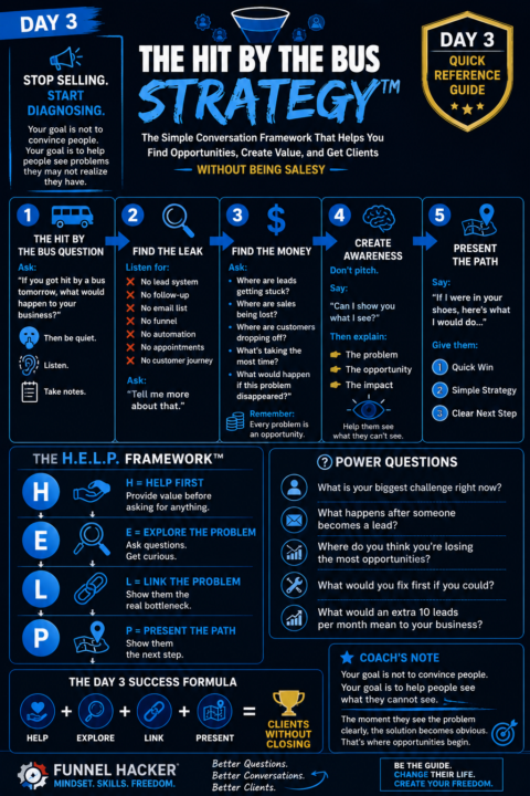
10d •
Average form completion is 14%. This format gets 57%
Same questions, four times the completions. The difference is the format. The industry average form completion rate is around 14%. Forms that show one question at a time average 57%. Why? One question per screen means the visitor never faces a wall of fields. Auto-advance and auto-scroll kill the clicking. And it's built thumb-first for mobile, where most of your traffic lives. The real insight isn't "use this tool." It's that a long form feels shorter when it's broken into single steps, even with the exact same number of questions. Perceived effort kills completion, not actual effort. If you've got an application funnel or a long survey form, split it into one question per screen. The form doesn't get shorter. It just stops feeling like work. How many fields does your longest form show on a single screen? If it's more than three, you're scaring people off.
1 like • 3d
Very nice! I'll have to look into updating my forms. Haven't been this successful. Thanks for the post!

6d •
The “Website That Never Gets Updated” Problem
Your website shouldn't be something you launch and forget. As your business grows, your website should grow with it. Update your services.Refresh your content.Replace outdated information. A well-maintained website tells visitors your business is active, professional, and paying attention to detail. Your website is often the first impression of your business—make sure it reflects where you are today, not where you were years ago.
1 like • 3d
Sweet and simple! Thanks for this @Paul Josan
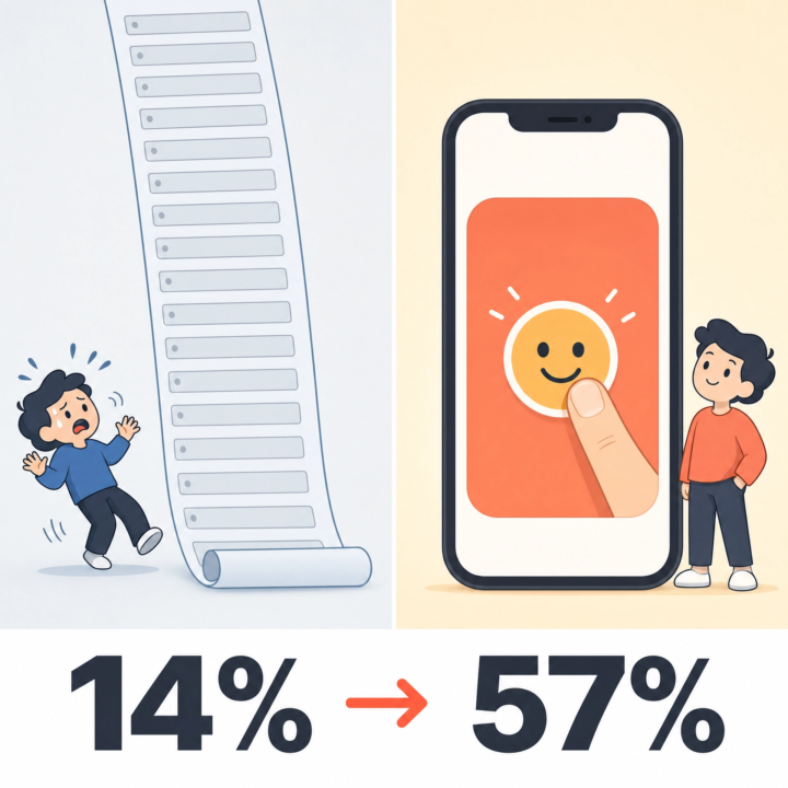
12d •
They deleted half the landing page. Conversions went up 844%
A marketing company had the usual landing page: video, signup form, "featured in" logos, a description, a how-it-works section, money-back guarantee, support promise, team bios. The works. They threw almost all of it out. New version: a signup form, a 6-word headline, an 8-word subtitle. Nothing else. Signups went from 1.39% to 13.13%. An 844% increase. Every extra section on an opt-in page is one more reason to think, scroll, hesitate, and leave. More page is not more persuasive. Usually it's just more friction. This is the hardest one for funnel builders to swallow, because we love building. But your opt-in page almost certainly wants fewer sections, not more. Try this: cut your opt-in page down to a headline, a subhead, and the form. Run it for a week against your current one. I'd bet on the stripped version.
1 like • 3d
@Andrew Bobchenok This is nuts! Thanks for this post!

6d •
A simple idea that compounds
One shift that changes how you grow: Stop asking: “How do I get more people?” Start asking: “How do I create more meaningful conversations?” A lot of opportunities don’t come from reaching more people. They come from building trust with the people already paying attention. Visibility opens doors. Conversations build relationships. Relationships create opportunities. The strongest growth usually happens when both work together. Keep showing up. Keep connecting
0 likes • 3d
@Mitanní Spruill-LeSueur Thanks for this post!
1-10 of 12

@john-steggell-9273
Just getting started on my own SMMA agency! Excited to start!
Active 3d ago
Joined Jul 1, 2026
Powered by