
Write something

3d •
Chart to Crochet
🧶 It’s been a little while since I’ve shared anything here, but I’m back… and I’ve got something exciting to share! I’ve started a brand new YouTube series called Chart to Crochet, where I’ll be taking you step-by-step through understanding Mosaic Overlay Crochet charts. Whether you’re completely new to reading charts or you’ve always relied on written instructions, this series is designed to build your confidence one lesson at a time. 🎥 Watch the latest episode here: https://youtu.be/iyOsiQtbjLM?is=bpSHr3nTshnOlK1N The videos are designed to be watched in order, as each one builds on what you’ve already learned. I’ll be adding new episodes regularly, so make sure you subscribe to the channel so you don’t miss the next one. I’d also love to know: • Have you learned to read Mosaic Overlay Crochet charts yet? • Or are you still relying on written instructions? Pop a comment below and let me know where you are on your mosaic journey. It’ll help me create videos that are most useful for you. Happy crocheting! Angela The Pattern Scribe 🧶
0
0
Feb 17 •
🧶 Quick Question for Mosaic Overlay Crocheters…
If you already crochet mosaic overlay, I’m curious — Where are you right now? A) Following patterns comfortably B) Confident reading charts C) Starting to tweak patterns D) Want to design your own E) Already designing but want more structure Comment with your letter 👇 I’m working on more structured content around progressing beyond just “following patterns” — so your answer helps. Thanks Angela
Feb 15 •
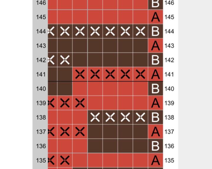
Chart Breakdown Insight
Here’s a small section from one of my mosaic overlay charts from the Tiger Scarf Pattern 👇 At first glance, it looks decorative. But what actually makes it work isn’t the motif. It’s the structure behind it. Notice: • The pattern is consistent across the row • Mosaic stitches fall in a predictable rhythm • The vertical drops align intentionally • The negative space is balanced, not accidental If even one of those elements is slightly off, the design starts to feel “uneven” — even if you can’t immediately see why. Overlay design isn’t just about drawing a shape inside a grid. It’s about controlling: • Rhythm • Anchoring • Width multiples • Visual weight When the structure is solid, you can be far more creative. Structure creates freedom. When you look at overlay charts, what do you notice first — the motif, or the spacing?
Feb 11 •
A Small Chart Detail That Changes Everything
Do you see how the front loop double crochets stack vertically? That’s what creates the clean “column” effect in overlay mosaic. Once you understand that logic, charts stop feeling random — and start feeling structured. Does anyone else look for vertical flow first when reading a chart?
Mar 2 •
The Small Detail That Changes Everything 👀
Can I tell you something? Most mosaic overlay pieces don’t look “unfinished” because of the chart. They look unfinished because of the edges. You can have the most beautiful overlay stitches…Perfect colour changes…Gorgeous contrast… But if the edges lean, ripple, or pull in, the whole piece feels slightly off. And here’s the important part: - Edge control isn’t about crocheting tighter. - It’s about understanding structure. Inside the Mosaic Overlay Crochet Hub, we’ve been working through: • Why tension shifts near edges • How turning chains affect the width • Where accidental narrowing creeps in • How to anchor stitches properly Because once you understand why it happens, you can fix it immediately. If you’re working on something this week, lay it flat and check your edges properly. And if you’ve ever thought, “Why does mine not look as crisp as the photos?” It’s usually this. Control builds confidence. Confidence builds polish. Polish builds professional-looking results. That’s what we’re doing here. If you want the full details. Click the Classroom tab. It's $5 per month for you to sharpen your mosaic overlay and to learn how to design and write your own crochet patterns.
0
0
1-6 of 6
powered by
skool.com/the-pattern-scribe-8072
A hub for crocheters who want clarity, control and deeper learning in mosaic overlay crochet design.
Suggested communities
Powered by