
🔥
17d • 💬 Community Chat
I analysed the top 100 Trending Skool About pages
I went through the About pages of the top 100 trending communities on Skool Discovery. On each one I looked at the headline, the body text, the proof they show, the cover image, the group description and the price. I wanted to see what they have in common and what tends to get someone to join. Here is what I found.
THE HEADLINE
Most of them open with the result you get, not the subject or the method. So instead of "a real estate community" it is "close your first deal in 90 days". Instead of "learn AI video" it is "make your first viral AI video in a day". One automation group opens with "automate 5 tasks in 7 days". A faceless YouTube one opens with building a channel without ever showing your face. A careers one opens with "if you're applying and getting no response, it's not bad luck, it's your strategy". Most of the time there is a number and a timeframe in that first line.
A lot of them follow the promise with an "even if" line, to deal with the obvious objection before someone clicks away. "Even if you've never made one." "Even if you're a complete beginner." "No code, no experience."
The About pages that just named the subject, like "a community about X", were usually the weaker ones. I think the result works better because someone only spends a second or two deciding, so the first line has to be the thing they actually want in their words. That is probably why so many of them lead with it.
THE FOUNDER AND THE SPECIFIC NUMBER
Every one of them has a real founder name and a face on the About page, not a logo. And there is almost always one specific number next to the name. Not "lots of students", but things like "$556,452 in member ad revenue", "34,000 sales", "helped 750 coaches", "$150M in ad spend", "100M views a month", "1,000+ doors". A specific number is more believable than a round one. An exact figure like that looks like a real count rather than an estimate.
A lot of them also add a short before-story with the number. "Laid-off nurse to creator." "Father of three feeding his family from Etsy." "Engineer who quit his job and bought 1,000 doors." "Surgeon who went full-time on YouTube." It makes the result feel like something a normal person could reach, instead of something only the founder could do. The strongest ones put a few proof points together, like "$25M in career sales, $3.5M online, 750 coaches helped, 3x Skool Games winner". The weaker ones just said something like "Amazon coach" with no number.
There were basically four ways they showed they could be trusted: their own results numbers, which was the most common; years of experience, like "20 years in recruitment"; brand names they have worked with, like a filmmaker listing Huda Beauty, L'Oreal and Sephora; or a famous name attached, like the communities built around Tony Robbins and Dean Graziosi. And a few of the smaller ones had their best proof in their bio instead of on the About page, which doesn't really help, because people don't read the bio before they decide.
THE COVER IMAGE
This was the most consistent thing. Almost every cover image is built like a YouTube thumbnail. The founder's face on one side, a big claim on the other, a dark or high-contrast background, one bright colour, usually blue, and a Skool Games badge in the corner if they have won one. A lot of them put the same claim from the headline straight onto the image. This makes sense, because the cover is the first thing someone sees on Discovery and in search, before any of the writing, so it has to get attention quickly with very few words. The ones that used a plain logo or a soft graphic didn't stand out as much. The few that didn't use a face used one big word on a dark background instead.
THE FREE OFFER AND THE BUTTON
Most of them offer something free to get people to join. A 5 or 7 day challenge, a free course, a pack of templates, or a free trial on the paid ones. The free thing is the main draw, and the community is what people are joining. The ones that did this best gave a free thing with some structure, like a challenge with a start date or a path with stages, rather than just a free course sitting there.
A free thing only helps if it's that good they would actually pay for it. If it is filler, it doesn't bring anyone in. And the About page always pointed at one next step, not several. It was pointing to the join button and one action. Even the busy-looking ones had a single main call to action and everything else was secondary.
PATTERNS ON THE PAID COMMUNITIES
A few things only showed up on the paid ones. A lot of them raise the price as the community grows, like "the price goes up once we hit 1,000 members", or "only 11 spots left at $9, then $50". It was nearly always the member count and price increase that drives the urgency. A lot of them compared the price to something small, like "less than a coffee a day", "under $0.30 a day", or one that said "my clients pay $39,000 a year, your cost is $70 a month". Some of the bigger paid ones listed each thing they include with a price next to it and added it up to a big number, then showed a small price underneath (value stack). And a few used "no refunds" as a way to filter for serious people. Actual money-back guarantees were rare.
An about page in a free community and a paid one are doing different jobs, so they are built differently. The free ones were usually short, because people decide quickly. The paid ones were longer, because they need to build up the value before someone pays.
HOW THEY WROTE THE PAIN
Where they mentioned the reader's problem, it was always aimed at the reader, not the founder talking about their own struggle. Things like "stuck in IT support and not moving up", "tired of getting banned and low views", "zero followers, zero experience, zero confidence", "every week there's a new tool and a new reason to feel behind". A few also used a "this is not for you if" line, like "do not join if you're not serious or you plan to spam". Some used short three-word lines, like "no camera, no crew, no budget". Used once or twice that reads fine, but when it's overused it starts to feel like a slogan.
THE THING ALMOST NONE OF THEM DO
Out of a hundred of the best About pages on discovery, only a few put a real, named member result on the About page itself. A name, a quote, a number from an actual student. Most of them use their own founder numbers, or something vague like "our members are getting great results". A couple linked out to a separate testimonials page, but didn't put it on the About page where people decide.
A founder's own numbers only show that the founder can do it. A result from a named member shows it has already worked for someone in the reader's position, which tends to be more convincing. It is also the kind of thing you would expect a good About page to have, and most still don't include it. So adding one would be an easy way to stand out.
If you have joined a Skool community recently, curious to know what it was on the About page that made you join?
__________________________________________________________
He helps Skool community owners scale to $5K+/month, using data, AI, systems and software.
Skool Games winner, made $45k in 11 days.
He built and ran his current Commozi System Skool community to $40K in 7 days.
There is a lot of free value in there. If you're serious about growing your Skool community then go and check it out, whatever stage you are at.
20
25 comments
I analysed the top 100 Trending Skool About pages
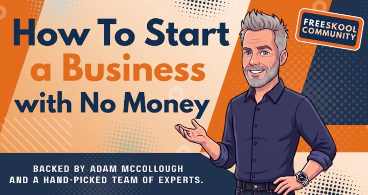
skool.com/start-a-business-with-no-money
Build a real business with no money, guided by hand-picked experts, practical support, and a community of like-minded entrepreneurs that care!
Leaderboard (30-day)
1

🔥
+261
2

🔥
+182
3

+158
4

🔥
+130
5

+128
Powered by