
Write something
17d •
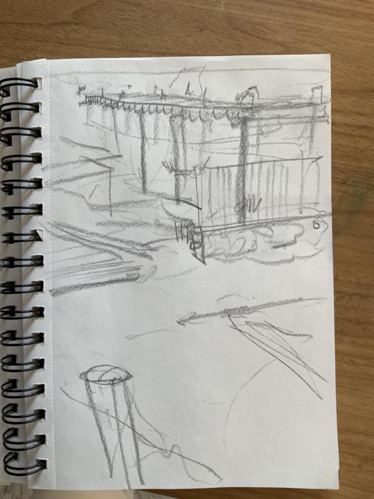
Draw something from life
Let’s see your life drawings in the comments! If you’ve never drawn from life before, give it a shot!
0
0
May 14 •
Welcome to the Pet Portrait Academy
If you're seeing this, it means your of the newest members to the Pet Portrait Academy!. As of right now, I don't have any courses set up, but if you have any questions about painting either with oil or acrylics, feel free to post those questions in the group and I'll try my best to answer them. Thanks again for joining my community and I hope you can use this group to inspire and empower you along your artistic journey. -Max
Jun 1 •
My Poster Design
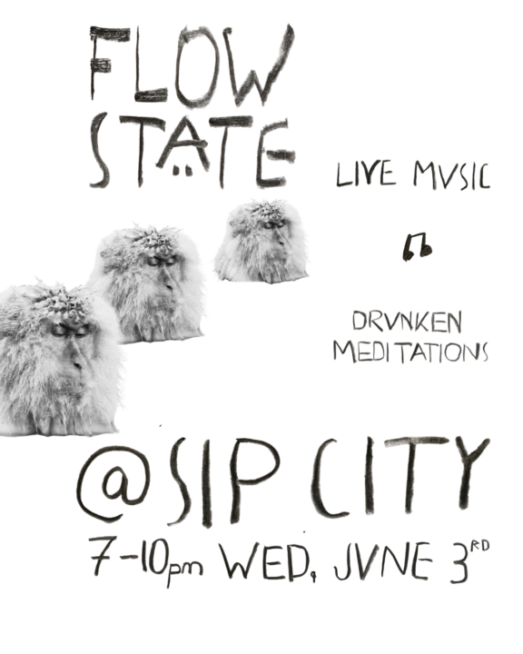
I want to talk about the design choices I made while putting together this fun poster for my band. (If you're in Charlotte, NC come check us out this Wednesday at Sip City!) The following design choices reflect the mood and style of my band, as well as the character of the crowd that frequents Plaza Midwood. Let's start with composition: This poster roughly resembles a converging line composition. The general flow of elements leads towards the little music note. These converging lines allow a generally loose and chaotic arrangement of elements while still maintaining a focus and balance. Hierarchy of the scale of elements: The most important elements--band name, venue name and date of the show--are the largest elements because they contain the most important info that will help people ultimately come to our show. Organic Style: Nothing in this poster was aligned. The font was hand written with soft vine charcoal and photographed. The mediating monkeys are placed at irregular intervals and each has been almost imperceptibly rotated to create a wobbly flow between them. The 'eye-balled' placement and sizing of elements make clear it's handmade nature, which stands out in the sea of Canva templates and AI generations. The Font: Creating this handwritten font was my favorite part of the process. I knew immediately that I wanted to draw inspiration from the handwriting of artist Egon Schiele. Attached is an image of one of his poems that I used. (My German is rusty, hopefully it's nothing vulgar.) Before Schiele's tragically early death in 1918, he was an influential member of the Vienna Secession - a group of artists who chose to separate from the traditions of the fine art world and branch into their own sect of Austrian Expressionism. Apart from its general elegance and simplicity, Schiele's handwriting embodies the bold, alternative Austrian Expressionism that I feel reflected in the culture emerging around Charlotte --- It's not often I get to use merge traditional fine art training with my graphic design skills, and I really enjoyed writing about all of my design decisions and maybe teach a little bit of art history at the same time.
0
0
May 30 •
What I’m reading
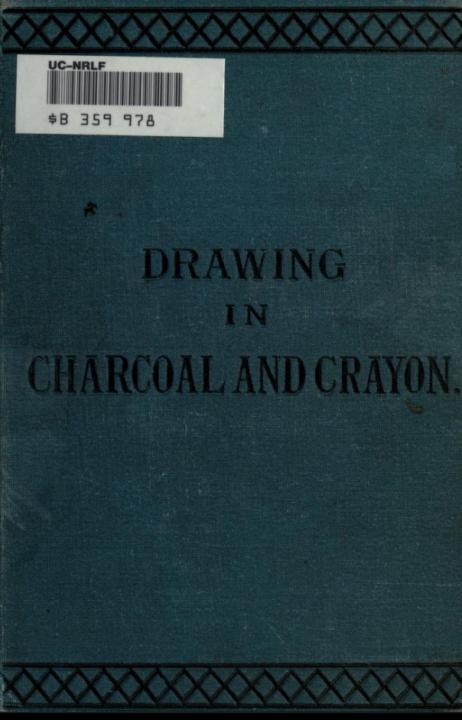
https://archive.org/details/drawingsincharco00fowlrich/page/23/mode/1up Drawings in charcoal and crayon for the use of students and schools by Fowler, Frank, 1852-1910 This book covers the foundations of traditional charcoal drawing methods that artists like John Singer Sargent first learned when he was studying in France. Charcoal is an absolutely amazing medium to use. It’s basically just burnt wood, but with it “large and striking effects are so easily and quickly produced, while it is also adapted to the most careful work, and may be carried on to any degree of finish” My favorite way to use charcoal right now it to use soft vine charcoal(charcoal from burnt grape vines) and drawing large, rhythmic lines on large newsprint. Do check out this online pdf of this book if you’re interested in learning charcoal drawing. Let me know if you guys have any questions!
0
0
May 26 •
New category! INSIGHTS
HELLO ALL, I’ve added a new category - insights. I added this because for me one of the post gratifying and fun parts of learning art is experiencing new realizations and insights about my painting mediums and about the reality in which I paint. As artists, we not only learns insights from others, but we also are tuned in to the world and we see and feel things that the average passerby overlooks. I’d like to hear about what you have learned recently during your artist’s journey! -post it in the ”insights” category
0
0
1-19 of 19
powered by
skool.com/pet-portrait-academy-9870
Paint Pet Portraits that friends and collectors will cherish for generations. Learn to paint with artists are around the world with guidance from Max.
Suggested communities
Powered by