
16d • Ask a Question
Colors
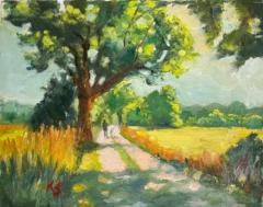
Hello everyone. I made a small color study here for an oil painting.
Normally you shouldn’t just copy the colors from the reference photo but improve them. I find that quite difficult, though! Does anyone have suggestions for a more pleasing color harmony? I’d be happy to hear your ideas! 🎨
7
14 comments
Colors
skool.com/painters-hub
🎨 Free community for landscape painters improving their skills. Learn to create professional-quality paintings you're proud to display or sell 😀
Leaderboard (30-day)
1

+221
2
+121
3

+105
4

+76
5

+70
Powered by