
13d (edited) • General discussion
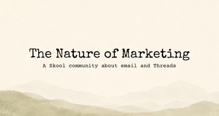
The Nature of Marketing has a new look!
I’ve recently changed the about page banner.
And I’ve just now changed the group icon to match. Not because the old icon was bad (no, in fact it’s really good imo).
But I also use it as the favicon for my main site and daily email newsletter.
So it’s confusing to me to navigate sometimes.
So I made it easier by making the icons different.
Just mentioning it so folks don’t get lost.
What branding blunders have you encountered recently that you’ve struggled to find suitable solutions for early on?
4
9 comments
The Nature of Marketing has a new look!
skool.com/kevin-hood-8749
Grow your business using email and threads.
Leaderboard (30-day)
1

+24
2

+23
3

+17
4

+13
5

+12
Powered by