
Pinned
May 6 •
Start Here: What You’re Building (and Where You Are)
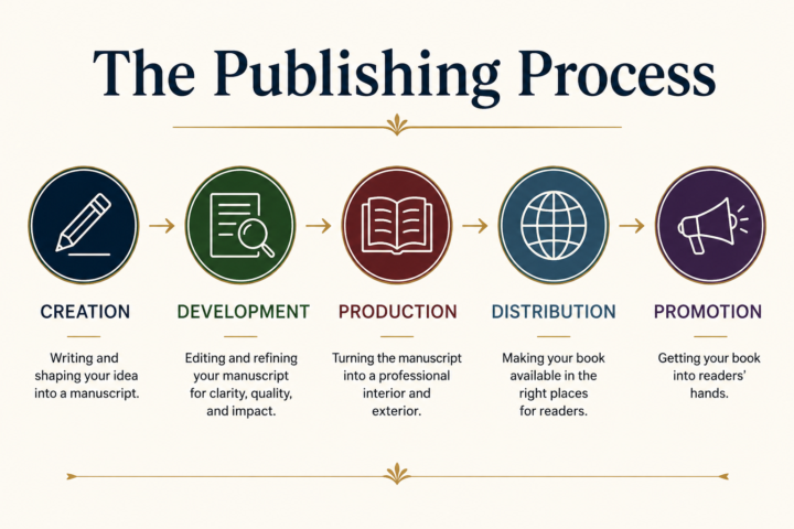
If you have a finished manuscript...or if you're at least halfway...you're in the right place. Inside this Guild, we focus on the full publishing process: - Creation (writing) - Development (editing) - Production (turning the manuscript into an interior and exterior) - Distribution (where it’s available) - Promotion (how it gets into readers' hands) That’s what we’re here to work through—practically. Please introduce yourself! Share: 1. What you’re currently working on 2. Where you are in the process: writing, editing, production, publishing, marketing 3. What you feel you need the most help with right now

10h •
Are there times when an author should not speak?
Lara’s latest podcast about how readers can get to know us better by hearing our voices really hit home but with a giant question: Are there certain situations in which hearing an author’s voice might actually be harmful to the book? I have a stutter. It is completely unreliable. One minute I might talk fine and no one would know that I stutter. Another, I might hammer through every single syllable (not exaggerating) and sound like a lawnmower trying to start. I can’t help thinking that if someone finds it tedious listening to me, it’s not going to endear them to my book. I’d love an honest reality check: Think about the time that you’ve had to listen to someone where it’s been painful to watch them get through their presentation. Would that experience have pushed you to want more of whatever they have to offer? Add in the fact that when someone uses a lot of ums or stumbles over their words, our society tends to view that as the person not knowing what they’re talking about. So are there instances, like a noticeable stutter, where it would be better for a book if the author stuck to writing articles instead of speaking? Please be honest. I will NOT be offended.
13h •
Build an Author Speaking Map
If you watched Thursday’s industry video, you know that your book isn’t your only asset as an author. Your ability to speak about the ideas, stories, and expertise behind it can open doors the book alone cannot. So let’s put that to work. Build yourself an Author Speaking Map: a simple way to identify what you can speak about, who would care about it, and where those people are already gathering. Here how... Take your book—or the body of work you’re building—and identify three things: 1. Three topics you could speak about 2. Three kinds of audiences who would care about those topics 3. Three places those audiences already gather Don't start by asking, “How do I become a speaker?” Start by asking, "Where are people already talking about the things I know?" For example, a historical novelist may have a talk for libraries, historical societies, or book clubs. A nonfiction author may have a talk for professional associations, businesses, churches, schools, or community organizations. A memoirist may have a topic that belongs in support groups, advocacy organizations, conferences, or workshops. Now take it one step further. For each topic, write one sentence that answers, "Why would someone invite me to talk about this?" Not: “I wrote a book.” That's not enough. Instead: “I can show your audience how…” “I can explain why…” “I can take your group inside…” “I can tell the story behind…” That sentence is the beginning of your speaking pitch. And here is the Guild challenge: Post one potential speaking topic below, along with the audience you think would care about it. We can help each other spot opportunities you may not see for yourself.
15h •
Scammer Update...
Unfortunately, we get scammers in here who sometimes get past our nets. One is Carmel Harrington. Another that we have banned is Stephen Schneider. This is another person who was trying to get business from our people in our group, and he is not legitimate. Others are Carmel Wilson and Virginia Evans. NO ONE has been cleared to offer services here.

10h •
Make It Look Like A Book - Fantastic!!
As I have been building the text portion of our book in Word and hoping to begin the InDesign template work, the "Clean the Manuscript Before You Hand It Off" module of the Insider Edition 1: Make It Look Like a Book training was FANTASTIC! I was well on the road to creating a real mess that would have been hard and costly to untangle. If you think that that a word like "fantastic" in all capital letters is a bit over the top.......it is fantastic to save money and time (I only have a finite mortal existence after all).
1-30 of 327
powered by
skool.com/independent-authors-guild-5490
A place for authors who want to get their books out of their heads and into readers' hands, with publisher and bestselling author Lara Helmling.
Suggested communities
Powered by