Activity
Mon
Wed
Fri
Sun
Aug
Sep
Oct
Nov
Dec
Jan
Feb
Mar
Apr
May
Jun
Jul
What is this?
Less
More
Memberships
META Ads Mastery
751 members • $19/month
Flows: Email for Coaches
271 members • $9/month
Agency Founders
516 members • Free
Content to Clients Community
772 members • Free
AI Money Lab
85.2k members • Free
AI Automation Agency Hub
328.6k members • Free
8 contributions to The Circle

Aug '24 •
How to take one time fee for your Skool Community
Lots of people were asking this question so I have created this video. Skool does not offer an option to charge a one-time fee for your Skool membership. This video is the complete tutorial on how you can still do it by integrating it with third-party solutions. I have used Pabbly and Stripe for this example. At the end of the training, you will have a working automation where people pay a one-time or lifetime membership fee and are automatically invited to your Skool group. If you have any questions or doubts about it, ask in the comments here. Important point: Once taking all these steps, convert your Skool to "paid" and ask people to enter their "email," which they used to make payments. This way, if anyone tries to join directly or there is any failure in the automation, you can manually enter them. It is highly unlikely but software issues are always there.

3 likes • Aug '24
Pabbly is really amazing tool
1 like • Oct '24
@Sacha Nahal yup
Jul '24 •
✅ Boost Your Webinar Revenue by a Strategic Downsell Email Campaign (ZERO risk)
Attention coaches, consultants, or service providers! If you conduct webinars, here's a powerful strategy to reclaim lost revenue. Downselling your lost customers is a great way to grab the lost revenue, and doing that through email automation is a cherry on top. NO ❌ Time investment + NO ❌ Financial risk = 🚀 Revenue ✅ This simple strategy can significantly increase your conversions by nurturing potential clients. Step 1️⃣: Identify the Opportunity ⮑ After hosting a webinar, not everyone who attended will buy your primary offer. However, they are still interested and can be converted with the right approach. Step 2️⃣: Develop a Downsell Product ⮑ Create a downsell product that complements your primary offer but at a lower price point. This product should provide value and address common pain points your audience faces. Step 3️⃣: Craft an Engaging Email Sequence ⮑ Design an email sequence targeting non-buyers from your webinar. Highlight the benefits of your down-sell product, and include testimonials, success stories, and limited-time offers to create urgency. Step 4️⃣: Provide Value and Build Trust ⮑ Ensure your email sequence offers valuable content, insights, and tips related to your expertise. This builds trust and keeps your audience engaged. Step 5️⃣: Track and Optimize ⮑ Monitor the performance of your email campaign. Analyze open rates, click-through rates, and conversions to refine your strategy and maximize results. 🛠️ Example Sequence: → Day 1: "Thanks for attending! Here’s a bonus resource." → Day 3: "Missed out? Here’s why our product is perfect for you." → Day 5: "Final chance! Special offer inside." ↗️ Result: Turn Warm Leads into hot-paying customers ... If you want the exact email sequence I use for my clients, comment "lost revenue" below, and I'll DM you the exact templates directly extracted from my clients' accounts. By implementing this email sequence campaign to down-sell a product, you can effectively capture lost revenue and provide additional value to your audience.
2 likes • Aug '24
@Satyarth Swami If you want to do a downsell on a sales call, At the last sweet point, offer your lead a option to try your product/service on a small scale. If you are on a webinar, after the webinar ends, You can offer downsell through emails, text...etc.
0 likes • Oct '24
@Sacha Nahal Yaa I can help you with Funnels, email marketing and automation.
Aug '24 •
Why you should be testing long pages? 🤔
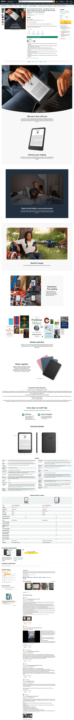
✅ As a rule of thumb, a webpage that sells should contain at least as many words as you would need to sell your product or service face-to-face. ↳ That’s because the page doesn’t have the luxury of asking for specific objections, so your content needs to address all of your customers’ most common questions ✔️. Some marketers are wary of long pages, associating them with aggressive sales techniques, but consider the world’s most successful online retailer 🔥. ↪ A typical Amazon sales page is very long, containing product details, images, videos, frequently asked questions, comparisons with other products, alternative options, and reviews. Have a look at the screenshot attached below, how long the Amazon Kindle page is!!! 🟩 Adding a huge amount of content works for Amazon, so it’s no surprise that they work for many others too. 🟩 The long pages can increase the conversion rate by 70-80%. Long pages work. The challenge is getting users to scroll down and see the content. How is your sales pages? LONG or SHORT. Comment below ⬇️
0 likes • Aug '24
@Satyarth Swami Yaa Its amazing for animated graphics
0 likes • Aug '24
@Rishi Lamba Yup also very smooth
Jul '24 •
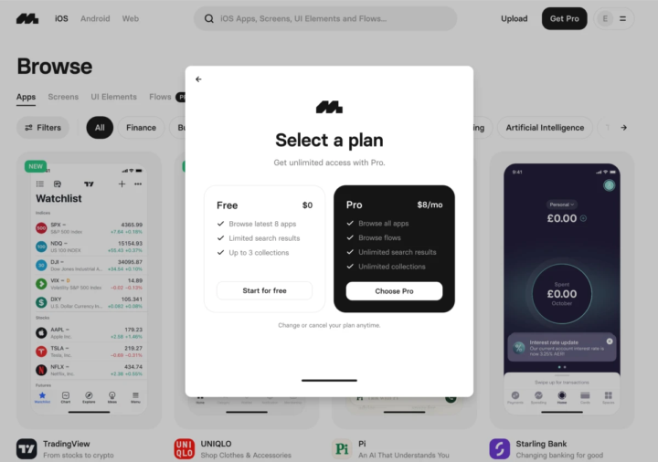
How reframing a choice boosted paid subscriptions by 19% ✅
In the next three minutes, I’ll show you how reframing a choice increased paid subscriptions by 19%. ↗️ Research: Watching the user experience During our usability research, we discovered an interaction that users understandably found jarring. It occurred when non-paying users selected content that was part of the paid plan, and triggered a popup (modal). The popup offered two choices: Start for free or Choose Pro. (Screenshots attached below) The problem ❌: Users who chose the Pro (paid) plan were moved to the pricing page, but those who opted to “Start for free” were simply dropped back into the website as the modal disappeared. ↗️ BEFORE: In the the original page Each option takes up a similar area, but the Pro box highlighted four benefits of the paid plan: - Browse all apps - Browse flows - Unlimited search results - Unlimited collections For many users, this sign-up process is the first interaction with the Pro plan, so we wanted to make the most of the opportunity ✅. 🤔 Rather than assume users won’t sign up for Pro, what happens if we reframe things and assume that they will? ↗️ AFTER: The tested page ⮑ We removed the “Free” option and focused on the Pro plan. ⮑ removing the Free plan, we can focus on the Pro (and make sense of the interaction.) We reframed the sign-up choice as a decision between going Pro ✔️ or skipping ⮑ . The secondary CTA, “Skip & start browsing,” made sense of the modal disappearing and improved the user experience. 🟩 Removing the “Free” panel also gave us more space to promote the Pro plan. We did this by: - Adding a benefit-driven headline: “Get unlimited access.” - Quantifying what access meant: “300,000+ screens and pro features.” - More details on pro features: Calling out tags, filters, and searches. - Lower commitment CTA: From “Choose Pro” to “Explore Pro features.” The “Explore Pro features” CTA encourages users to take the next step without mentally committing to something. 🔥🔥🔥 Result: Conversions increased by 19%
4
0
Jul '24 •
3 techniques to improve your value proposition
Even if your visitors can understand your writing … even if they can use your website … and even if you offer what they came for … they may not understand ❌—or like—your value proposition. What is a value proposition? The seller’s perspective: ⮑ Value Proposition = Benefits − Costs The buyer’s perspective: ⮑ Value Proposition = Pros − Cons Three ways brands fail to communicate their benefits (the pros)—and several ways to fix the problems 1. Many companies don’t make it clear what the product or service does "Plain language almost always beats branding waffle." When products are sold using vague language, the results can be disastrous. The visitors don’t understand what they’ll get. For example: 🟥 Branding waffle: “Music, Meet Home.” 🟩 Plain: “The world’s leading speaker system: Play any song in any room from any phone.” Another example: 🟥 Branding waffle: “Introducing the oases of freshness: The Aquaris, the Tritona, the Anapos.” 🟩 Plain: “Drink pure, freshly-filtered water every day (and avoid single-use plastic).” Many marketers aren’t aware that their website has this problem. The problem goes beneath the radar because visitors seldom report that they are “struggling to understand the value proposition.” Instead, they say things like, “I’m still researching.” Also, most unclear descriptions aren’t as obviously bad as the ones above. The best way to identify unclear benefits is through user testing (explained in previous post). During user tests, listen for clues that the users haven’t understood the product or service. For example, you may find that a user’s objections to buying don’t make sense. Or that the user has gone quiet. 2. Some companies forget to mention valuable benefits For Example, a mobile company gave away a high-quality travel adapter with every travel phone they sold—but never mentioned it ❌. When they added the adapter to the website, sales increased ✅. So they added it to the offline marketing campaigns too. This was one of the many factors that allowed us to triple their sales in one year.
2 likes • Jul '24
@Ram Akkineni Thanks
0 likes • Jul '24
@Ram Akkineni
1-8 of 8

@samyak-khatua-3367
Low Conversions?
❌ Stop Wasting Ad Dollars 👉 Fix Your Sales Page with ✅ proven tactics.
Active 386d ago
Joined Feb 13, 2024