Activity
Mon
Wed
Fri
Sun
Aug
Sep
Oct
Nov
Dec
Jan
Feb
Mar
Apr
May
Jun
What is this?
Less
More
Memberships
Mosaic Overlay Crochet Hub
56 members • Free
11 contributions to Mosaic Overlay Crochet Hub

Feb 17 •
🧶 Quick Question for Mosaic Overlay Crocheters…
If you already crochet mosaic overlay, I’m curious — Where are you right now? A) Following patterns comfortably B) Confident reading charts C) Starting to tweak patterns D) Want to design your own E) Already designing but want more structure Comment with your letter 👇 I’m working on more structured content around progressing beyond just “following patterns” — so your answer helps. Thanks Angela

1 like • Mar 17
I would like to feel more comfortable reading charts
1 like • Mar 21
Following along for row by row. The start and continuity of mosaic in the round. When 1/4 of round is shown I don't know where to start and how to continue for other 3 sides.
Feb 15 •
Chart Breakdown Insight
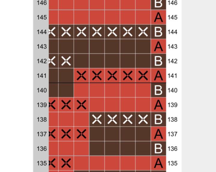
Here’s a small section from one of my mosaic overlay charts from the Tiger Scarf Pattern 👇 At first glance, it looks decorative. But what actually makes it work isn’t the motif. It’s the structure behind it. Notice: • The pattern is consistent across the row • Mosaic stitches fall in a predictable rhythm • The vertical drops align intentionally • The negative space is balanced, not accidental If even one of those elements is slightly off, the design starts to feel “uneven” — even if you can’t immediately see why. Overlay design isn’t just about drawing a shape inside a grid. It’s about controlling: • Rhythm • Anchoring • Width multiples • Visual weight When the structure is solid, you can be far more creative. Structure creates freedom. When you look at overlay charts, what do you notice first — the motif, or the spacing?
1 like • Mar 17
I see spaces first; the hidden yet to be revealed.
Mar 16 •
🧶 What’s on Your Hook Right Now?
Let’s see what everyone is working on this week! Are you currently crocheting: 🔹 A mosaic overlay blanket 🔹 A cushion or smaller project 🔹 One of my patterns 🔹 Designing your own mosaic chart 🔹 Something completely different Drop a photo or comment below and tell us: ✨ What project is it? ✨ What colours are you using ✨ Whether it's going well… or fighting you 😅 I’ll jump in and comment on a few projects too! Let’s fill this discussion with some mosaic inspiration 🧶
1 like • Mar 17
Love trains! Dad worked for CNR.
1 like • Mar 17
Testing a vest for a designer. Working a mosaic pattern for my son's birthday in April. Completing another mosaic blanket. Dreaming of my next projects lol
Feb 13 •
Quick thought…
Something I’ve noticed over the years… Mosaic overlay only feels complicated when it’s approached row by row. When you begin to see it as a series of structural blocks, repeating logic rather than isolated stitches, everything shifts. Charts stop feeling abstract. Diagonals stop feeling advanced. Colour changes stop feeling unpredictable. Design isn’t about memorising symbols. It’s about recognising structure. Have you ever had a moment where mosaic overlay suddenly “clicked” differently for you?
1 like • Mar 17
I learned embroidery and cross-stitching using charts so charts are not intimidating to me. However, charts for 'in the round' confuse me and I usually go with written instructions unless I need to refer to charts.
Feb 11 •
Which Would You Choose?
Same design. Two completely different moods. A = Dramatic contrast of colour B = Soft & subtle Which would you crochet? And why?

1 like • Mar 17
I enjoy the subtleness of the second two colour version. It is peaceful and simple beauty. The first piece is dramatic and I feel the alertness of the animal and it's heightened awareness of something extraordinary happening.
1-10 of 11