Activity
Mon
Wed
Fri
Sun
Aug
Sep
Oct
Nov
Dec
Jan
Feb
Mar
Apr
May
Jun
Jul
What is this?
Less
More
Memberships
AI Automation Society
424k members • Free
Leadership in Land
184 members • Free
Land Home Package Investing
295 members • Free
Dirt To Dollars
2.5k members • Free
Reverse Deal Finder FREE
476 members • Free
1 contribution to Leadership in Land

May 2 •
UnConference Logos--- could use your vote!
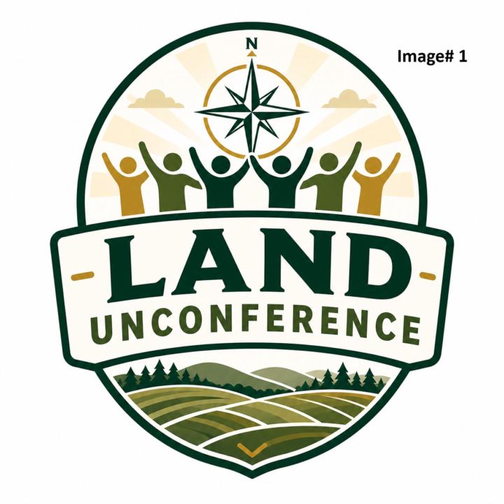
Alright friends, I’d love your input. I'm not a huge branding guy. To me, the whole UnConference "brand" isn't about me---- it's about you!! But it's been highly suggested to me that now that we've been doing this a few years that well... it is time! We’re playing around with a few logo concepts for the Land Unconference, and I’d love to hear which one feels most like the event and community we’re building. I wanted the feeling of getting direction, the power of community, knowing that this is about land investors, and sense of mastermind coming together. I labeled each option in the upper right corner: Logo #1 Logo #2 Logo #3 When you vote, I’d love for you to think about a few things: Which one feels the most like Land Unconference? Which one feels the most inviting and relationship-driven? Which one would look best on a website, shirt, hat, or event sign? Which one makes you think, “Yeah, I’d want to be part of that”? Please vote for your favorite, and if you’re willing, drop a quick comment with why you picked it. Brutally honest but kind feedback is welcome. This is early-stage, so your thoughts really help. Or.... if you have a different logo that you'd like to submit, would really love that too!!
Poll
16 members have voted

1 like • May 4
The logos look nice, but I prefer simpler logos with less detail. If you look at all the major companies, they all have simple logos. That's just my two cents...take it or leave it. :-)
1-1 of 1

@reid-kurtenbach-5416
We fund land deals for land investors nationwide through Parcel Funders (www.parcelfunders.com).
Active 18h ago
Joined May 4, 2026
INTJ
Broomfield, Colorado
Powered by