Activity
Mon
Wed
Fri
Sun
Feb
Mar
Apr
May
Jun
Jul
Aug
Sep
Oct
Nov
Dec
Jan
What is this?
Less
More
Owned by Moses
Memberships
Brendan's AI Community
22.8k members • Free
AI Agents Academy
560 members • Free
GHL Blueprint
1.3k members • Free
The AI Surfer Circle
978 members • $194/m
The THRIVE Community
240 members • $1/month
Skoolers
186.6k members • Free
Digital Roadmap AI Academy
620 members • Free
The CashflowDiary Cartel
180 members • Free
5 contributions to GHL Blueprint

7d •
One tiny funnel tweak did what months of hustle couldn’t.
I didn’t post more. I didn’t rebrand. I didn’t create a new offer. I didn’t hustle harder. I changed ONE thing in my funnel…and suddenly nothing felt forced anymore. That’s when I knew the problem was never me. For the longest time, I truly believed I needed more more content, more ideas, more consistency, more effort. Classic trap. Dead wrong. What actually changed everything was this 👇 A few precise funnel tweaks + deep, strategic guidance on how each step should flow into the next. Not cosmetic changes. Not “make it look nicer” edits. But real, conversion-first strategy. Once that clicked: • My message finally landed with the right people • Conversations felt natural instead of awkward • My funnel started doing the heavy lifting (as it should 😮💨) Here’s the part most people overlook 👇 I didn’t rebuild anything from scratch. I optimized what was already there. That single shift helped me: • Attract intentional leads • Build trust faster • Turn clarity into consistent momentum If your funnel kind of works but feels heavy, confusing, or stuck…you don’t need another template. You don’t need more content. You need strategy + precision. If you want someone who can look at your funnel and instantly say, “Yep — THIS is the tweak that changes everything,” reach out directly to my certified funnel builder. 📲 WhatsApp: +1 (862) 562-6786 Sometimes one strategic move beats 100 random ones. And when your funnel is right… everything else finally breathes.

1 like • 5d
I am still in state of figuring out how to craft funnel pages that work to catch leads, perhaps you can be of assistance.
0 likes • 2d
I am still a beginner, finding my way in the whole digital marketing. So, it will all aspects you mentioned.

9d •
🎆2026 Database Reactivation PLUS+ (VIP Lifetime Access)
I’m starting the year by doing something I’ve never done before — and likely won’t do again. For New Year’s, you can unlock LIFETIME access to both paid tiers of GHL Blueprint: 🔴(DETAILS ARE BROKEN DOWN IN VIDEO BELOW ASWELL)🔴 Premium + VIP ✔ One-time payment ✔ No monthly fees ✔ No annual renewals ✔ Full access forever This is for people who are serious about building real skills, real systems, and real income in 2026. ⭐ What’s Included in Premium (Normally $67/mo or $497/yr) Prospecting Blueprint - Build better lead lists - Book more appointments - Handle objections with confidence - Scripts, messaging angles, and real case studies Weekly Prospecting Coaching Call - Prospecting strategy - Appointment setting - List building - DM & outbound breakdowns 💎 What’s Included in VIP (Normally $247/mo or $997/yr) DBR Elite Bundle (~$997 value) - Complete DBR snapshot - Templates, messaging, and launch system - How to sell DBR as a high-ticket offer Reputation Management Mastery (~$997 value) - Full sprint recordings - How to set it up, sell it, and prospect it - Includes the same snapshot I used to help a client get 30 five-star reviews in 30 days High-Ticket Sales Training - My full framework for closing $5K–$10K deals - The exact structure I use on every sales call Two Weekly GHL Office Hour Calls - Automation help - Troubleshooting - Sales help - Live support launching client campaigns 🚀 NEW: ChatWidget Master Offer Course (Releasing January 5th — included FREE) This course will show you how to: - Turn website chat widgets into revenue-producing assets - Position chat widgets as a paid offer, not a free add-on - Sell and deploy AI-powered chat for local businesses - Stack this offer alongside DBR, Reputation, and Speed-to-Lead If you’ve been wanting a front-end or upsell offer that businesses immediately understand — this is it. 🎁 NEW YEAR BONUS A free 1-hour 1:1 call with me(Normally $250/hr)

0 likes • 5d
Hi Austin, we did talk when I bought the your program, which I am still learning from them. I am new in the Digital marketing space. I wonder if you can have time for me to open my eyes a bit more. I have been listen to your recorded coach, you are relevant to assist me. Please tell me when we can meet online.

Nov '25 •
Stop Chasing, Start Attracting
Real Talk: I’m in the middle of a transformation right now. I’ve been building my business the traditional way for years — hustling, cold outreach, hoping for referrals… and while it worked, growth was slow. Frustratingly slow. Then I started using a system—a sales funnel—to attract, nurture, and convert leads consistently. And let me tell you… it’s like flipping a switch. My business has skyrocketed, and the growth is happening faster than I ever imagined. Here’s the thing: I’m not special. I just found a system that works and committed to it. If you’ve ever felt stuck, overwhelmed, or like you’re spinning your wheels… I get it. I was there too. This funnel didn’t just grow my business — it gave me peace of mind, stability, and freedom to do the work I love. Now, instead of chasing, I’m attracting. Curious to hear from this community: 👉 Who here is using funnels to grow your programs? 👉 And if you’re not yet, what’s been holding you back?
0 likes • 5d
I am still in that state, perhaps you can be of assistance

Dec '25 •
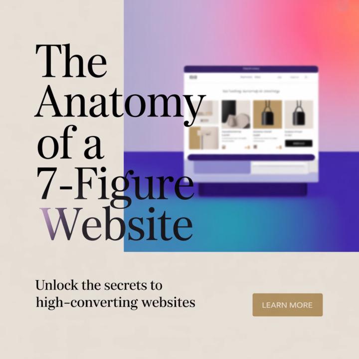
The Anatomy of a 7-Figure Website
Most people think a 7-figure website is about fancy animations, effects, or “looking cool.” Nope. A real high-performing website is simple, spacious, and built for decision-making — not decoration. Here’s what every 7-figure brand site has in common: 1️⃣ Minimalist, High-End Layout Clarity beats creativity .People should know exactly what you do within 3 seconds. 2️⃣ Spacious, Clean Sections Room to breathe = room to think. Crowded sites kill conversions. 3️⃣ Elegant, Modern Typography Your fonts say more about your brand than your colors. Luxury = simplicity. 4️⃣ Strategic Flow, Not Random Pages Hero → Problem → Solution → Proof → Action .Every scroll should lead somewhere intentional. 5️⃣ Visual Depth (Subtle, Not Loud) Soft shadows, light gradients, smooth spacing. Your site should feel premium without shouting. 6️⃣ A Clear CTA That Stands Out No 10 buttons. Just one pathway to take the user forward. The difference between a normal website and a 7-figure one? A normal site “shows. ”A 7-figure site “guides.” If you want, drop your website link in the comments I’ll reply with 3 improvements you can make to increase trust, clarity, and conversions.
0 likes • 25d
rierproperty.org, still under contruction

Dec '25 •
Attention B2B service businesses 🚨
Hey, I’m Raymon. I started as a freelancer building systems… now I’m the white-label automation partner behind 2 companies helping them manage 7+ brands. Agencies bring in clients, I deliver the work inside GHL so their brand looks premium. Automations, appointment systems, chatbots, review flows, voice ai assistants … all done quietly in the background. If you want a reliable partner to fulfill your client projects without hiring a full team, drop “WHITE LABEL” below we can have a quick chat to see if I would be a great fit for your business needs.
1 like • 25d
WHITE LABEL
1-5 of 5

@moses-makgato-2003
Prof Moses Makgato started into property investment since 2007. He empowers professionals to move beyond salaries and build sustainable wealth.
Active 2d ago
Joined Dec 13, 2025
Powered by