Activity
Mon
Wed
Fri
Sun
Aug
Sep
Oct
Nov
Dec
Jan
Feb
Mar
Apr
May
Jun
Jul
What is this?
Less
More
Owned by Matthias
Take your first confident step with AI in 14 days. Personal, but not alone. Practical, no generic tutorials. Regardless of where you are right now.
Memberships
Personal Growth Skool
137 members • Free
Just Create It With AI
493 members • Free
AI for Online Skool Educators
5 members • $9/month
Roast & Promote 🔥📢
229 members • Free
Cut2Freedom | Video Editing
117 members • Free
Digital Quick Start
138 members • Free
AI Business Operating System
10 members • Free
AI OS
1k members • Free
useful AI
23.6k members • Free
47 contributions to Roast & Promote 🔥📢

🔥
2d •
Roast My About Page
We left the UK with remote work, built income online and now travel full-time as a family of 5. We built this community to share and teach: How you can land a fully remote job and work from anywhere. The exact steps on how we grew our social media to a combined 80k+ following and monetised it! This is for you if: ✅ You're stuck in a 9-5 and want more from life ✅ You want to travel, live abroad, and stop waiting to enjoy life Not for you if: ❌ You're not willing to learn or take action Inside, you'll get: 💼 Remote job listings 📱 Ways to build online income ✈️ Guidance on moving abroad 🤝 A community of like-minded people making the same move 🎁 Join today and get the Remote Work Starter Kit on us. CV Review (£50) Brand New Remote-Ready CV (£150) Total value £200. ✅Yours free when you start your 7 day free trial. 🔄 Cancel anytime Members have landed remote roles, built side incomes and moved abroad. You're Next! 🙌 Click The Yellow Button & Start Right Now. https://www.skool.com/workfromanywhere/about


🔥
0 likes • 12h
Hi @Kevin Hall! Happy to read that you hit the road with your whole family! That's fantastic. I often hear about singles/couples, but families, that's great. Today in exactly 11 weeks we'll be moving from Switzerland to BC, Canada. So, the topic is actually, generally interesting for me. For the roast. Reading your about page, I'm wondering what benefit you would give me that I couldn't get with AI. I updated my CV last year with the help of AI for example. If I'm looking for job listing, online portals, I either saved a list from LinkedIn or ask AI to give me some links. I wouldn't join your community, even the topic is interesting to me, but I don't see a clear added value at first. I'm pretty sure you have examples, you helped people doing it, just for me that doesn't pop out immediately. You loose me before you win me.

2d •
Reset & Rebuild - RoW#20
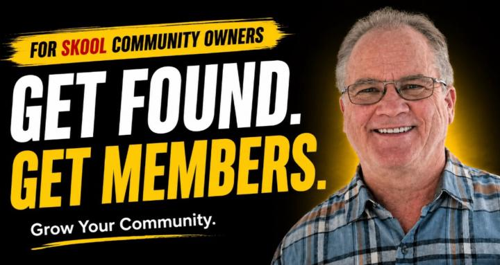
If your community is not getting the attention it deserves it might be the time to go back, fix it and start over again with an improved message. And @Dave Hughes is the best person for that. He is the best roaster, being the first month winner 3 times in a row, because he loves helping people improve their Skool. You can get his direct help at Skool Reset & Rebuild. 💡 Here is what is inside: ✅About page audit + rewrite ✅ Skool search visibility help ✅ Community structure review + fix ✅ Engagement strategies ✅ Weekly coaching + support 🛠️ And what he fixes: - Low engagement - No engagement - Weak engagement - Silent members - Dead communities - Weak About pages - Invisible communities - Weak onboarding - Poor positioning - Weak messaging - Search visibility - Getting members - Engagement problems If you own a community and is not there yet, that is a must. Join now
🔥
4 likes • 2d
Congrats @Dave Hughes

2d •
Roast me PLEASE.. AI Video done DIFFERENT
He everyone you all roasted this in the past and here it is live enjoy and have fun and the person who roast the best will get a token of my appreciation @Paulo Costa, The Roaster will judge it and offer you the gift .... https://storycast.cloud
🔥
4 likes • 2d
Hey @Gary Boyd, thanks for sharing! The website looks super! First impression ✅. Great video in the background, wonderful advertizer! Let me go through what I recognized after second 1 scrolling through the website on desktop computer. - The robot looks sad. Opening a website, seeing a superb clip doesn't match a sad robot in my opinion. - The purple button looks broken to me. I'd make it a one liner as the other one. - Between the nice images, styles and clips there is this sentence "And 3 more styles available". It feels lost in the middle of nowhere and with a not so relevant information. I'd say make a shape/button around it and/or change it to "more styles available". - On the pricing, I'd tend to remove the first check with the "500 monthly tokens" as it says the exact same thing just one line above. And actually that's the place where I would expect it, not in the long list of benefits. You don't need to add more points to these lists, rather make them shorter or change the visualization so the viewer can extract the information better. - Then I saw this one button in another color. Would be okay if it turns that way once I hover over it, but it feels strange. This section is important, but looks not organized. The website is so good, don't loose people in this section. I don't know you, but seeing this I could think "that doesn't look organized. I don't need to buy a mess. I'm out." Why do I feel that way? The "most popular" indication pushes the heading down and out of sync with the others. the buttons are higher and lower depending on the length of the list - and as I said, the color of this one button. - You have four pricing tiers and another one "coming soon". That's a lot. I wouldn't put it underneath the others. And, scrolling down the page, it's weird to me, that the pricing table appears AGAIN and in another format. The second time you even introduce "beta tokens"... that doesn't help me feeling of getting overwhelmed quickly. What are the beta tokens? Why are there two different kind and amount of tokens? Is this second pricing table different from the first one? - And last point: In the footer you have the pricing link again, but the URL changes. Doesn't make sense to me, why you have a third pricing table that you need to maintain. Don't make it too complicated, just refer to the main table on the page.
3d •
BBQ Sunday: 🔊 Music
When you think about a BBQ party with friends and family, what is the first music that comes to mind? For me this is the music that brings me to those moments. Going to a poll, sunny day, meat on the grill, relatives doing chit chat... Anyway here are the scores for Roaster of the Week 🏆1st: @Dave Hughes : 88 points Dave is a Skool guidance expert and several people are very grateful for the help he gives here and takes even further at Skool Reset & Rebuild 🥈 2nd:@Rudy Rodulfo: 16 points Rudy helps you train with purpose, recover with intention and live by faith at TEMPLE - Gym and Wellness 🥉 3rd: @Alexandra Alexa Alexa will help you stop self sabotaging at The Growth Network! Dave is heading for the firstn win of July. But you can still get ahead if you do some sunday grilling! Let's roast!
🔥
1 like • 3d
Congrats Dave! and of course the others 😊
4d •
Hey hi
Little personal news: I'm moving to a different state. I've been living at a different state than my family for the past 4 years. Now im moving back to be closer to them for 2 reasons: - Raising a child away from family support is super hard. - We got our own apartment there, so that means no more rent. Just a small debt for a quick 30 years, it will go by fast. So I'm not giving up on this place. Just too busy trying to box everything, sell some stuff, find a painter to deliver our rented house and other moving arrangements. I'll be back to the old rhythm in a couple of weeks hopefully with better support for everything and more time to work on my projects and give all of you the roastings you're looking for.

🔥
7 likes • 4d
Hey Paulo, that sounds solid! Have a great time moving, settling and organizing everything. I can absolutely relate as we're raising four kids without family support, the nanny went back home after just 3 months and in about 10 weeks we're moving continents. Have a great time man! 😊 You're doing a phenomenal job here.
🔥
6 likes • 4d
@Paulo Costa, The Roaster I heard a bit about the situation in Brazil, yet I can('t) only imagine. For us it was definitely a blessing to have my wife taking care of the kids all the years and we find a way to manage. I know you'll moving towards that day! 😊
1-10 of 47
🔥
@matthias-schweiker-3619
I meet people where they are. Whether you've never touched AI or you're stuck mid-project - I'll help you move. See it yourself: How To AI
Active 23m ago
Joined May 17, 2026
Aargau, Switzerland