Activity
Mon
Wed
Fri
Sun
Mar
Apr
May
Jun
Jul
Aug
Sep
Oct
Nov
Dec
Jan
Feb
What is this?
Less
More
Memberships
SyncRadar
328 members • Free
The Sync Alliance
158 members • $55/month
Cinematic music feedback
96 members • Free
Music Made Easy w/ Andrew Hand
91 members • Free
The Sync Circle
61 members • Free
Cinematic Music Made Easy
203 members • Free
Audio Artist Academy
1.9k members • Free
Audio Artist Rise
104 members • $97/month
36 contributions to Audio Artist Academy

23d •
Trailer cuts?
So I was talking to good ol ChatGPT earlier tonight and had asked it about strategies for contacting publishers. It mentioned using cut versions of my music and that got me thinking as I don’t think I’ve heard of doing that before. Part of its reasoning was my track are too long (2:30-3:00, doesn’t seem too long to me 😂) and people make their decisions within the first 10-15 seconds. I know that’s true. I recognize it’s a bot so I’m skeptical to put all my eggs in that basket. So naturally I came here to see what people think about sending different versions in a demo reel. Would love to hear any feedback in this area as I’m still working to get my first placement!

1 like • 12d
ChatGPT is giving you the wrong advice. If you want to get trailer tracks published, you need a reel with full tracks. Everyone involved in the trailer business will want to look at the waveform of the full track first. Only if that looks usable (i.e. has the proper structure), will they press play.
1 like • 11d
@Zach Broberg Can't remember which videos exactly, but he definitely touches on this point a couple of times in the trailer courses and I've heard him repeat the advice in AAR calls and in 1:1s we've had. Taking a step back, when putting a reel together you just need to take the wants and needs of your target audience in mind. Trailer tracks live and die by their structure, so that is what the reel must demonstrate. A game reel, on the other hand, needs to demonstrate succinctly that you can write for the various needs of a game (main theme, exploration, battle, etc). Different audience, different approach - though it can be the same music. My game reel consists of entirely of choice snippets from trailer tracks - at least for the moment. I'm going to have to write new material, as all the tracks in the reel have now been licensed to a production library. The price of success! 😅

⭐
25d •
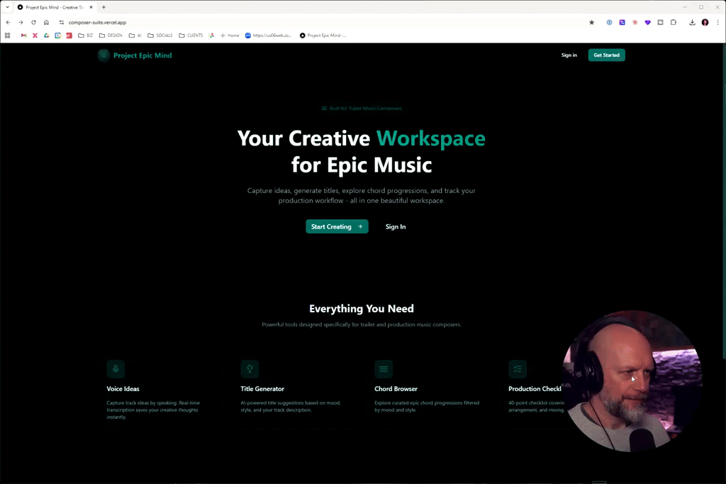
Introducing Project Epic Mind: A Creative Workspace for Epic Music
Hey everyone, I’m excited to share my latest project, called Project Epic Mind, which is a creative workspace designed - at least for now - for epic trailer music. The platform allows you to capture ideas, generate titles, explore chord progressions, and track your production workflow, all while keeping the focus on inspiring creativity rather than replacing it with AI. I’d love your feedback on features and suggestions for the trailer checklist, as I aim to keep things simple and effective. What do you think? Do you have feedback? Suggestions? I am all ears! :)
3 likes • 25d
So… when is this going to be integrated with Growbaze? 😍
Jan 9 •
Using AI images for album artwork and youtube
Hi everyone I have recently heard that a video game that used an AI cover and won game of the year has had the award stripped from them due to the use of AI art for a game cover. Do you think that moving forward we will need to find alternate artwork for Album covers and youtube videos to be safe? Or is it ok to still use AI?
4 likes • Jan 9
The awards were retracted over the use of an AI generated texture (that was patched out shortly after launch): https://kotaku.com/clair-obscur-expedition-33s-loses-indie-game-awards-after-being-accused-of-lying-about-ai-use-2000655119 I'm completely torn about this topic. On the one hand, I believe that (generative) AI is here to stay and use of it is going to be a non-issue in 3-5 years time. Human art (in all its forms) will be considered to be of higher value, but no one will bat an eye at an album cover that is based on an AI generated image... At the same time, the current climate around AI appears to be very explosive, especially in the game industry (where I spend a lot of time). It's gotten to a point where companies get in trouble for posting "AI Programmer" positions, which is insane. AI Programmers within a game studio are those people who make enemies able to find their way around the level and behave in ways that makes games fun to play. Studios who are working on innovative new types of enemy behavior are having to pitch that to investors and publishers without using the word AI, because the using the word can mean instant rejection. Most non-technical people conflate "game AI" (path finding, state machines, etc) with "generative AI" (ChatGPT, Veo, Suno, etc). I don't think use of AI art in a reel used only to attract (B2B) clients is a hot button issue at the moment (heck, all the images in my own reel are AI generated... haven't heard a peep about that). However, anything consumer facing - YouTube, Spotify, etc. - is at risk of getting slammed by the anti-AI mob.

Jan 6 •
Mobile Studio
Hi there! I finally decided to put together a mobile studio so I can keep working even when I’m away from home. I was curious to hear what your mobile setup looks like, if you’re using one. Here’s what I’m currently working with: - MSI 15" PC with 64 GB RAM - 2 TB NVMe SSD for a selection of libraries that let me sketch or build a full track - Arturia MicroLab MK3 - iPad Pro as a second screen when needed - Stream Deck Mobile on my phone Still refining it, but it’s already proving pretty useful.
2 likes • Jan 8
My desktop setup is a MacBook Pro that is docked to my external screen, audio interface and midi controllers via a powered USB hub. Detach the one cable and I’m mobile. (Do have an external SSD with additional libraries on it that stays attached when I take the laptop with me)

Jan 6 •
Favourite Piano VSTs?
Hi Everyone and Happy New Year! Just wondering what some of your favourite realistic-sounding Piano VSTs are? My go-to in trailer tracks is the Felt Piano from Spitfire's Olafur Arnalds Toolkit, but I need something a little less soft for a project I'm working on. I've been using Addictive Keys from XLN Audio for years in personal projects, but I'm not sure it quite has the realism I want/need for this professional project. Though interested if anyone disagrees! Let me know your thoughts! I'm hoping not to break the bank on another piano, but I'd love to have something that sounds super realistic to slot into my wider instrument collection (Nucleus, Metropolis Ark, Damage 2, Gravity etc) Thanks all!
3 likes • Jan 7
Like @Kristóf Fábián, I can recommend NI’s Noire or it’s successor, Claire, which has become my go-to since it came out. ALT Grand from Westwood Instruments if you need a thing with character. For a concert sound, the BBCSO Piano from Spitfire (was a separate add on when I got it).
1-10 of 36

@jim-offerman-4592
I'm an independent (solo) game developer and singer-songwriter from The Netherlands.
Active 2m ago
Joined Mar 12, 2025
Netherlands
Powered by