Activity
Mon
Wed
Fri
Sun
Mar
Apr
May
Jun
Jul
Aug
Sep
Oct
Nov
Dec
Jan
Feb
What is this?
Less
More
Memberships
Drawing & Painting Accelerator
20 members • $150/month
Society of Figurative Art
480 members • Free
57 contributions to Drawing & Painting Accelerator

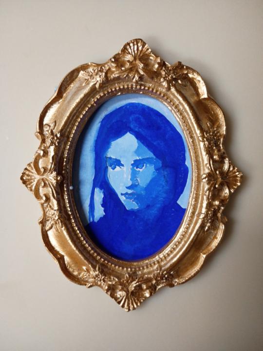
9h •
Quick digital colour study
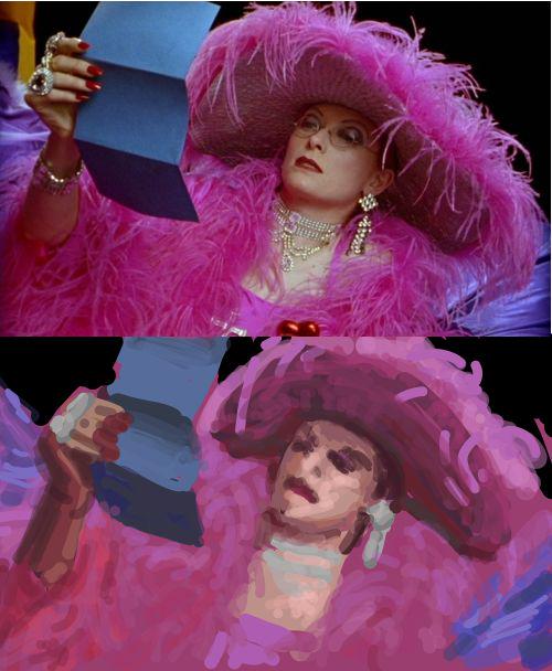
Just something I did while on a train with nothing else going on. Now I'm looking at it again, it feels like the face is too prominent and too warm. To take this further, I'd try to darken the face a little, plus darken more around the head and silhouette of the shoulders to hopefully push them further back. Of course, I could also spend time trying to get a likeness but that wasn't the goal of the exercise. It's interesting to see how chromatic/saturated this kind of material gets. I think the pink feathery stuff transmits light and makes it more intensely colourful. It was also nice to see how colour temperature can tell the story of which planes are facing in which directions. At least it seems to me that the cool blue light tells a story of what faces upwards. Since my train journey finished I could not take it further, and some things like the colour of the jewellery I did not have time to really take a go at. The film is Wittgenstein directed by Derek Jarman by the way.
2
0
9h •
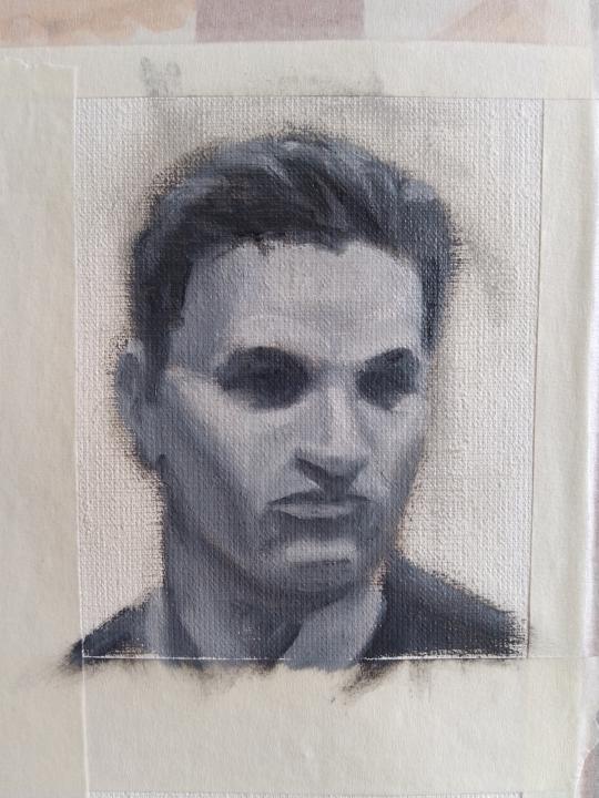
Head study
Another head study with imagined top/butterfly lighting. It's nice to have an exercise that forces me to use some knowledge of planes. The likeness is not great, perhaps because the painting looks too wide and square-jawed. I also feel the form modelling in the mouth and chin is a bit confused. In terms of values, I wonder if I could have pushed some of the darks a bit darker. And finally, with imagined lighting one of the hardest things is to decide on a good shadow border shape. I ended up with something quite simple but it could have been nice to make it a bit more interesting to look at. Nevertheless, I'm still happy with it. It was fun to make and looks human!
1
0
2d •
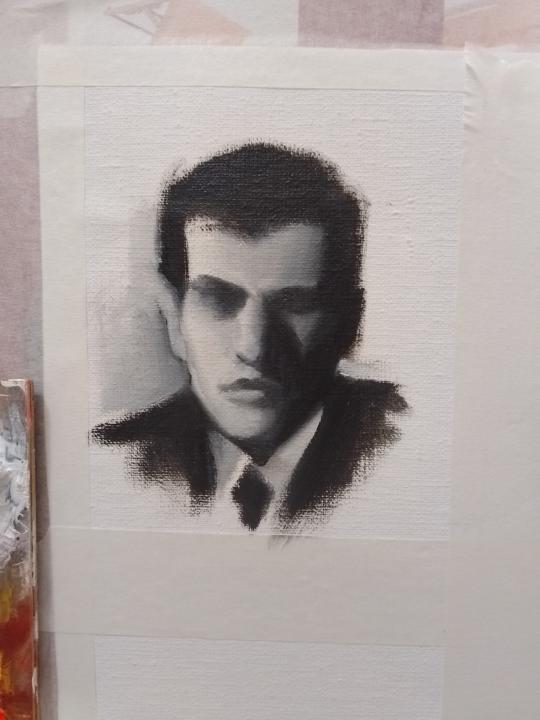
Head sketch
This time I tried another variation. I worked from photo reference but tried to use my imagination to slightly change the position of the light source, basically just as an excuse to test out my knowledge of planes on a problem. I'm not too pleased with the result but that's more a consequence of the drawing being a bit poor. With hindsight I should have spent more time look at the reference. The head angle for example is wrong, and there are simple problems like one of the shoulders not being at the right height. I think the imagined lighting looks alright though.
0 likes • 2d
@Janet Abrahams Thanks!
1 like • 2d
@Chris Legaspi Thank you very much for pointing it out! Now I do see that it's off and has impacted other things like the sizes of the ears. Much appreciated
1 like • 2d
@Janet Abrahams That is pretty small. Nice work getting the eyes and the shadow under the nose and so on.
1 like • 2d
@Janet Abrahams Cool. Rounds are very nice for modulating line thickness. What do you like for oil paints? I like hog hair rounds and I'm not too fussy about the brand -- some of my mid-price ones are better than more expensive ones and so on, the paint brush brands are all a bit confusing for me. Maybe there's just too many competitors in the EU.

4d •
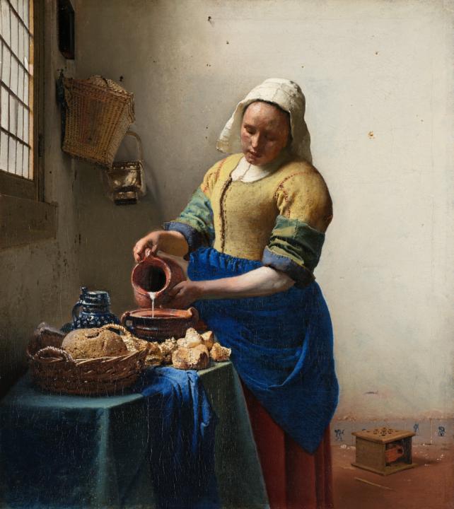
🖼️ Masters Project #2 (Feb 2026) - Master Thread ✍️🎨🤝
⭐ Our master work of the month is: "The Milkmaid" (De melkmeid or Het melkmeisje) by Jahannes Vermeer* Date: C 1657 - 1658 https://en.wikipedia.org/wiki/The_Milkmaid_(Vermeer) Why Vermeer? - I believe he is one of historically great artists/draftsman in human history and is worth of study - The 19th century greats that we idolize all looked to the 17th greats that came before them, so we should do the same - It's good to examine a more "famous" or "mainstream" work from history to see if it's actually worthy of being remembered (hint: Vermeer actually is!) - Personally I admire and need to study, model and examine soft and quiet work/scenes and genres. Soft, quiet, pretty look and aesthetic is something I want to strengthen in my own work. I would like to do 3 paintings by Vermeer this month (see attached). ------------------------- 👉 To join the project: #1. Study this masterwork to the best of your ability and current skill level. #2. Study with intent and care. Learn from the master, don't just copy. #3. Post your work here in this thread. #4. Along with your work share your lessons and thoughts. Drawing/painting with thought and intention = massive learning. #5. Support, encourage and teach your classmates. Treat this project like we are in a live classroom. In live class rooms students collaborate and mentor others. Complete at least 1 master study per week before the deadline so I can give you feedback. I will also do live demo every week on one of the master study paths. For details on how to study at your level scroll down or read the full project post here 👇: https://www.skool.com/drawing-academy/new-group-project-concept-please-read-and-vote?p=1a7d8fe1 🟢 Basically you can be as ambitious as you want - sketches, line drawings, thumbnails or full size/ambitious copies. It's up to you and your current level.
1 like • 4d
Looking forward to this! Just thinking about what you said about his soft and quiet aesthetic, I remember reading an article about authenticating Vermeer paintings where an expert said that "Girl with a Flute" couldn't be his because the main figure is facing the viewer and looking at the viewer and that is just not the Vermeer aesthetic.
1-10 of 57
Active 23m ago
Joined Oct 7, 2025
Powered by