Activity
Mon
Wed
Fri
Sun
Mar
Apr
May
Jun
Jul
Aug
Sep
Oct
Nov
Dec
Jan
Feb
What is this?
Less
More
Owned by Andrew
This is the best way for beginners to learn DaVinci Resolve, built for busy solopreneurs & creators who want a repeatable editing process.
For creators using YouTube as a discovery platform who want help making clear decisions and building a real, sustainable business.
Memberships
Mid-Life Creator Community
187 members • $39/month
The YouTube Blueprint
1.4k members • Free
Skool Growth Free Training Hub
5.7k members • Free
Photography Community
2.1k members • Free
AI Online Educators & Coaches
358 members • Free
The Color Grading Vault
24 members • Free
Skoolers
190.1k members • Free
The 5- Hour YouTuber Community
969 members • Free
The Content Revenue Lab
515 members • Free
2 contributions to The Color Grading Vault

14d •
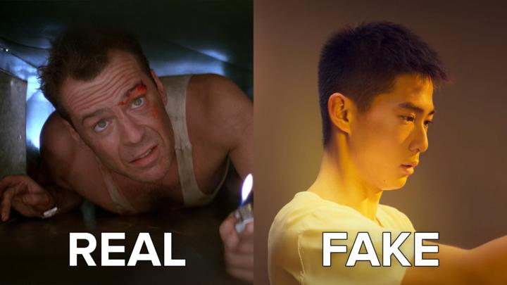
Die Hard vs Hitman 4: What Classic Films Teach Us About Authentic Color Grading
Introduction: A 14-Year-Old Changed My Perspective Christmas 2025. I'm sitting with my nephew—he's 14, grew up on Spider-Man movies and Fortnite—watching Die Hard for probably the 50th time in my life. Out of nowhere, this kid drops a bomb on me: "Uncle Qazi, this feels like they didn't even grade this movie. It just feels so realistic. Like, it just feels like what I'm seeing in this room." I nearly spit out my drink. Here's a kid who's been raised on CGI spectacles, HDR everything, and hyper-stylized content... and he's blown away by how REAL a 1988 action movie looks. That moment made me realize something profound: We've lost the plot in modern color grading. Fast forward a few days. I bought IP Man 4: The Finale on Apple TV (highest quality, Dolby Vision, the works). I'm a massive fan of the franchise, so I was pumped. And within 10 minutes, I wanted to throw my remote at the screen. It looked TERRIBLE. Washed out. Over-stylized for no reason. Distractingly bad. And this is a 2019 film with every technological advantage imaginable. So today, we're doing a deep dive: Die Hard (1988) vs IP Man 4 (2019)—and what these two films teach us about authentic color grading, when to stylize, and why "more technology" doesn't always mean "better results." Buckle up. This is going to be eye-opening. --- The Die Hard Masterclass: When Invisible Grading is Perfect Grading Shot Analysis: Bruce Willis in the Nakatomi Plaza Let's break down one of the most iconic scenes in action cinema: Bruce Willis, bloodied and exhausted, navigating through the Nakatomi Plaza. What you're seeing: - Shot on 35mm film (Panavision cameras) - Lit with practical lights and traditional tungsten fixtures - Minimal color timing in post (this is pre-DI era) - Natural skin tones with slight warmth from interior lighting - True blacks in the shadows - Blown-out practicals (the lamps in the background) Why it works: 1. The skin tones are PERFECT. Bruce Willis looks exactly like a human being would look in that environment. There's natural warmth from the 3200K tungsten lights in the room. His skin has texture, dimension, and reality. You're not thinking about color grading—you're thinking about whether John McClane is going to survive. 2. The contrast is authentic. Look at those blacks. They're actually BLACK. The shadows have weight. And when you see a bright light source (like the lamp in the background), it's blown out—just like it would be if you tried to look at a bright bulb with your own eyes. 3. The color palette matches the environment. Interior office building at night? Warm tungsten lights. Outside the windows? Cool blue moonlight and city lights. It's exactly what you'd see if you were there. 4. The dynamic range limitations ADD to the realism. Film stock in 1988 couldn't capture the same dynamic range as modern digital cameras. So when a light is bright, it blows out. And you know what? That's how our eyes work too. We can't look directly at a bright light without squinting or looking away. The "limitation" actually enhances the authenticity.

2 likes • 4d
This was great! Thanks for sharing!
1 like • 4d
@Waqas Qazi 👍 maybe even a video walkthrough of these types of posts.
5d •
Do you have color grading experiences?
Do you have color grading experiences?
Poll
6 members have voted
3 likes • 4d
I do have some experience, but not as a colorist, just what I’ve explored for the projects I’ve worked on.
1-2 of 2

@andrewgfarmer
Follower of Jesus, Husband, Dad of 5, Helping Creators Make Better Videos, F1 Fan, Tech Nerd, & I Drink Cold Coffee.
Active 40m ago
Joined Jan 31, 2026
Powered by