
Jan 21 • General discussion
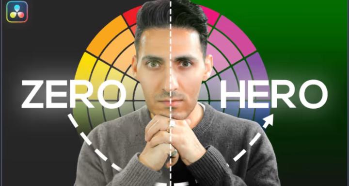
Die Hard vs Hitman 4: What Classic Films Teach Us About Authentic Color Grading
Introduction: A 14-Year-Old Changed My Perspective
Christmas 2025. I'm sitting with my nephew—he's 14, grew up on Spider-Man movies and Fortnite—watching Die Hard for probably the 50th time in my life.
Out of nowhere, this kid drops a bomb on me:
"Uncle Qazi, this feels like they didn't even grade this movie. It just feels so realistic. Like, it just feels like what I'm seeing in this room."
I nearly spit out my drink.
Here's a kid who's been raised on CGI spectacles, HDR everything, and hyper-stylized content... and he's blown away by how REAL a 1988 action movie looks.
That moment made me realize something profound: We've lost the plot in modern color grading.
Fast forward a few days. I bought IP Man 4: The Finale on Apple TV (highest quality, Dolby Vision, the works). I'm a massive fan of the franchise, so I was pumped. And within 10 minutes, I wanted to throw my remote at the screen.
It looked TERRIBLE. Washed out. Over-stylized for no reason. Distractingly bad. And this is a 2019 film with every technological advantage imaginable.
So today, we're doing a deep dive: Die Hard (1988) vs IP Man 4 (2019)—and what these two films teach us about authentic color grading, when to stylize, and why "more technology" doesn't always mean "better results."
Buckle up. This is going to be eye-opening.
---
The Die Hard Masterclass: When Invisible Grading is Perfect Grading
Shot Analysis: Bruce Willis in the Nakatomi Plaza
Let's break down one of the most iconic scenes in action cinema: Bruce Willis, bloodied and exhausted, navigating through the Nakatomi Plaza.
What you're seeing:
- Shot on 35mm film (Panavision cameras)
- Lit with practical lights and traditional tungsten fixtures
- Minimal color timing in post (this is pre-DI era)
- Natural skin tones with slight warmth from interior lighting
- True blacks in the shadows
- Blown-out practicals (the lamps in the background)
Why it works:
- The skin tones are PERFECT. Bruce Willis looks exactly like a human being would look in that environment. There's natural warmth from the 3200K tungsten lights in the room. His skin has texture, dimension, and reality. You're not thinking about color grading—you're thinking about whether John McClane is going to survive.
- The contrast is authentic. Look at those blacks. They're actually BLACK. The shadows have weight. And when you see a bright light source (like the lamp in the background), it's blown out—just like it would be if you tried to look at a bright bulb with your own eyes.
- The color palette matches the environment. Interior office building at night? Warm tungsten lights. Outside the windows? Cool blue moonlight and city lights. It's exactly what you'd see if you were there.
- The dynamic range limitations ADD to the realism. Film stock in 1988 couldn't capture the same dynamic range as modern digital cameras. So when a light is bright, it blows out. And you know what? That's how our eyes work too. We can't look directly at a bright light without squinting or looking away. The "limitation" actually enhances the authenticity.
The Walter Murch Principle in Action
Walter Murch—the legendary editor behind The Godfather, Apocalypse Now, and The English Patient—famously said: "The best editing is where the edit is invisible."
Die Hard's color grading (or lack thereof) embodies this perfectly. You're not watching "a movie with great color grading." You're watching John McClane fight terrorists. The grading gets out of the way and lets the story, performances, and cinematography do the talking.
This is the gold standard for:
- Action films set in realistic environments
- Dramas
- Thrillers
- Period pieces (when you want authenticity)
- Any narrative where realism serves the story
The Technical Breakdown
Let's get nerdy for a second. Here's what's happening technically:
- White balance: Properly set for the tungsten interior lighting (~3200K)
- Exposure: Exposed for the subject (Bruce Willis), letting the practicals blow out naturally
- Contrast: Full range from true black to clipped whites
- Saturation: Natural and restrained—colors look exactly like they would in real life
- Skin tone placement: Right on the vectorscope line where it should be
- Color temperature: Warm interiors, cool exteriors—natural environmental color
The result? Timeless. Die Hard looks just as good today as it did in 1988 because it's grounded in reality.
---
The IP Man 4 Disaster: When Technology Meets Bad Decisions
Now let's talk about IP Man 4: The Finale (2019).
I'm not exaggerating when I say this might be one of the worst-graded films I've seen from a major studio in the last decade. And I LOVE the IP Man franchise, which makes this even more painful.
Shot Analysis: The Grey Curse in Full Effect
Pull up any scene from IP Man 4, and you'll see the same problems:
What you're seeing:
- Shot on modern digital cameras (probably ARRI Alexa or RED)
- Massive dynamic range capability
- Professional lighting
- And then... someone destroyed it all in the color suite
The problems:
- Everything is grey. Look at the waveform. Nothing hits true black. Nothing breathes at the top. Everything lives in the middle. It's flat, lifeless, and boring.
- The colors are simultaneously washed out AND over-saturated. How is that even possible? The practicals (light bulbs) are this weird, gunky yellow that doesn't exist in nature. But the overall image feels desaturated and muddy.
- Zero contrast. The blacks aren't black. The whites aren't white. There's no separation, no depth, no dimension.
- Skin tones are all over the place. Sometimes too warm, sometimes too cool, never quite right.
- It's a PERIOD PIECE. This is set in the real world, in real locations, with real people. Why are we stylizing it like it's a sci-fi film? What purpose does this serve?
The Frustrating Part: They Had Everything They Needed
Here's what kills me about IP Man 4: They had EVERY advantage.
- Modern digital cameras with 14+ stops of dynamic range
- Professional crew
- Beautiful locations
- Talented actors
- Decades of color grading knowledge and tools
And they ended up with something that looks worse than a film shot 30+ years earlier with "inferior" technology.
Why?
Because technology doesn't make good color grading. Good decisions make good color grading.
What They Should Have Done
IP Man 4 should have looked like Die Hard. Period.
It's an action film set in the real world. The story is grounded. The martial arts are realistic and brutal. The tone is serious.
So the color grading should have been:
- Neutral and authentic
- Proper contrast with true blacks
- Clean, accurate skin tones
- Natural color palette that matches the environments
- Invisible—letting the story and performances shine
Instead, they went for this weird, washed-out, over-stylized look that serves absolutely no purpose and actively distracts from the film.
Real talk from Qazi: I bought this movie. I rarely buy movies—I have every streaming service. But I love IP Man, so I purchased it on Apple TV for the highest quality possible. And I couldn't even finish it because the color grading was so distractingly bad. That's a failure on every level.
The Technology Paradox: Why More Isn't Always Better
Let's address the elephant in the room: Why do older films often look better than modern ones?
Film vs Digital: The Great Debate
Film (Die Hard, 1988):
- Limited dynamic range (~10-12 stops)
- Natural grain structure
- Organic color response
- Forces you to expose correctly on set
- Minimal post-production manipulation
- Color timing, not color grading
Digital (IP Man 4, 2019):
- Massive dynamic range (14+ stops)
- Clean, noise-free image
- Infinite color manipulation in post
- Can "fix it in post" mentality
- Extensive color grading capabilities
- RAW files with maximum flexibility
On paper, digital should win every time. So why doesn't it?
The "Fix It in Post" Trap
Here's the dirty secret of modern filmmaking: Digital cameras have made people lazy.
When you shoot film, you have to get it right on set. Lighting, exposure, white balance—everything has to be dialed in because you can't fix it later. This forces discipline and intentionality.
With digital, you can shoot flat LOG profiles and say "we'll figure it out in post." And that's where things go wrong.
Colorists are handed footage that's:
- Under-lit
- Improperly white balanced
- Shot in the wrong color space
- Exposed incorrectly
And then they're expected to "make it look cinematic" in the grade. So they start pushing and pulling, adding contrast here, saturation there, trying to create something from nothing.
The result? Over-graded, over-stylized, unnatural-looking images. Like IP Man 4.
The Discipline of Limitation
Die Hard looks great partly BECAUSE of its limitations.
The filmmakers couldn't rely on fixing things in post. They had to:
- Light it properly on set
- Expose correctly
- Use practical lighting that motivated the scene
- Make intentional choices about color temperature
And because they did all that work upfront, the "color grading" (really just color timing) was minimal.
They weren't trying to create a look—they were just making sure everything matched and looked natural.
Lesson: Constraints breed creativity and discipline. Unlimited options breed indecision and over-manipulation.
Case Study: Misery (1990) - The Perfect Middle Ground
Let's look at another classic: Misery (1990), directed by Rob Reiner, shot by Barry Sonnenfeld.
This film is a MASTERCLASS in authentic color grading.
What Makes Misery's Color Grading Perfect
Exterior scenes:
- Natural blue in the shadows (because that's what happens in real life—shadows reflect the blue sky)
- Proper contrast with deep blacks
- Snow that actually looks like snow (not blown out, not grey)
- Color temperature that matches the time of day
Interior scenes:
- Warm tungsten lighting from practical sources
- Papers and objects picking up that warmth naturally
- Skin tones that look like actual human skin
- The greyest grey you'll ever see (true 18% grey)—not the "grey curse" grey
Why it works:
- It respects reality. When you're outside in the snow, shadows ARE blue. When you're inside with warm lights, things ARE warm. The color grading matches what your eyes would see.
- The contrast is perfect. Blacks are black. Whites are white. There's dimension and depth to every frame.
- It serves the story. This is a psychological thriller about isolation and captivity. The authentic, slightly cold color palette enhances that feeling without being heavy-handed.
- The color rendition is accurate. Sticky notes look like sticky notes. Red markers look like red markers. Wood looks like wood. Nothing is pushed or stylized unnecessarily.
This is what modern films should aspire to when they're telling grounded, realistic stories.
---
When to Break the Rules: Dune, Wicked, and Fantasy Worlds
Now, here's the important caveat: Not every film should look like Die Hard.
Some stories DEMAND stylization. Some worlds NEED to look different from reality.
Dune (2021): Stylization Done Right
Denis Villeneuve's Dune is heavily stylized. The color palette is desaturated, pushed toward amber and teal, with a hazy, dusty quality throughout.
And it works perfectly. Why?
- We're on an alien planet. We've never been to Arrakis. We don't know what it "should" look like. So we buy the stylization.
- It's consistent. Every frame feels like it exists in the same world. There's a cohesive visual language.
- It serves the story. The harsh, desaturated look reinforces the brutal, unforgiving nature of the desert planet.
- It's intentional. Every choice feels deliberate and motivated by the narrative.
This is fantasy done right. When you're creating a world that doesn't exist, go for it. Stylize. Create. Push boundaries.
The Wizard of Oz (1939): The OG Color Master
Want to see how to do vibrant, stylized color? Look at The Wizard of Oz—the FIRST color film ever made.
Those colors POP. They're bold, saturated, and beautiful. And it works because:
- It's a fantasy world
- The vibrant colors contrast with the sepia-toned Kansas scenes
- It's intentional and serves the "over the rainbow" concept
- The colors have WEIGHT—they're not washed out or muddy
Compare that to Wicked (2024), which should have been a spiritual successor to Oz's color palette. Instead, it's grey, washed out, and lifeless. A film about a magical, colorful world that looks like someone smudged Vaseline on the lens.
The lesson: If you're going to stylize, COMMIT. Don't half-ass it.
---
The Spider-Man Problem: Fantasy Films That Look Like Home Videos
Let's talk about the Marvel Cinematic Universe for a second.
Spider-Man: Far From Home is a superhero movie. Peter Parker has superpowers. He's fighting villains with elemental powers. He's swinging through European cities in a high-tech suit.
This is FANTASY. This is where you should be having FUN with color.
So why does it look like I shot it on my iPhone with #nofilter?
The scene in Italy:
- Flat, washed-out colors
- No contrast
- Boring, lifeless image
- Looks like a travel vlog, not a superhero movie
What it should have looked like:
- Vibrant, saturated colors (it's Italy!)
- Strong contrast
- Dynamic, exciting color palette
- Something that makes you go "wow, this is a superhero movie!"
This is the opposite problem from IP Man 4. IP Man should have been neutral and authentic but was over-stylized. Spider-Man should have been stylized and exciting but was flat and boring.
Both films failed because they didn't match the grade to the genre.
---
The Qazi Framework: Matching Grade to Genre
After 15 years working with everyone from Kanye to Drake to major Hollywood cinematographers, here's my framework for deciding how to approach color grading:
Go Neutral & Authentic When:
- The story is grounded in reality
- It's a drama, thriller, or realistic action film
- It's a period piece (unless there's a creative reason to stylize)
- It's documentary or corporate work
- The goal is to make the audience forget they're watching a movie
Examples: Die Hard, Misery, No Country for Old Men, There Will Be Blood
Tools: Check out professional color grading tools at Qazverse for presets like "Jurassic World Rebirth" that give you clean, neutral, cinematic looks in one click.
Go Stylized & Bold When:
- It's a fantasy or sci-fi world
- It's a superhero film
- It's a music video
- It's a fashion/editorial piece
- You're creating a world that doesn't exist
Examples: Dune, Blade Runner 2049, The Matrix, Mad Max: Fury Road
Tools: For stylized looks, RapidGrade offers presets like "Tasteful Teal and Orange" and "Amber Silk" that let you create bold, cinematic looks without spending hours building from scratch.
The Key Question:
Before you touch a single node, ask yourself:
"Does this story take place in the real world, or am I creating a fantasy?"
That one question will guide every color decision you make.
---
Practical Lessons: What You Can Apply Today
Alright, let's make this actionable. Here's what you should take away from the Die Hard vs IP Man 4 comparison:
Lesson 1: Respect Your Source Material
If you're working on a realistic project:
- Don't over-stylize
- Match the color temperature to the environment
- Keep skin tones natural
- Use proper contrast
- Let the story breathe
Lesson 2: Technology is a Tool, Not a Solution
Having the latest camera or the most powerful color grading software doesn't matter if you're making bad creative decisions.
Focus on:
- Proper exposure on set
- Good lighting
- Intentional color choices
- Serving the story
Lesson 3: Contrast is King
Both Die Hard and Misery have one thing in common: proper contrast.
- Blacks that are actually black
- Whites that breathe at the top
- Separation between foreground and background
- Depth and dimension
If your image is living in the middle (the grey curse), you've already lost.
Lesson 4: Skin Tones are Non-Negotiable
Die Hard: perfect skin tones.Misery: perfect skin tones.IP Man 4: inconsistent, often wrong skin tones.
Your priority list should be:
- Skin tones
- Contrast
- Everything else
Get those two right, and you're 80% of the way there.
Lesson 5: Build a Reference Library
Stop guessing. Start referencing.
Create a folder with screenshots from:
- Die Hard - for authentic action
- Misery - for perfect contrast and natural color
- Dune - for stylized fantasy
- The Wizard of Oz - for vibrant, bold color
- No Country for Old Men - for neutral drama
Before you start grading, pull up a reference and ask: "Should my project look more like Die Hard or more like Dune?"
----
The Workflow Solution: Stop Reinventing the Wheel
Here's the brutal truth: In 2026, clients don't care how you achieved the look. They care about results.
If you're spending 6 hours building a neutral, authentic look from scratch, you're wasting time. Professional colorists use professional tools.
What changed my career:
After working with the biggest names in music and film, I realized I was spending too much time on technical execution and not enough time on creative decisions.
So I built a system: professional color grading presets developed over 15 years of experience. Now I can:
- Apply a neutral, cinematic look in one click
- Spend my time on creative refinement
- Deliver projects faster
- Take on more clients
Want to work smarter? Check out the professional color grading tools at Qazverse. Whether you're going for a Die Hard-style authentic look or a Dune-style fantasy aesthetic, having professionally-built presets saves you hours and delivers better results.
---
The Future of Color Grading: Back to Basics
Here's my prediction: We're going to see a return to authentic, natural color grading in the next few years.
Why? Because audiences are getting tired of the grey curse. They're tired of washed-out superhero movies and over-stylized dramas that serve no purpose.
My 14-year-old nephew—who grew up in the age of digital everything—was blown away by how REAL Die Hard looked. That tells you something.
The pendulum is swinging back.
Smart filmmakers and colorists are going to embrace:
- Proper contrast
- Natural skin tones
- Authentic color palettes
- Invisible grading that serves the story
And the ones who don't? They're going to keep making IP Man 4-level mistakes and wondering why their work doesn't resonate.
----
Your Action Plan: Grade Like Die Hard, Not Like IP Man 4
Here's what to do right now:
Step 1: Watch These Films with Fresh Eyes
Pull up:
- Die Hard (1988)
- Misery (1990)
- No Country for Old Men (2007)
Watch them specifically for the color grading. Notice:
- How natural the skin tones are
- How strong the contrast is
- How the colors match the environment
- How INVISIBLE the grading is
Step 2: Audit Your Current Project
Open up whatever you're working on right now and ask:
- Is this a realistic story or a fantasy?
- Does my grade match the genre?
- Are my skin tones accurate?
- Do I have proper contrast?
- Am I over-stylizing for no reason?
Step 3: Build Your Toolkit
Stop wasting time building looks from scratch. Invest in professional tools that let you work faster and deliver better results.
Ready to level up? Visit Qazverse for professional color grading presets, plugins, and training from someone who's worked with the biggest names in the industry.
Step 4: Practice Restraint
For your next realistic project, challenge yourself:
- Use minimal nodes
- Focus on contrast and skin tones
- Don't add unnecessary stylization
- Make the grade invisible
You'll be amazed at how much better your work looks when you get out of the way.
---
Final Thoughts: The Invisible Art
Die Hard doesn't have "great color grading" in the traditional sense. It has PERFECT color grading because you don't notice it.
You're not thinking about the colors. You're not distracted by weird stylization. You're just watching John McClane be a badass.
That's the goal.
IP Man 4 fails because the color grading is distractingly bad. It pulls you out of the story. It makes you think "why does this look so weird?" instead of caring about the characters.
Your job as a colorist isn't to show off. It's to serve the story.
Sometimes that means bold, stylized looks (Dune).
Sometimes that means invisible, authentic grading (Die Hard).
The key is knowing which approach serves the project—and having the discipline to execute it properly.
Now go watch Die Hard again. Study it. Learn from it. And apply those lessons to your next project.
Your clients will thank you.
---
FAQ: Die Hard vs Modern Color Grading
Q: Should I shoot on film to get the Die Hard look?A: No. You can achieve authentic looks with digital cameras. The key is proper lighting on set and restrained grading in post. Shoot in LOG or RAW, expose correctly, and don't over-manipulate in the grade.
Q: What's the best way to learn authentic color grading?
A: Study classic films from the 80s and 90s. Watch Die Hard, Misery, The Fugitive, Heat. Notice how natural everything looks. Then try to replicate that with your own footage. Also, check out professional training at Qazverse.
Q: Why do modern films look so grey?
A: Multiple reasons: shooting flat LOG profiles and over-correcting in post, trying to preserve dynamic range at the expense of contrast, following trends instead of serving the story, and lack of discipline in the color suite.
Q: Can I use LUTs to get the Die Hard look?
A: LUTs can be a starting point, but Die Hard's "look" is really just proper exposure, good lighting, and minimal manipulation. Focus on nailing your contrast and skin tones first. Professional presets from Qazverse can help you achieve clean, neutral looks quickly.
Q: Is it okay to stylize period pieces?
A: It depends. If the stylization serves the story (like O Brother, Where Art Thou?), yes. But if you're going for historical authenticity (like IP Man should have), keep it neutral and realistic.
---
Want to master authentic color grading like the classics? Join the community at Qazverse for professional tools, training, and resources from Qazi, who's spent 15 years working with the biggest names in film and music.
Drop a comment below: Team Die Hard or Team IP Man 4? (Just kidding, we all know the answer.) But seriously—what's your favorite example of authentic color grading? Let's discuss. 👇
3
5 comments
Die Hard vs Hitman 4: What Classic Films Teach Us About Authentic Color Grading
skool.com/the-color-grading-vault-3449
Your Complete Color Grading Knowledge Base. QazVerse
Leaderboard (30-day)
1

🔥
+2
Powered by