
Pinned

8d •
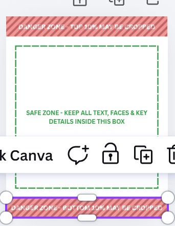
Week 6 Canva Templates
https://canva.link/hdi3gnj7ictf66f Square 1:1 (1080 X 1080) https://canva.link/0oh7s6gxmkas25d 4:5 Feed (1080 X 1350) https://canva.link/fcp2uzn2yaq6bj6 9:16 Stories and Reels (1080 X 1920) Use it to check your image, move the text around, etc. Just copy this to your Canva. When you open it, you can hit duplicate image so the original sizer isn't modified directly
Pinned
11d •
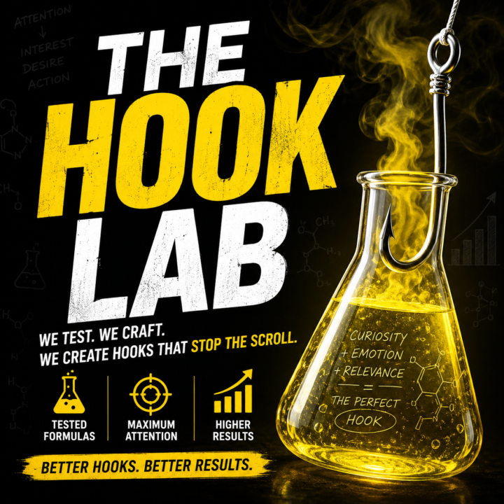
Hook Lab: The Claude Skill
Most book ads fail at the first line — the hook. Hook Lab fixes that. Tell it your book and it writes a full set of scroll-stopping hooks across all four types (curiosity, emotion, provocation, story fragment), for both image and video, including ready-to-shoot one-two-punch reveals. Already have a hook? Paste it in and Hook Lab scores it out of 12, tells you exactly what's weak, and rewrites it stronger. No more guessing whether your ad is telling instead of showing. Upload your book and get hook suggestions after you list your genres, your tropes. Bullet version (feature list) - Generates 3 image + 3 video hooks from just your title, genre, and premise - Covers all four hook types and flags the one to test first - Audits any hook on a 6-point rubric with specific fixes — not vague feedback - Catches the classic killers: telling, salesy, generic, name-soup, jargon, too-long - Outputs paste-ready text or a branded Word doc Available in the Premium Benefits Classroom only! It will be uploaded shortly!
8
0
8h •
The ad that made people mad (and built our business)
The ad that built a huge chunk of our business made people mad. It asked, flat out: Is M.D. Cooper the next Larry Niven? Sci fi readers had OPINIONS. The comments lit up. And the clicks came. Here's the lesson I teach now: the goal of an ad is not to be liked. The goal is to be noticed. A polite ad that nobody reacts to is invisible. And invisible doesn't sell books. What's an ad idea you've been too nervous to run? Tell me. Let's pressure-test whether it's actually too bold, or just bold enough.

2d •
Bestie Claude
Bestie Claude suggested several fixes to improve the scoring. If you aren't using the AI analysis prompt Jill uploaded, I highly recommend. Claude still drags me about the background in the Spousal Death photo, but I might still try it and see how it does since it's the background that is cuing the genre and feel of the book.
2d •
Where are your spoons going this week?
Real talk for the middle of the week. You have a limited number of spoons in a day. Energy units. And the publishing world will happily eat every one of them with drama, doom-scrolling, and arguments that change nothing. Choose where your spoons go. The author who guards her energy and quietly gets the work done will outlast the one who burns out winning internet fights. Keep your head down. Get stuff done. What is stealing your spoons this week? Name it here. Sometimes saying it out loud is how you take the energy back.
1-30 of 1,631
Leaderboard (30-day)
1
+39
2
+32
3

+19
4
+17
5
+16
Powered by