
Write something
3d •
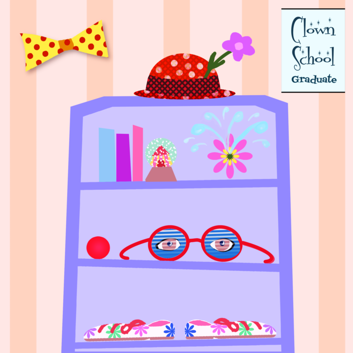
Sunglasses prompt
This was all kinds of fun to make! (Fonts are Fontdinerdotcom Sparkly and Fontdiner Swanky, both free for personal use.)
45m •
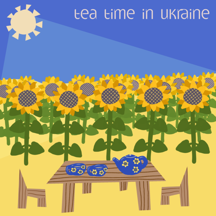
Prompt: Tea, farm, busy, yellow & blue
The colors yellow and blue immediately brought Ukraine to mind with their fields of sunflowers. Clearly these growers have been busy, and soon will take a tea break! I first thought of the watermelons - my favorite food - which they also grow quite splendidly when they can, but the color theme spoke sunflowers. Font is Gatometrix by the Polish fontmaker Gluk. Be sure to check out his other many wonderful fonts for which he generously allows personal use. https://www.dafont.com/gatometrix.font
0
0
5d •
Wednesday Check-In
Alright, now that my studio makeover is done, I can focus again on what’s most important to all of us: art-making. 😇 So, I would like to ask you today: What’s one tiny thing that has made art-making easier or more enjoyable for you lately? Let’s all share our little tips and tricks so we can learn from one another! Mine is: Using the same color palette for several drawings instead of starting from scratch every time. Not only does it help tremendously while drawing, but it also creates this cohesive look that people recognize as “style”. It can also be a limitation that makes you think outside the box! What if the item you would like to draw is originally red, but you don’t have red in your color palette? Now you’re practicing problem-solving, too! Now tell me yours! 👇
6d •
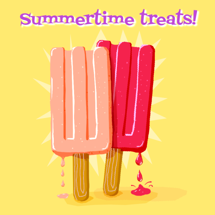
My popsicles are melting!
I was reminded in one of the chats here of a time in the 1960s when my younger sister thought half a popsicle would save for later in the under-chair storage area of her school desk. I was called in to clean up the sticky puddle. Hot New Orleans almost-summers in a school without air conditioning gave that poor popsicle no chance! (Unlike the time I visited a family in Denver that was storing boxes of ice cream on their porch in winter!)
23d •
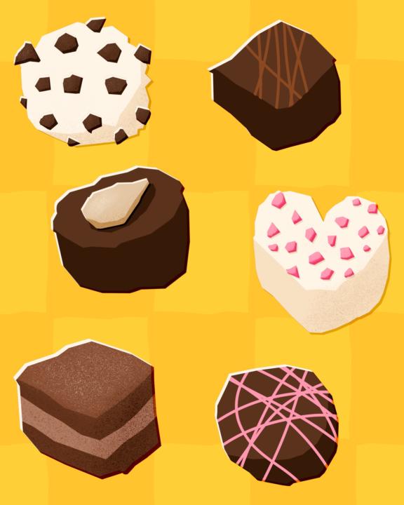
Update on the chocolates pattern
since so many of you asked for it, here comes my updated chocolates pattern! This is what I did: - I duplicated the original canvas to keep the old version and work freely on a duplicate, just in case! 😁 - I removed the checkerboard pattern and went with a plain yellow. I tried green and purple, but yellow was my favorite. - I added a different upscaled checkerboard pattern in the same yellow, but set the blend mode to screen to create a brighter hue. Then turned down the opacity until I liked the contrast. - I changed the color of 2 of the pralinés to white, to have more variety - I kept the chocolate in one layer apart from the background so I could still make adjustments to both background (i.e. different colors!) but also to slightly move & rotate some of the chocolates, just to get rid of too much order In general, this is once more a great example for me that less is definitely more, especially when it‘s about the background. Now I am pretty content with the result, although it is lacking a bit of contrast, green or purple would probably look better. I just love the yellow… 😇 What do you think about the before and after?
1-9 of 9
powered by
skool.com/the-wonky-art-society-4784
Better your art the low-pressure way. Practice with joy, draw more, and grow your skills in a friendly creative community.
Suggested communities
Powered by