

May 29 •
Challenge?
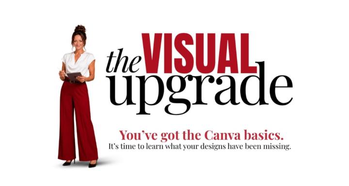
How are those magazine covers coming along? Here’s mine so far! Share what you’ve got if you want to ♥️ There’s replays available if you’d like to watch them

Jun 5 •
Magazine Cover Reviews
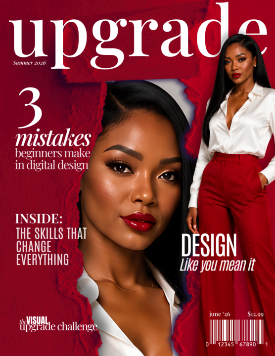
If you’ve submitted an entry for the magazine cover challenge - your review is in your inbox! I haven’t gone live to review yet bc I know there’s at least one person who asked for additional help ❤️ If you participated in the challenge and would like to show off your work, post it in the comments below 👇 Here’s mine 👀 Thank you to all who participated!! We will do a coworking session tomorrow to work on the new one… y’all ready?
May 25 •
Weekly Challenges, Magazine Cover
Watch the video to understand where to find the weekly challenges, how to submit, and all the details you need to successfully complete the challenge!

Jun 1 •
June 1-7, 2026 Challenge explained!
A new challenge has dropped! Watch the video for the details ❤️

May 31 •
Need another day?
I only have one challenge entry. It’s 654pm. Do yall need another day? Another coworking session for it?
Poll
1 member has voted

1-19 of 19
powered by
skool.com/the-canva-curriculum-6147
Learn Canva with hands-on training, weekly events, templates, a free eCourse & tools to make your brand stand out.
Suggested communities
Powered by