
30d • General discussion
🚨 Need Your Honest Feedback 🚨
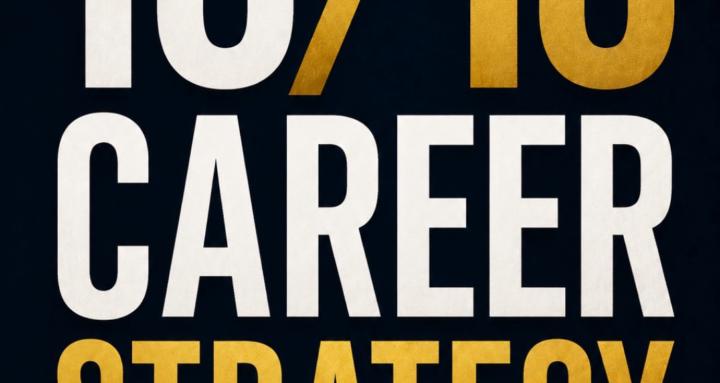
I've just finished the cover design for my upcoming book, 10/10 Career Strategy, and before I lock it in, I'd love some honest opinions from this community.
The goal is simple:
👉 Make busy professionals stop scrolling.
👉 Instantly understand who the book is for.
👉 Feel compelled to pick it up.
A few questions:
- Would this make you stop and take a closer look? Why or why not?
- What's the first impression you get from the cover?
- Does the title and subtitle clearly tell you what the book is about?
- Is there anything that feels confusing, too busy, or unnecessary?
- If you saw this on Amazon, would you click on it?
I'm not looking for compliments—I want the kind of feedback that makes the final version stronger.
Rip it apart if you think something isn't working. Every suggestion helps.
Thanks in advance! 🙌
(See attached cover.)
0
2 comments
🚨 Need Your Honest Feedback 🚨
skool.com/the-1010-career-strategy-7887
Welcome to a community built on the 10/10 mindset: the belief that everyone can achieve a ‘10/10’ level of success and fulfilment in their career.
Powered by