
May 3 • 🎯 Niche Reports
🎯 Sniper Report #5: Animal shelter
Dear Niche Snipers,
This niche isn’t “cute pets.” It’s identity clothing for people who do emotionally heavy, physically messy work… and still show up.
Shelter apparel gets bought for three reasons: it signals “this is my people,” it helps the mission (conversation starters at events), and it’s an easy gift when you don’t know what else to get the volunteer who never asks for anything.
What makes it interesting is the culture. There’s a strong in-group language around shifts, duties, seasons, and roles. If you write to that reality (without being mean), you dodge the generic rescue-slogan pile and you instantly feel “authentic shelter.”
🧠 Market Snapshot
The buyers split cleanly into staff/volunteers, fosters/adopters, and donors/advocates.
Staff and volunteers want repeat-wear, uniform-adjacent shirts they can toss on for transport runs, adoption days, intake, and cleaning. They also crave insider humor because it’s one of the few ways to lighten work that can be brutal.
Fosters and adopters buy emotion: the “we did it” story, the gotcha-day vibe, the pride of taking on the hard cases. Donors and advocates buy values-forward messaging, but they still prefer it to feel personal—not generic.
Underneath all of it is the same psychology: compassion, resilience, and pride in doing the unglamorous work that saves lives.
📈 Demand Signals
This market has practical demand, not just “I like animals” demand. People actually need shirts that function during shifts and events, so you get repeat wear instead of “one-time novelty.”
Cause signaling is baked in. These shirts are worn to spark conversations, recruit fosters, and normalize adoption.
Giftability is strong because the calendar is full of moments: volunteer appreciation, foster anniversaries, rescue milestones, fundraising events, and seasonal surges like kitten season.
If you want a simple demand checklist, it’s basically:
• Uniform-adjacent repeat wear
• Conversation-starter advocacy
• High gift frequency moments
♟️ Competition Hypothesis
Competition is medium-high, but it’s not evenly distributed. The crowded zone is anything that looks like a bumper sticker: generic adoption slogans and paw/heart clichés.
The open space is the operations layer. That’s the stuff only shelter people truly laugh at: intake, laundry, paperwork, enrichment, transport, kennel cleaning. It’s not glamorous, which is exactly why it feels real.
Two sharp angle opportunities to lean into:
1) Role-based micro-identity series: cat room crew, bottle feeders, dog walkers, behavior team, transport drivers. This lets you build a “collection” instead of one-off designs.
2) Process pride framing: make the behind-the-scenes tasks feel like hero work (without sanctimony). Shelter people don’t want pity. They want respect and recognition.
🎯 High-Probability Shirt Concepts
I CAN’T, I HAVE KENNEL DUTY — Instant staff/volunteer identity line; reads fast and feels like real shift life (bold block type, small kennel + paw).
SHELTER LAUNDRY NEVER ENDS — Insider truth that hits everywhere; funny because it’s painfully accurate (badge/patch emblem with washer icon).
ASK ME ABOUT FOSTERING (I DARE YOU) — Advocacy as playful confrontation; perfect for events and recruiting fosters (big headline + speech bubble/megaphone).
I SPEAK FLUENT SCARED DOG — Skills-based pride for handlers and patient dog people; more “respect” than “cute” (minimal cautious dog silhouette).
I CAME FOR ONE SHIFT. I STAYED FOR THE PAWS — Captures the volunteer pipeline story; wholesome giftable line (script emphasis on STAYED with paw trail).
BOTTLE FEEDER. SLEEP DEPRIVED. VERY PROUD. — Micro-niche bullseye for neonatal/kitten season; strong identity and seasonality (stacked type, tiny bottle + kitten).
THIS SHIRT IS MADE OF DOG HAIR AND DEDICATION — Broad shelter realism with affection; works across roles (distressed “hair” texture effect).
🎨 Design Strategy
Keep these looking like they belong at a shelter: readable at distance, durable vibes, minimal ink, and one icon max.
Colors (print-friendly, shelter aesthetic)
• #1F2937 (Charcoal)
• #111827 (Near-black)
• #F59E0B (Warm amber accent)
• #10B981 (Rescue green)
• #F3F4F6 (Off-white)
Fonts and feel
• Bold condensed sans for “duty / crew / mode” statements (uniform-like, event readable)
• Rounded friendly sans for cat/kitten and softer concepts
• Varsity/workwear slab for badges and “pride in the grind” designs
Layouts that win here
• Badge/patch emblems for duty and insider-ops concepts (left chest or centered)
• Stacked three-line statements for quick scan across a parking lot at an adoption event
• Light/dark inversions so teams can match whatever shirt color the event uses
Series expansion that scales cleanly
“I CAN’T, I HAVE ___ DUTY” becomes an engine: CAT ROOM DUTY, INTAKE DUTY, TRANSPORT DUTY, ENRICHMENT DUTY. Then mirror it with micro-role capsules (DOG WALKER, CAT SOCIALIZER, TRANSPORT CREW, FRONT DESK HERO) and seasonal drops like KITTEN SEASON SURVIVOR.
📊 Scalability Verdict
Humor Potential: 8/10
Series Potential: 9/10
Evergreen Strength: 8/10
Competition Risk: Medium (generic rescue slogans crowded; operational-insider angles reduce risk)
This niche is crowded at the surface and wide open underneath—win by writing to the work, the roles, and the reality.
(Image sources: amazon.com)
1
5 comments
🎯 Sniper Report #5: Animal shelter
powered by
skool.com/niche-sniper-lab-4099
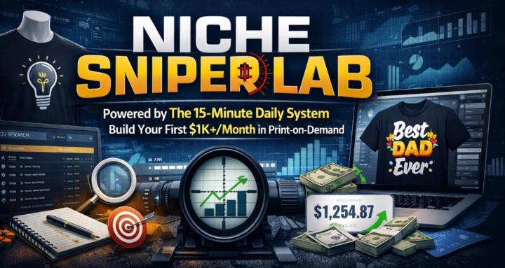
Powered by The 15-Minute Daily System. Build Your First $1K+/Month in Print-on-Demand.
Suggested communities
Powered by