
Mar '25 • Learning & Growth 📘
SIMPLIFY?
Hey everyone, I hope everyone has had a great start to their day so far, i wanted to just update you all on the changes to the logos and the thoughts behind it.
Firstly, I noticed that because of the over complicated logo, CONVERSION RATES were at a all time LOW which was a bit disappointing as The Amount of LANDING PAGE VISITERS was GROWING 2-4X so clearly the overcomplicated schemes were turning people off.
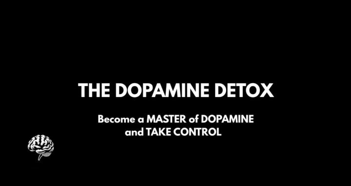
While the dopamine detox logo was previously Deep colors of blue and purple to signify focus and Intelligence, it just did not preform to it's capability as it should have.
I instead opted for colors like black and white in order to keep it simple and also, to trigger less dopamine. I got the idea that a black greyscaled logo would make more sense as a OVERCOLORED logo would give too much stimulation.
Maybe I do put too much thought into it but at the very least it feels like the right choice, all WORKSHEETS and PDF's will be redesigned with this LOGO/BANNER TYPE AS WELL!!
0
0 comments
SIMPLIFY?
skool.com/fraction-nyc-2435
DISCOVER the POWER of CONTROL over you're DOPAMINE And become A PRODUCITVITY WARRIOR in a AGE OF DISTRACTION
Powered by