
Write something

🔥
4d •
Halloween Inspired Moodboard
Halloween will be here before we know it… even if some of us are still firmly clinging to summer. 😂 But creating this moodboard had me thinking about pumpkins, flickering lanterns, deep purples, burnt orange, and all the delightfully spooky things we could create. So I have an idea… What if we did a Halloween Challenge? Or is that a holiday you skip over? Nothing complicated. Just a reason to pick a project, actually make the thing, share what we’re working on, and see where everyone’s imagination takes the same spooky little season. So before I start plotting… Who’s up for a Halloween Challenge? 🎃 And more importantly: What would you want to make?

🔥
11d •
🌊 The Great Seasonal Divide Moodboard 🍂
It feels way too early for fall... ...and yet here we are. Kids start Back-to-school tomorrow. Pumpkin spice ads. Halloween displays. Craft stores acting like October starts tomorrow. Meanwhile, summer is looking around, wondering if anyone noticed it hasn't actually left yet. So where do you stand? ☀️ Team "Don't Rush My Summer" or 🎃 Team "Bring Me the Cozy" Drop your vote below, and tell us which image from today's moodboard makes you want to grab your paintbrush first.

🔥
25d •
Moodboard Monday
🌸 Moodboard Monday 🌸 Some people see a mess of flowers. I see a color conversation. This week's moodboard started with those rich blue hydrangeas and wandered from there. One flower whispered, "Bring the navy." Another insisted on olive greens. Before long, warm orange and deep burgundy had pulled up a chair too. Funny how creativity works. It rarely arrives alone. That's one of my favorite exercises when I feel stuck. I don't ask, "What should I create?" I ask, "What colors are already telling a story?" This palette could become: 🎨 A painted dresser 🛋️ A cozy living room 🪵 A website design 🧵 A quilt 📸 A photography edit 🏡 Even the inspiration for an entire room. There are no creativity police handing out tickets for unexpected color combinations. Sometimes the colors that "shouldn't" work together end up creating something unforgettable. Your Creative AF challenge: Find one photo today that catches your eye. It could be flowers, an old truck, peeling paint, a coffee shop, or a random puddle after the rain. Pull 5 to 6 colors from it and build your own moodboard. Then tell us... What would you create with this palette? Let's fill the comments with color and inspiration. You never know whose next masterpiece begins with your ordinary photo. 🎨✨

🔥
Jul 13 •
Moodboard Monday: Beach Vibes & Grounded Hues
One of my favorite ways to spark new ideas is by starting with a single photo. The little beach scene tucked into the bottom left corner was the inspiration for this entire moodboard. From there, I asked myself... "If this photo became a room, what would it look like?" The soft sand became warm stone tiles. The weathered driftwood inspired natural wood textures. The deep ocean blues found their way into ceramics and fabric, while earthy browns kept everything feeling grounded and cozy. I especially love pulling together materials that could actually become part of a home... flooring, backsplashes, shower tile, coasters, textiles, pottery. Suddenly you're not just decorating a room, you're telling a story inspired by a single moment. The fun part is that this doesn't just work for home décor. It works for paintings, furniture makeovers, quilts, scrapbook pages, mixed media... pretty much any creative project. So here's your Creative AF challenge: Grab one photo that makes you smile and see where it takes you. Build a moodboard from its colors, textures, and feeling. You might discover a color palette or project idea you never would have found otherwise. What's the first thing you would create from this beachy palette?

🔥
Jul 6 •
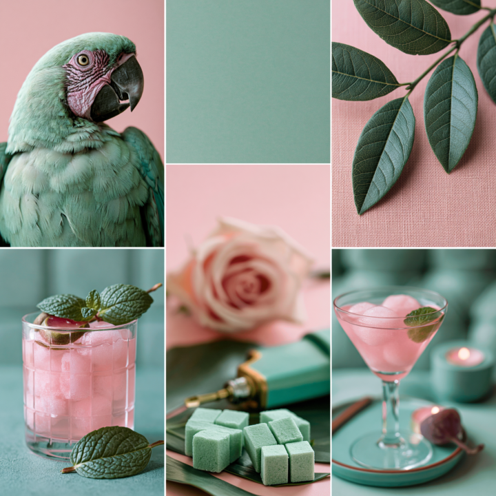
🎨 Moodboard Monday | Mint Green with Pops of Pink
This week's moodboard is a little different. I came across this brightly colored parrot on Pinterest and started playing with his colors in Photoshop. After a little experimenting, I landed on this soft mint green and blush pink palette and immediately thought, "Now that's interesting." Next, I adjusted the leaves to match the same vibe, then searched Pinterest for a few more images that fit the palette. Before long, this entire moodboard came together. One thing I love doing is shifting the colors of existing images in Photoshop or Canva. It can completely change the mood of a photo and spark color combinations you probably wouldn't have considered otherwise. It's a great creative exercise when you're feeling stuck. Now tell me... why does this moodboard make me crave a Cosmopolitan and mint chocolate chip ice cream at the same time? 😂 One of my favorite Pinterest features right now is Collages. You can pull elements from different Pins, arrange them into your own moodboard, and even share it as a post. It's a fun way to experiment with color, texture, and style without needing any fancy design skills. Just one warning... set aside a little extra time before you start. Pinterest has a funny way of turning a five-minute idea into an hour-long creative rabbit hole. How would you use this color combination? Would you lean into a retro diner vibe with black and white? Maybe a coastal cottage, a glam bedroom, or a painted furniture piece? I'd love to hear where this palette takes you. 💚🩷
1-18 of 18
skool.com/creative-af
A community for curious minds and creative souls who follow “what if” into the unexpected.
Leaderboard (30-day)
1

🔥
+21
2
+7
3
+6
4
+5
5

+4
Powered by