

11d •
Claude For Your Brand
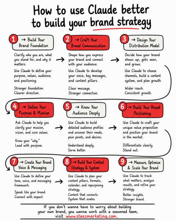
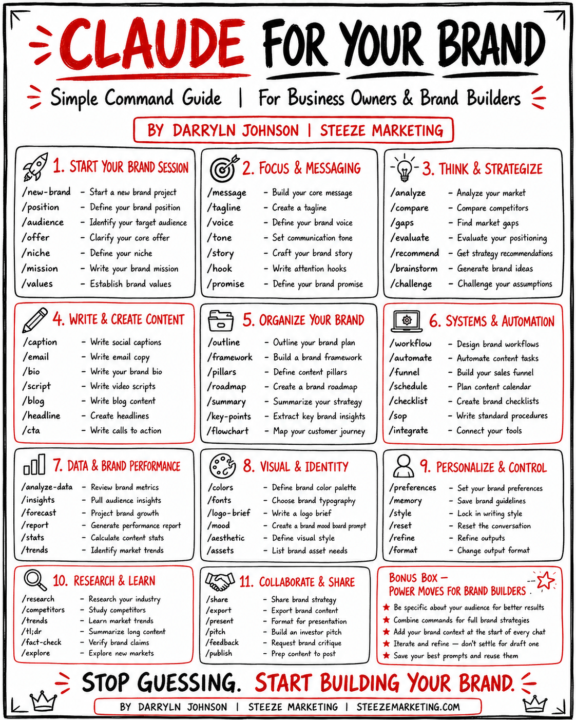
So I fell in love with Claude because of the "sophisticated simplicity" of it. These prompts should help you get to that next level!
0
0
11d •
AI Courses
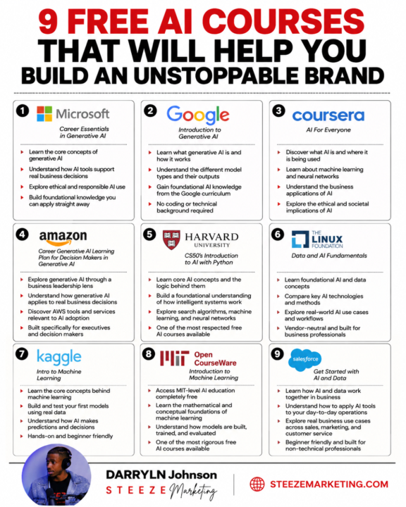
AI has different spectrums. The last year I have taken time to find course that help you understand it form different angles! Here are some good ones!
0
0
Jan 6 •
What A Brand Kit Consists Of
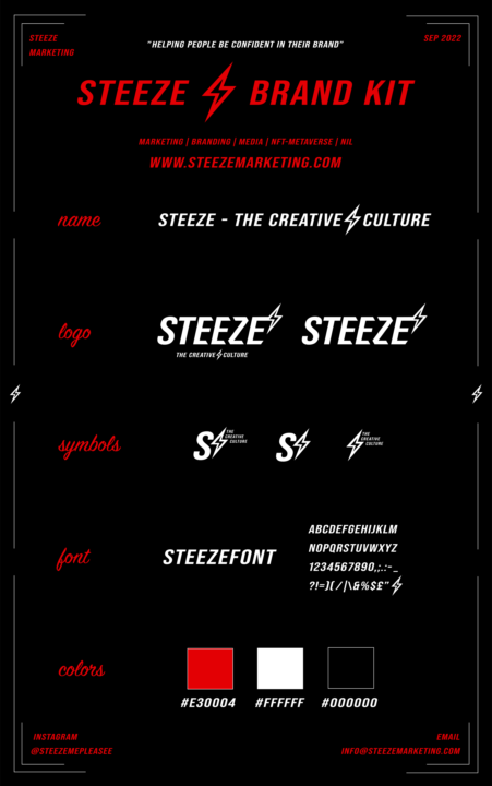
Why This Brand Kit Exists (And Why It Matters) This is the Steeze Brand Kit, and it’s not “design for design’s sake.” It’s a control system. Every element here exists to do one job: Create consistency, confidence, and recognition at scale. Name & Positioning: “Steeze – The Creative Culture” isn’t a tagline. It’s a standard. It tells people exactly what we stand for and what kind of work we produce before a single word is spoken. Logo System: You’ll notice multiple logo variations. That’s not indecision, it’s strategy. Different placements, formats, and use cases require flexibility while keeping the identity intact. Same DNA. Different environments. Symbols: The lightning bolt and mark variations are shorthand for the brand. These are used when the full logo would be overkill. Think icons, watermarks, accents, motion graphics. Typography: One font. One voice. Consistency in typography builds familiarity. Familiarity builds trust. Trust converts into sales. Color Palette: Red for energy and urgency. Black for authority and control. White for clarity. No extras. No distractions. This palette is intentional and repeatable across every platform. Why This Matters: A brand kit removes guesswork. It keeps your content clean. It keeps your team aligned. And most importantly, it makes your brand feel established instead of experimental. If your brand looks different every time it shows up, the market assumes you’re still figuring things out. This is what “figured out” looks like.
1
0
1-4 of 4
powered by
skool.com/built-from-experience-4665
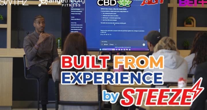
Built From Experience by Steeze Marketing is a private community teaching real-world branding, marketing, and systems through proven execution.
Suggested communities
Powered by