Activity
Mon
Wed
Fri
Sun
Sep
Oct
Nov
Dec
Jan
Feb
Mar
Apr
May
Jun
Jul
Aug
What is this?
Less
More
Royalty Guild. Amazon KDP
463 members • $5/month
The Profit Formula Academy
183 members • Free
The 1% KDP Publishing Club
1.5k members • Free
Publish & Profit Challenge
5.2k members • Free
Publisher Mastery (KDP Course)
3.2k members • Free
Driven Publishers
4.5k members • Free
7 contributions to Royalty Guild. Amazon KDP

Apr 30 •
Is It Possible to Run Ads Successfully without Reviews?
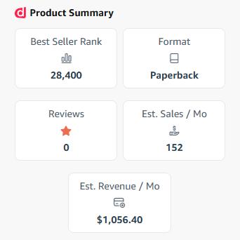
I hope the data in the screenshot answers this question well enough. This is just the 7th day of the campaign, and the conversion rate is more than 19%. Hear me correctly: I do not mean to say that reviews are not important. Quite the opposite, I am sure reviews are essential for success. But do not let the absence of reviews (yet) stop you from actively promoting your book. And next, to get a very good deal for the BookVillage review platform, use the link https://bookvillage.pub/?via=guild Have you had experience with good book sales without reviews, or with a minimal number of them?

1 like • 6d
@Thomas Juuls That’s so cool, thank you and @Igor O for sharing your results! I have a book in German market since June, I even have 7 reviews, but was afraid starting ads. Now I definitely will test it as well.
Feb 19 •
Covers Designer Hire: Which Set of Covers Do You Like Better?
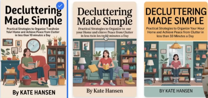
Imagine you are creating a book about decluttering. If you hired two cover designers and gave them a task: Create a cover for a book about decluttering with the title: "Decluttering Made Simple. Subtitle: Practical Strategies to Organize Your Home and Achieve Peace from Clutter in Less than 10 Minutes a Day. By Kate Hansen." Designers returned with their concepts. What offer would you prefer as a prototype to continue with? Your ideas about the quality of designs? Cast your vote for the set you like better. ----- ⚠️ If you recognized some designs, NO SPOILERS please.
Poll
22 members have voted
3 likes • Feb 20
Definitely set #2, middle one looks the most clean, but a little too simple, the other ones are also nice. Yes, people can definitely distinguish, publishers certainly, regular readers I think are also getting nauseous from all these low-quality same-looking AI images and covers. On the other hand, I’m wondering if you would use AI-generated realistic pictures and make AI generate something like the set #2, maybe that would not be this obvious. Also - what I’ve meant to ask: does you tool to compare covers on the website work? I was meaning to use it for my next cover, when I get to it, but don’t seem to see any options to vote for other people’s book anymore.
Dec '25 •
✍🏻 Proofread Your Manuscript at No Cost. How-To
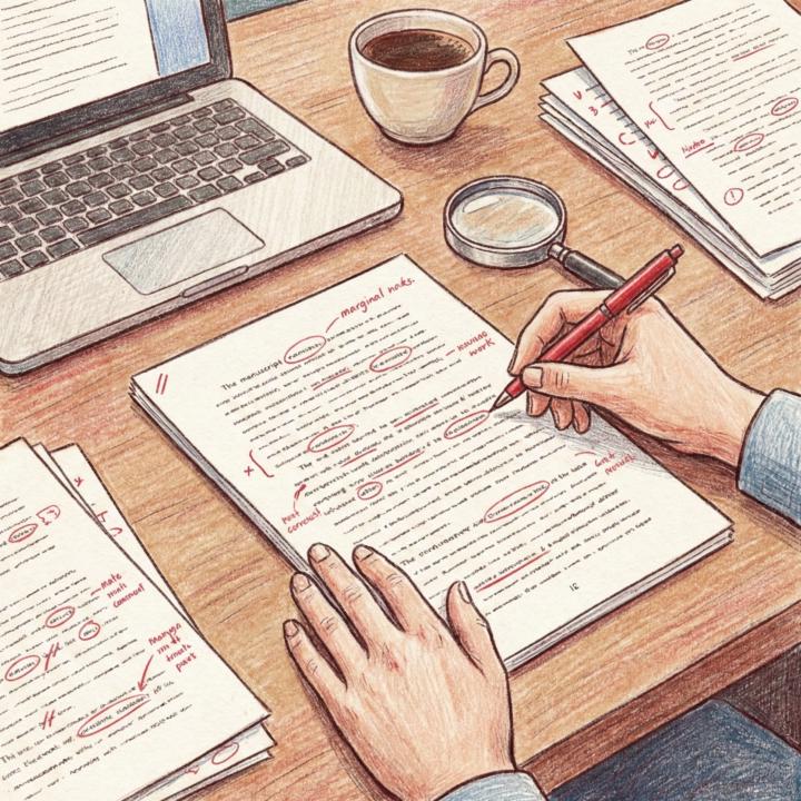
In the discussion of our poll, @Riaz Nawaz mentioned proofreading. The full proofreading process is now published in the Classroom. Please give your feedback in the comments after you try it out.
0 likes • Jan 5
I don’t have much experience in audio books yet. But I created my audio book with the Amazon virtual voice, which is completely free. It was also helpful with spotting mistakes in the text. Might be an option for those, who look for a free option.

Jan 4 •
Feedback - journal
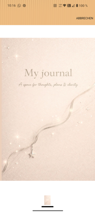
https://amzn.eu/d/eam9lZq Hello! Could you please share your feedback on this? This is the first journal I’m uploading. Thank you very much! Kind regards, Hannah
3 likes • Jan 5
I really like the cover 😍would be helpful to showcase the interior, in an A+. Even for a journal, I’m curious how it looks inside - lined? Blank pages? Colored with some nice layout? Even if it is written in the description - some people don’t read it, but rather look for visual clarification 😉

Dec '25 •
book cover hell
will you help i have chnaged the cover x 3 and about to do it again to boost impressions can you give me your top two covers
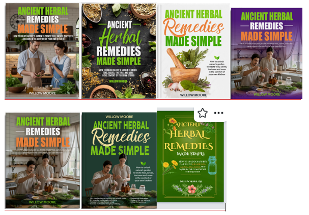
3 likes • Dec '25
For me 2 and 3 👍
1-7 of 7

@yuliya-firsova-8952
In the beginning of my publisher‘s journey
Active 12h ago
Joined Dec 17, 2025