Activity
Mon
Wed
Fri
Sun
Dec
Jan
Feb
Mar
Apr
May
Jun
Jul
Aug
Sep
Oct
Nov
What is this?
Less
More
Wisdom to Wealth Academy
132
5.0
$67/m
Creator Boost Tribe
9.2k
Free
29 contributions to Creator Boost Tribe

Feb 21 •
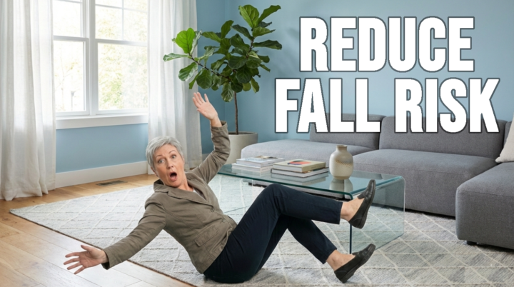
Help Me Choose My Next Thumbnail : )
Video title, optimized for search: How to Prevent Falls: 5 Things That Reduce Fall Risk My audience avatar is people over 50 that are deconditioned because of various problems. (Illness, injuries, strokes, etc.) They have mobility issues and need to get moving again safely. The middle option with the blue background is my usual format. (I would run a test, but my impressions are quite low, rendering the tests ineffective at best.) If you have any other suggestions, let me know. Thanks in advance. 🌼
Poll
7 members have voted
2 likes • Feb 21
I like number one because it grabs your attention. You could always run your own kind of test. If you use number one and it gets more views than normal, then you’ll know that was a good choice. If it doesn’t, then maybe don’t use that type again.
Nov '25 •
1,000 Subscribers!
After over 1 year of consistent weekly uploads, I've reached 1,000 subscribers. I just want to thank @Alexa Saarenoja for starting this group when she did. I was lucky enough to find her channel way back before she was monetized and was inspired to take the plunge into YouTube because of something she said. I believe that with persistence and patience, it is possible to grow your channel and find your audience. Although I am on the slow growth path, I'm building my channel in a way that feels authentic to me. Thank you--especially to the people who were with me in that first cohort of this group. So many of you were instrumental at that time. You shared your perspective and expertise and you helped me to have the audacity to think I could do this. I will always be grateful for that. 💚
3 likes • Nov '25
Congratulations!
3 likes • Nov '25
@Catherine R So now that you have 1000 subscribers, what’s your next goal?
3 likes • May '25
I think it’s so true about being in alignment with what you’re supposed to be doing. I didn’t realize how much I hated doing long-form video until I started making shorts. I used to struggle with making videos. Now I can’t wait to make one. I’m so excited about it everyday.

🍀
May '25 •
Some Friday Motivation
It’s Friday — and that means it’s time to check in, not check out! :) Whether you had a productive week or feel like you barely moved the needle, I want to remind you of this: 👉 Progress is not always loud. Sometimes it’s the quiet consistency, the small decisions, the one post you made even when you didn’t feel “on”… that’s moving you forward. Don’t underestimate what you’re building — one step, one video, and one idea at a time. 👉 The gap between where you are and where you want to be is made up of daily courage. And you’ve shown it just by being here, showing up for yourself and your vision. So take a breath, reflect on one win from this week — big or small — and set one simple intention for the weekend. You’ve got this. Let’s finish the week strong, creators!!! xoxo Share below: What’s one thing you’re proud of this week? Let’s celebrate all forms of progress 💬👇

3 likes • May '25
@Alexa Saarenoja yay! I’m so glad you were able to do that!
3 likes • May '25
@Neppi Stenbäck that sounds so exciting!
Apr '25 •
Need Some Thumbnail Help 💚
Edited to add a 4th option, based on feedback. Feel free to add your opinion. I am going to explain my reasoning for each choice. If there is a reason why my logic fails, please let me know. I'm at the stage where I am stuck, and I need to learn why things are not clicking. If you have a different idea for text, let me know. The current title is "Struggling with Shoulder Pain? You're Overlooking This". Let me know about colors and font if you have an opinion. They say consistency is important for branding, so I'm trying to figure out what is best for my CTR. Choice one is my first attempt because in this video I'm doing all of my exercises from the floor. My understanding is that if the first scene is the same as the thumbnail, that will "comfirm the click", letting the viewer know they are in the right place. Most of my titles have this type of coloring. Choice 2 is because Roberto Blake said something about cutting yourself out for the thumbnail. He knows what he's talking about. I figured if I cut myself out, I should be reaching too, because the exercises will help you reach better over time. Experimentling with new colors. Choice 3 is the same as 2 but with the look of pain. People say faces are important. I've always made my thumbnails with me smiling. Figured it wouldn't hurt to try something new. Apologise for the length of this, but I'm hoping for some feed back that will help me have a formula going forward.

2 likes • Apr '25
I like number 2 because it looks like you are actually reaching without pain. And I like the bright blue uncluttered background. But I do like the suggestion of showing you reaching for something on a high shelf, because that would be a real life situation and the reason someone would want to get help in the first place.
1-10 of 29
@wendy-nichols-4284
My channel is @MyLifeJam. I help busy Christian moms be more productive in everyday life so they have more time and energy for what matters most.
Online now
Joined Sep 16, 2024
Texas
Powered by