Activity
Mon
Wed
Fri
Sun
May
Jun
Jul
Aug
Sep
Oct
Nov
Dec
Jan
Feb
Mar
Apr
What is this?
Less
More
Owned by Peter
Drawing-focused course on building cinematic IP, from initial sketches and visual design to story, worldbuilding, and a screen-ready concept.
Memberships
Slinging Ink Skool
2.3k members • Free
ComicBookSkoolhouse
65 members • Free
Anime HQ
185 members • Free
Release The Dead
18 members • Free
Skoolers
194.9k members • Free
4 contributions to Slinging Ink Skool
22d •
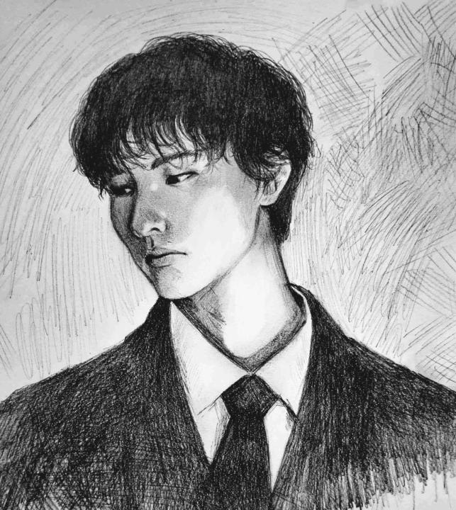
Sketch
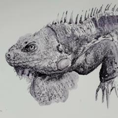
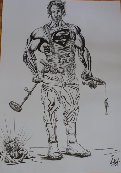
Hi everyone, I'd like to share some of my sketches. The first is inspired on one of my best friend , other copy on comics and pastel dog portrait. Venom with copic is my favourite.
1 like • 17h
I really like your panels @Antonio Grimaldi . What happened to that comic?
11d •
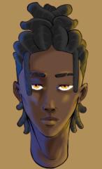
Digital cleanup
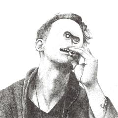
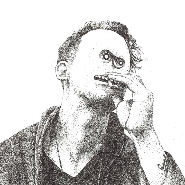
I put one of my recent drawing through the same digital cleaning process i do with my comics At least one person has said this makes it a misrepresentation of my art, but i feel like this is more in line with what i actually see when i draw it. The original photo is so dull and weirdly yellow. What do yall think?
0 likes • 17h
I really like the faded look you’re going for @Patrick Long. I’d lean into that and try to draw or paint it directly that way. I couldn’t find the exact reference I had in mind, but I did come across a James Jean painting that captures a similar feeling.
3d •
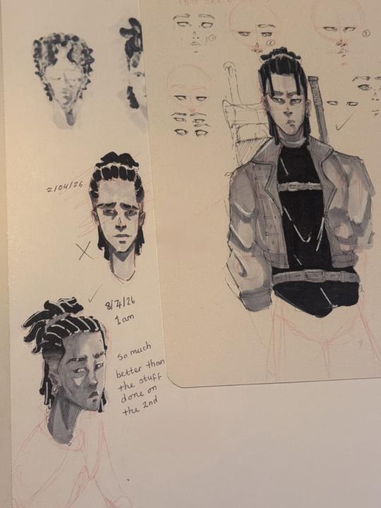
First Post!
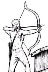
Lately I’ve been trying to really narrow down a consistent character style and some of the results I’m quite happy with some others not so much. Still trying to learn how to draw clothes and how folds and shadows/highlights work on faces too but I’m quite happy with today’s attempt:) (also included some stuff over the last week). Would love any tips !
0 likes • 17h
These are really great Bradley. Congrats. One thing to keep in mind with wrinkles, they usually radiate toward or away from points of tension and movement . You know, like the armpits, elbows, and crotch. If you think about where the fabric is being pulled or compressed, the wrinkle lines will naturally follow those forces.
2 likes • 17h
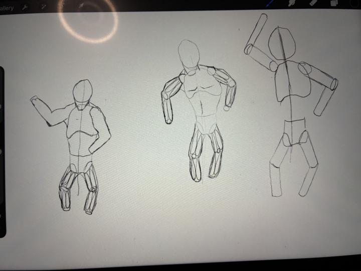
I was attending a Comic Book School over 20 years ago and my teacher had us do one body part at a time. We start by understanding the anatomy, then tracing over images, then redrawing them without tracing but from memory. Eventually, we put it all together and that worked really well for us.
1-4 of 4
@peter-ricq-9947
Award winning illustrator, filmmaker, writer, director. PeterRicq.com.
Active 3h ago
Joined Apr 10, 2026
Powered by