Activity
Mon
Wed
Fri
Sun
Sep
Oct
Nov
Dec
Jan
Feb
Mar
Apr
May
Jun
Jul
Aug
What is this?
Less
More
Owned by Nyala
The digital marketing community for entrepreneurs using AI content creation, faceless marketing & Twinfluence to build real income. 💚
SkoolKit | Skool CRM Toolkit
338 members • $2/month
Digital Roadmap AI Incubator
768 members • Free
Grow With Evelyn
3.8k members • $7/month
EverAds | Growth Boost Style
1.1k members • Free
Healthcare Business Academy
116 members • $17/month
Obsessed Visual Lab
16 members • Free
Pretty Prompted Portal 💎
183 members • Free
PSD Wealth Academy
110 members • $27/month
Ineffable.ai — Create with AI
453 members • $19/month
5 contributions to Digital Roadmap AI Incubator

12d •
I'd love your thoughts.
I recently received some valuable feedback and made a number of changes to my homepage. ChatGPT, Claude, and I have been working overtime. 😊 If you have a few minutes, I'd appreciate your perspective. Thank you all. Have a blessed day. michelemccain.lovable.app

2 likes • 8d
@Michele McCain Your page looks great! I did a video for you, I'll send it to you but for now, here is a comprehensive, conversion-focused prompt I engineered for you. Simply upload the long screenshot of your sales page & copy and paste all the written content and paste this prompt in 👇🏾 You are a world-class Conversion Rate Optimization (CRO) Expert and Direct Response Copywriter. Analyze the attached screenshot(s) of my sales page. Your objective is to perform an exhaustive, section-by-section audit to ensure the page maximizes clarity, readability, emotional resonance, and high conversions. 1. Overall Page Audit Please evaluate the page overall on a scale of 1–10 across these core areas: - Visual Hierarchy & Formatting: Is the layout clean, uncluttered, and naturally guiding the eye? - Skimmability & Readability: Are typography, line length, contrast, spacing, and bolding optimized for fast scanning? - Copywriting & Value Proposition: Is the offer immediately clear within the first 3 seconds? - Mobile-Friendliness: Based on visual spacing and layout, does this look like it will translate seamlessly to a mobile screen? 2. Section-by-Section Breakdown Go through the page top-to-bottom, section by section (e.g., Hero Section, Problem Identification, Transformation/Solution, Offer & Deliverables Stack, Social Proof/Testimonials, Guarantee/Risk Reversal, FAQs, and CTAs). For each section, analyze: 1. Current Purpose: What is this section trying to achieve? 2. What’s Working Well: Highlighting strong hooks, visual elements, or clear copy. 3. Conversion Friction & Weaknesses: What is confusing, missing, overwhelming, or visually cluttered? 4. Actionable Tweaks: Provide concrete suggestions to improve copy, layout, or design. 3. Specific Conversion Checklist Specifically address these crucial conversion drivers: - Hero Section Hook: Does the main headline focus on a strong outcome/desire, and does the sub-headline validate it? Is the primary CTA above the fold? - Copy Mechanics: Is the copy overly feature-focused, or does it tap heavily into desired outcomes and emotional pain points? - Social Proof: Is social proof strategically placed near high-friction moments (like CTAs and pricing), or is it buried? - Call to Actions (CTAs): Are the CTA buttons visually prominent, high-contrast, and action-oriented (beyond generic terms like "Buy Now")?
2 likes • 8d
@Michele McCain you’re so welcome and I forgot one more thing. Make sure you tell it the type of page it is cause it could be that this isn’t meant to be a sales page. It’s meant to be the front page of a website or something else. Tell it what your goal is for the page. 💚
9d •
Checking In: How'd The New Era of Influence Land For You?
Hey everyone! 👋🏾 Hope y'all are doing good today. It's been a couple weeks since I came through and shared The New Era of Influence with this community, and I've been thinking about y'all since. I'd genuinely love to know how it landed. Did anything shift for you after that workshop? Have you tried anything with an AI Twin since, even something small? Or maybe it just got you thinking differently about how you show up online consistently. I want to hear all of it, the wins, the "I'm still processing this" thoughts, whatever's true for you. Drop a comment below and let me know where your head's at. 🤗 Prefer to share it privately instead? No worries at all, https://forms.gle/jCTr2PiAQEc7fm3T6 takes two minutes.

1 like • 8d
@Nicole McCain AI

15d •
Your AI is Missing This😬
You can't just give your AI instructions without proving the right layers of context. Don't act surprised when your output doesn't sound like you or it's not the quality you expected. Most business owners think "context" means writing a longer prompt or uploading one big document once. That's not a context layer, that's a one-time info dump that goes stale in a week. Real context is layered and it accumulates. Here are a few things to consider when preparing context for your AI: ✅ Identity/standing context — your business, principles, who you are, your brand voice, your goals and misson, frameworks, your non-negotiables. This rarely changes. It's the foundation layer. ✅Operational context — what's happening right now. Active projects, current clients, this week's priorities. This decays fast and needs refreshing constantly, which is exactly the "conversational history" problem the report is describing. ✅ Decision history — the "why" behind past calls. Why you priced something a certain way, why you said no to a client type, what you tried before that didn't work. This is the layer almost nobody builds, and it's the one that stops an agent from re-suggesting something you already killed six months ago. ✅ Relationship/permission context — who's allowed to see what, who this agent is acting on behalf of. This week, pick one AI tool you're relying on. Ask yourself what it actually knows about your business versus what it's guessing. Are you giving your AI enough context and examples we're talking to it?👇🏿
1 like • 12d
I love this! I learned this the hard way. Everybody thinks the magic is in writing a better prompt, but my biggest breakthroughs came when I started giving my AI better context instead. My brand docs, messaging, past decisions, completely changed the quality of the output. I'm curios to hear your answer to this what's one layer of context you've seen people overlook the most?
16d •
My first post 👋🏾
Hey everybody, I’m Nyala, but most people call me Coach NeNe. 👋🏾 Some of you were with me last Wednesday for The New Era of Influence workshop, and I just want to say thank you again for the way y’all showed up, participated, and shared your feedback afterward. I had such a good time teaching inside this community. I’ve been in online marketing for more than 15 years, and these days my work sits at the intersection of AI, visibility, content, and monetization. I’m the creator of TwinFluence and the Twinfluencer Marketing methodology, which is basically all about helping entrepreneurs use AI Twins and characters to show up more consistently, create content, grow their visibility, and market their businesses without feeling like they have to become full-time content creators or losing what makes them human. I love what @Nicole McCain AI has built here and I'm excited to grow with you all!!

1 like • 16d
@Nicole McCain AI I'm excited to see 🙌🏾🙌🏾 I'm nosy 👀😆
1 like • 15d
@Dr. Severine Bryan happy Monday Dr. Bryan thank you so much ❤️
27d •
Tonight's Session was AMAZING!!
Hey guys! Thanks again to coach Nyala for walking us through using our digital twins to market our business and make $1200/day! Im sorry that I forgot to hit record. Dunamega, I'm so sorry you missed out on a great session! If you want to tell next to your content your visibility by using your AI twin for talking head or b-roll or training videos then grab the Twinfluence program HERE.

0 likes • 19d
@Kathryn G Thank you so much for your kind words Kathryn 💚 I had a great time with you all!
0 likes • 19d
@Carla Dancy Smith Carla 🤗🤗 Thanks for coming!
1-5 of 5
@nyala-thorpe-1698
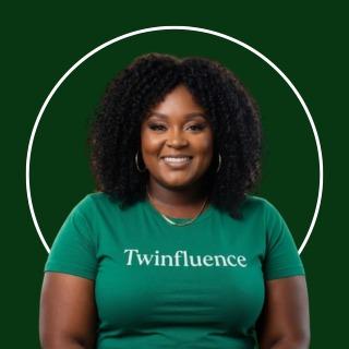
The queen of TwinFluence™ — helping you turn what you know into digital offers, create AI twins that sell them, and stack passive income
Active 42m ago
Joined Jul 22, 2026
Powered by