Activity
Mon
Wed
Fri
Sun
Jun
Jul
Aug
Sep
Oct
Nov
Dec
Jan
Feb
Mar
Apr
What is this?
Less
More
Memberships
RUrestore hair loss community
129 members • Free
AI Automation Made Easy
16.5k members • Free
AI Automation Society
350.7k members • Free
AI Money Lab
71.5k members • Free
LBC
448 members • $29/m
1 contribution to RUrestore hair loss community

Mar 8 •
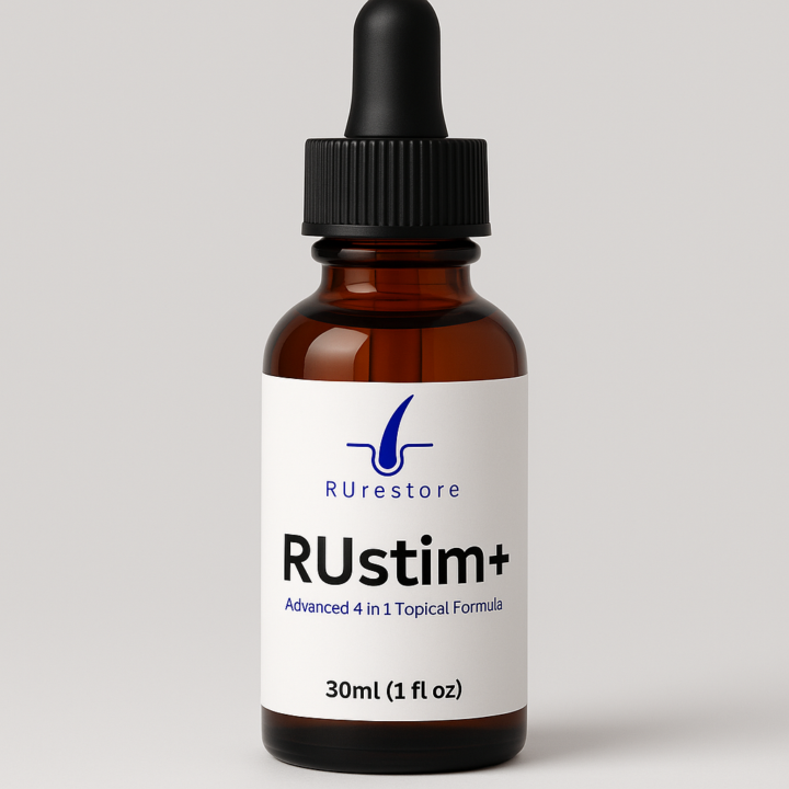
what do we think of the label design?
Hey guys, I want your input, what do we think of the bottle label design?

0 likes • Mar 8
Choosing the Right Label Design Both labels are clean, professional, and fit well on the amber dropper bottles. The "better" design actually depends on your friend's target audience and the exact formulation of the product. Here is a breakdown of how the two designs compare: The Left Design ("RUstim+") * Vibe: Commercial, consumer-friendly, and brand-focused. * Pros: It builds a specific product identity ("RUstim+") rather than just selling a chemical. The "Advanced 4 in 1" tag implies added value and a comprehensive solution. The larger font is also slightly easier to read from a distance. * Best for: A broader market looking for an all-in-one hair loss solution without needing to understand the underlying chemistry. The Right Design ("5% RU58841") * Vibe: Clinical, scientific, and transparent. * Pros: Hair loss communities (like the one this was posted in) are notoriously heavily researched and skeptical. They usually want to know exactly what active ingredients they are buying and at what concentration. Highlighting the exact chemical and the dosage (50 mg/ml) builds immediate trust with this niche. * Best for: The hardcore hair loss community who specifically seeks out RU58841 and values transparency over marketing terminology. The Verdict If the product is specifically aimed at the hair loss community he's posting in, the design on the right is likely to perform better. That demographic wants the raw stats. However, if the product actually is a 4-in-1 blend, he shouldn't use the right label, as it misrepresents the product as a single-ingredient formula. A good compromise might be using the "RUstim+" branding but clearly listing the primary active ingredient percentages directly below it.
1-1 of 1

Active 3d ago
Joined Mar 7, 2026