Activity
Mon
Wed
Fri
Sun
Oct
Nov
Dec
Jan
Feb
Mar
Apr
May
Jun
Jul
Aug
Sep
What is this?
Less
More
Auswandern & Online Business
896 members • Free
KI Transformation: Claude Code
537 members • Free
BNB Playbook (FREE)
544 members • Free
Airbnb Free Course
8.8k members • Free
KI Flow
2.3k members • Free
AI Netzwerk DACH (A.N.D.)
1.2k members • Free
AI Automation Vault
37.1k members • Free
The Agentic Lab
2.4k members • Free
Claude Community -Deutsch
473 members • Free
6 contributions to Skool Extensions 🧩

🔥
Jun 16 •
🔥 Moderator Found!
I’m excited to announce that I’ve found our new moderator: @Kimberly Armatys 🎉 She’ll be helping to bring more action, engagement, and fun into the community. Expect more discussions, challenges, and creative ideas Kimberly will also get deeper insight into the extension, early access to upcoming features, and the opportunity to provide direct feedback that helps shape future development. Please give Kimberly a warm welcome 👇🏼


2 likes • Jun 17
Well done Kimberly - looking forward to seeing your personal touch flowing into this realm 🤓
🔥
Jun 8 •
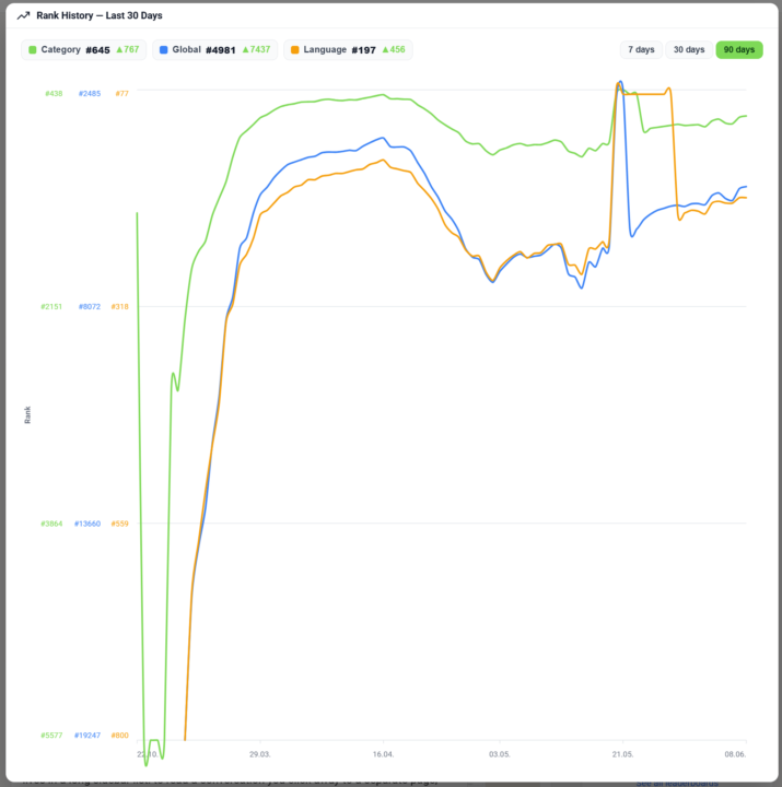
Community Rank History (Premium Feature 👑)
𝗖𝗼𝗺𝗺𝘂𝗻𝗶𝘁𝘆 𝗥𝗮𝗻𝗸 𝗛𝗶𝘀𝘁𝗼𝗿𝘆 — 𝗦𝗲𝗲 𝗪𝗵𝗲𝗿𝗲 𝗮 𝗖𝗼𝗺𝗺𝘂𝗻𝗶𝘁𝘆 𝗛𝗮𝘀 𝗕𝗲𝗲𝗻 𝗧𝗿𝗲𝗻𝗱𝗶𝗻𝗴 Skool shows a community's current rank, but never where it came from — is it a rising star or a fading leader? Community Rank History turns that single number into a story. Click the rank on any community page and a chart opens its ranking trend over the last 30 days, so you see at a glance whether a community is climbing or sliding before you join, partner or buy. The chart draws three lines at once — global rank, category rank and language rank — each in its own color and toggled on or off from the legend, so you can isolate the one you care about or compare all three. Switch the window between 7, 30 and 90 days to zoom from a quick pulse-check out to a full quarter, and hover any day to read the exact ranks on that date. It's the kind of view you'd otherwise have to rebuild by hand from screenshots taken weeks apart. The history is a Premium feature. Free users still see the chart — blurred, with an upgrade prompt — so the value is visible before the paywall; Premium unlocks the sharp, full history. The data is served on demand from the Skool Extensions backend, which keeps a rolling daily snapshot of every tracked community's ranks, so the line you see is real recorded history rather than an estimate. --- 𝗖𝗼𝗺𝗺𝘂𝗻𝗶𝘁𝘆-𝗥𝗮𝗻𝗴-𝗩𝗲𝗿𝗹𝗮𝘂𝗳 — 𝗦𝗶𝗲𝗵, 𝘄𝗼𝗵𝗶𝗻 𝗲𝗶𝗻𝗲 𝗖𝗼𝗺𝗺𝘂𝗻𝗶𝘁𝘆 𝘁𝗲𝗻𝗱𝗶𝗲𝗿𝘁 Skool zeigt den aktuellen Rang einer Community, aber nie, woher er kommt — ist sie ein aufgehender Stern oder ein verblassender Marktführer? Der Community-Rang-Verlauf macht aus dieser einen Zahl eine Geschichte. Klick auf den Rang auf jeder Community-Seite, und ein Diagramm öffnet den Ranking-Verlauf der letzten 30 Tage, sodass du auf einen Blick siehst, ob eine Community steigt oder fällt — bevor du beitrittst, kooperierst oder kaufst. Das Diagramm zeichnet drei Linien auf einmal — globaler Rang, Kategorie-Rang und Sprach-Rang — jede in eigener Farbe und über die Legende ein- und ausblendbar, sodass du die eine isolieren kannst, die dich interessiert, oder alle drei vergleichst. Schalte das Zeitfenster zwischen 7, 30 und 90 Tagen um, um vom schnellen Puls-Check bis auf ein ganzes Quartal zu zoomen, und fahre über einen Tag, um die genauen Ränge an diesem Datum abzulesen. Es ist die Art Ansicht, die du dir sonst von Hand aus wochenweit auseinanderliegenden Screenshots zusammenbauen müsstest.
7 likes • Jun 8
Nice - das sind sehr wertvolle Daten 🤓
🔥
Apr 17 •
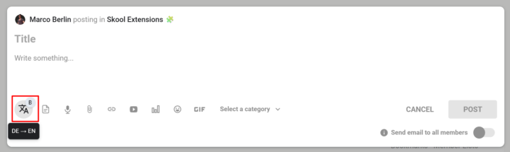
Translate Button
𝗧𝗿𝗮𝗻𝘀𝗹𝗮𝘁𝗲 𝗕𝘂𝘁𝘁𝗼𝗻 — 𝗢𝗻𝗲-𝗖𝗹𝗶𝗰𝗸 𝗧𝗿𝗮𝗻𝘀𝗹𝗮𝘁𝗶𝗼𝗻 𝗥𝗶𝗴𝗵𝘁 𝗶𝗻 𝘁𝗵𝗲 𝗘𝗱𝗶𝘁𝗼𝗿 Writing in a multilingual community usually means jumping to a translation tab, pasting your text, copying the result back, and losing your flow. The Translate Button puts translation directly inside every Skool editor — no context switch, no lost selection, no copy-paste dance. The translate icon lives on the Bold Button as a small badge: click the badge to toggle the main button between bold formatting and translation mode. Once you're in translate mode, select any text in the editor and click the button — the selection is instantly replaced with its translation. Your cursor stays in the same spot, so you can keep typing. The translation direction follows your interface language: if your UI is set to German, Spanish, or French, text translates to English; if your UI is English, text translates to German. The button shows up in every Skool editor that already supports the Bold Button — feed post composer, comment reply fields, reply-to-reply editors — and also in the native DM and Group Chat input. While a translation is running, the button dims briefly so you know it's working; failures stay silent to avoid interrupting your writing. Because the badge toggle is persistent, you can set the button to translate mode once and use it as a pure translation tool throughout your session, or flip back to bold formatting whenever you need it. --- Ü𝗯𝗲𝗿𝘀𝗲𝘁𝘇𝗲𝗻-𝗕𝘂𝘁𝘁𝗼𝗻 — 𝗘𝗶𝗻-𝗞𝗹𝗶𝗰𝗸-Ü𝗯𝗲𝗿𝘀𝗲𝘁𝘇𝘂𝗻𝗴 𝗱𝗶𝗿𝗲𝗸𝘁 𝗶𝗺 𝗘𝗱𝗶𝘁𝗼𝗿 Schreiben in einer mehrsprachigen Community bedeutet meistens: Tab mit Übersetzer öffnen, Text einfügen, Ergebnis zurückkopieren — und dabei den Schreibfluss verlieren. Der Übersetzen-Button bringt die Übersetzung direkt in jeden Skool-Editor: kein Kontextwechsel, keine verlorene Markierung, kein Copy-Paste-Tanz. Das Übersetzen-Symbol sitzt als kleines Badge am Bold-Button: Ein Klick auf das Badge schaltet den Haupt-Button zwischen Fettschrift-Modus und Übersetzungs-Modus um. Im Übersetzungs-Modus markierst du beliebigen Text im Editor und klickst den Button — die Markierung wird sofort durch die Übersetzung ersetzt. Dein Cursor bleibt an derselben Stelle, sodass du einfach weitertippen kannst. Die Übersetzungsrichtung richtet sich nach deiner Oberflächensprache: Bei deutscher, spanischer oder französischer UI wird nach Englisch übersetzt, bei englischer UI nach Deutsch.
8 likes • Apr 17
du bist ja krasser als Anthropic mit deinen Releases! Coole Sache🤓
🔥
Mar 18 •
Right-Click Quick Actions
𝗥𝗶𝗴𝗵𝘁-𝗖𝗹𝗶𝗰𝗸 𝗤𝘂𝗶𝗰𝗸 𝗔𝗰𝘁𝗶𝗼𝗻𝘀 — 𝗦𝗵𝗼𝗿𝘁𝗰𝘂𝘁𝘀 𝗪𝗵𝗲𝗿𝗲 𝗬𝗼𝘂 𝗡𝗲𝗲𝗱 𝗧𝗵𝗲𝗺 The extension adds context-sensitive right-click menus to key elements on Skool, giving you instant access to actions that would otherwise require multiple clicks or page navigations. Right-click on any event in the Calendar sidebar and you get five options to export it to your personal calendar: Google Calendar, Apple Calendar, Outlook, Outlook.com, or Yahoo. Google opens a pre-filled event in a new tab. The other four download the event as an ICS file directly through Skool's API — no copy-pasting of dates or titles needed. Right-click on the notification bell in the navbar and you'll see "Customize notifications", which opens Skool's notification settings page in a new tab. A shortcut to a page that's otherwise buried several clicks deep. Right-click on any category chip in your community feed (admin/owner only) and you get "Edit Categories", which opens the community settings directly on the categories panel — skipping the three-step navigation through Settings, Community, and Categories. Right-click on any bio section on a profile page and you get "Edit bio", which opens your profile settings and focuses the bio field — a direct shortcut to update your description. Right-click on the pinned groups sidebar (the community icons on the left) and you get "Community settings", which opens the community management page in a new tab. All right-click menus can be globally enabled or disabled via the "Right-Click Menus" toggle in the settings panel. All context menus adapt to your current theme (dark or light mode) and follow the extension's language setting. --- 𝗥𝗲𝗰𝗵𝘁𝘀𝗸𝗹𝗶𝗰𝗸-𝗦𝗰𝗵𝗻𝗲𝗹𝗹𝗮𝗸𝘁𝗶𝗼𝗻𝗲𝗻 — 𝗔𝗯𝗸ü𝗿𝘇𝘂𝗻𝗴𝗲𝗻 𝗴𝗲𝗻𝗮𝘂 𝗱𝗼𝗿𝘁, 𝘄𝗼 𝗱𝘂 𝘀𝗶𝗲 𝗯𝗿𝗮𝘂𝗰𝗵𝘀𝘁 Die Extension fügt kontextsensitive Rechtsklick-Menüs an wichtigen Elementen auf Skool hinzu und gibt dir sofortigen Zugriff auf Aktionen, die sonst mehrere Klicks oder Seitenwechsel erfordern würden. Rechtsklick auf ein Event in der Kalender-Sidebar zeigt dir fünf Optionen zum Export in deinen persönlichen Kalender: Google Kalender, Apple Kalender, Outlook, Outlook.com oder Yahoo. Google öffnet ein vorausgefülltes Event in einem neuen Tab. Die anderen vier laden das Event als ICS-Datei direkt über Skools API herunter — kein Kopieren von Daten oder Titeln nötig.
1 like • Mar 18
fantastic news! Absolutely love it! This tool will crush the skool ecosystem.🤓🤓
🔥
Mar 10 •
🧩 Skool Extensions starting
skool-extensions.com I’m officially releasing my Skool Extensions! 🥳 Install the extension, give me your feedback and ideas, and spread the word! --- Hiermit veröffentliche ich offiziell meine Skool Chrome Extension 🥳 Installier dir die Extension, geb mir Feedback und Ideen und erzählt es weiter.

21 likes • Mar 15
Alles in einem Tool - sehr (s)kool 🤓
1-6 of 6

@michael-gruendling
* 𝐒𝐚𝐚𝐒 𝐟𝐨𝐮𝐧𝐝𝐞𝐫 𝐨𝐟 𝐭𝐡𝐞 𝐬𝐞𝐫𝐯𝐢𝐜𝐞 *💡𝐰𝐰𝐰.𝐬𝐭𝐫-𝐰𝐚𝐭𝐜𝐡𝐝𝐨𝐠.𝐜𝐨𝐦💡
🕊️Author "The skool book"&"Everyone can YouTube"
Online now
Joined Mar 12, 2026
ENFP
Leipzig
Powered by