Activity
Mon
Wed
Fri
Sun
Jul
Aug
Sep
Oct
Nov
Dec
Jan
Feb
Mar
Apr
May
Jun
What is this?
Less
More
Owned by Melissa
Perimenopause & Menopause relief for Hot flashes~Mood swings~Weight gain ~ Midlife nutrition & fitness goals ~ Nurse guidance for hormone balance!
Memberships
GenX Creator Lab
690 members • Free
71 contributions to Painting for Drawing Dropouts

🔥
May 17 •
My apologies for being absent
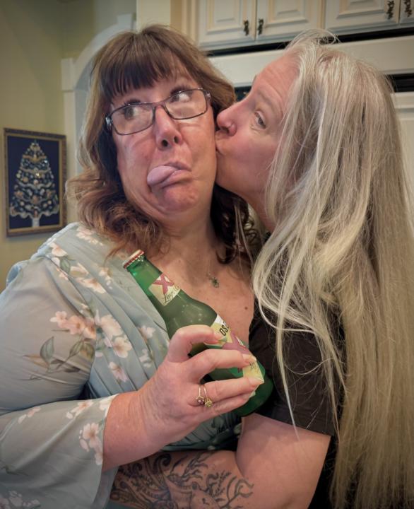
I wish I could bring you all with me to feel this fairy tale of a wedding. It’s been so beautiful even though I am older and jaded about marriage. They are both so young and full of energy. We were up till midnight dancing in celebration. There is a houseful of people. I’ve been helping cook and clean for days. But that’s the part that I love the most. The bonding and intimacy that comes with the work. Supporting my bestie as her last child in the nest gets married to his best friend. Here are a few pics. -Me trying to get Colleen (mother of the groom) to chill out a little. She needed a beer and some love and the inspiration of a funny pic. -The bride took a pic before the ceremony of us all. I am behind someone and nearly impossible to identify. My bestie in the front row made a funny. -The wedding was set in front of the gorgeous lake but the wind blew 20 mph for the last two days and made it a challenge because everything was blowing over. Some ladies had to change their outfits because their dresses were blowing up. I wore shorts under mine. -the reception in front of this grand home. There was no backup plan if it rained so thankfully this day was perfect. There was about 140 people in attendance. So my apologies for being a bit distracted. I will be back in full force tomorrow.

1 like • 28d
@Michelle Cyr I'm sure it was like a breath of fresh air! I'm leaving on Friday for Maine ~ attending one of my best friend's daughter's wedding ~ her first experience as MOTB ~ 💜
1 like • 21d
@Michelle Cyr thank you! It was the best weekend 💜
🔥
May 7 •
Let’s play a game.
My beautiful friend @Heather Boers has taught me how wonderful games are. So we are going to dip our toe in the water so to speak with a game. Post an image. 🖼️. Any image. It can be a drawing, a wood burning, a painting, your diamond art or even a 10 second pig stick figure. The rest of us must guess if that image is YOUR creation or not your creation. 👍🏻 - to vote if you think YES 👎🏻 - to vote if you think it’s NOT their art. ___________________ ‼️ HERE IS WHAT’s IMPORTANT ‼️ ‼️‼️YOUR VOTE‼️‼️ I will choose one winner that really participated who really voted on the others images. and they get a FREE month of Premium on me! That’s access to the painting library with the complete step-by-step instructions to paint the reference image of your choice.

2 likes • May 8
@Kate Bullock I knew it looked like your work 🥰🥰🥰 that white background threw me off track lol 😂 @Michelle Cyr
1 like • 21d
@Michelle Cyr yes! it was my work! You knew it right off the bat 😅
🔥
28d •
Remember this painting?
This painting by Frances Featherstone is ABSOLUTELY remarkable to me. It has interest, mystery and depth. I have spent no less than an hour studying it both for color and for composition. COMPOSITION first - in the second image, I have isolated the values and see this zigzag? This is what makes this image so successful in it’s composition. We’ve talked about triangles and these angles in the zig zag are along the same lines. Not exactly in the center and not perfectly symmetrical (super important!). She also brings in an odd location to view this perspective. COLOR - I have sampled the colors and put them in dots in the third image here. Be sure to open it big so you can see them all. There are basically two colors - pinks and greens. But it’s important to understand WHY these colors look so great together. If I were to mix these for oil paints, I would mix a large batch of For pink, Quadridone Magenta (QM) + Chromium Green Light (CGL) When I want to SLIGHTLY warm the value, I would add a little Cadmium Scarlet (CS) If I wanted to darken, I would use RU To lighten I would use Titanium white. For the greens, Chromium Green Light (CGL) + Raw Umber (RU) To lighten I would also use titanium white and quite possibly a yellow to help that warm glow. So let me just list the few paint colors I would use here: QM, CGL, RU, CS, Yellow, White. Like that’s it! That is why this is so amazing. Using a limited color palette actually makes paintings MORE sophisticated. Does this surprise you? It’s there anything that you would like more clarity on? How can I make you understand this better? In Premium - we will be going into these deeper. Choosing color is VERY VERY important.

1 like • 27d
Love to listen to your breakdown of this one! It really draws me in!!
1 like • 27d
@Michelle Cyr interesting that it's interesting ~ 😜
🔥
May 15 •
What are your thoughts?
Francis Featherstone Holding on to my Dreams. What is your interpretation. Besides pink. What colors do you see in the paint? Zoom in, explore this and tell me how it makes you feel?
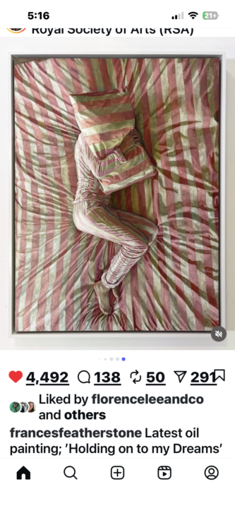
0 likes • May 16
I see a greenish gray color on the stripes. I like the premise of the painting a lot… and hiding behind that pillow is perfection for someone trying to not be woken up!
🔥
May 9 •
😮😮😮 JUST WOW 😮😮😮
I had NO idea our little art game was going to explode like it did. You guys went full on Rabid Beaver with a damn Flame Thrower! The Stories. Laughter. Old artwork. AI debates. Pole dancing illustrations. Questions about the Glory Hole. Fucupcakes. German Shepards. Wood burning. Digital art. People reconnecting with parts of themselves they forgot about. Seriously impressive for a group that mostly feels they aren’t creative or artistic. THIS is NOT just a space to teach painting. But a space where highly intelligent people can discover what their creativity looks like without feeling stupid or judged. Watching you guys interact, encourage each other, joke around and actually LOOK at each other’s work was amazing. This isn’t social media BS! We are real PEOPLE. And THAT is what makes my heart explode! Like seriously I have tears of joy as I re-read this entire thread again. My promise of a FREE month of Premium goes to: 🔥 @LM Sharron 🔥 Girl… You brought humor, vulnerability, honesty, curiosity, conversation, and a whole mega fuckton of personality. Thank you. Thank ALL of you. This thread was one of my favorite things we’ve done here so far and I think yours too. We are DEFINITELY doing this again. I am putting on my creative brain to do more like this. And to leave you with a thoughtful question: Do you think that sharing creative work feels vulnerable because there’s no one correct answer? No absolute? Or…..?

1 like • May 11
It was a lot of fun! Always a great time in here girlfriend!
1-10 of 71

@melissarn
RN x 35 yrs ~supporting women in Perimenopause & beyond to create a personal hormonal roadmap with health coaching & goal setting for lasting wellness
Active 8d ago
Joined Mar 5, 2026
Powered by